丸められたプログレスバー内の丸められた進行状況
作業中のアプリでカスタムプログレスバーを作成しようとしています。最後に必要なのは、進行状況インジケーター自体です。代わりに、2番目の画像のように、プログレスバー自体の左端と右端のように、そのバーを丸くしたいと思います(もちろん赤い円を除いて)。


プログレスバーのレイアウト定義は次のとおりです(簡潔にするために、レイアウトファイルの残りの部分は省略されています)。
<ProgressBar
    Android:id="@+id/progress_bar"
    Android:layout_width="fill_parent"
    Android:layout_height="60dp"
    Android:padding="3dp"
    Android:max="100"
    Android:progressDrawable="@drawable/progress_bar_states"
    Android:layout_marginTop="10dp"
    style="?android:attr/progressBarStyleHorizontal"
    Android:indeterminateOnly="false"
    Android:layout_below="@id/textview2"
    Android:layout_alignLeft="@id/textview2"
    />
これがprogress_bar_states.xmlファイルです。
<layer-list xmlns:Android="http://schemas.Android.com/apk/res/Android">

    <item Android:id="@Android:id/background">
        <shape>
            <solid Android:color="#20ffff00"/>
            <corners Android:radius="60dp"/>
        </shape>
    </item>

    <item Android:id="@Android:id/progress">
        <clip>
            <shape>
                <solid Android:color="#20ffffff"/>
                <corners Android:radius="60dp"/>
            </shape>
        </clip>
    </item>

</layer-list>
どうすればよいですか?進行状況インジケーターを定義するためのオプションがまったく表示されません。これを別の方法で行う必要がありますか?私はまだAndroidに慣れていないので、どんなガイダンスも歓迎します。
@ Ando-あなたの解決策は非常に私が必要としているものに近いです。インジケーターの動きの始まりが今の問題ですが、オリジナルのようなクリップではないからだと思います。インジケーターが起動し、最初のある時点までは「絞られている」ように見えます

適切なポイントに到達するまで、問題なく表示されます。

このソリューションで最初に「クリッピング」をどのように達成しますか?
@bladefuryの場合-ご覧のとおり、上の画像の前縁と比較すると、平坦になっているように見えます。

編集:これをかなり長い間見ていなかった後、私は https://github.com/akexorcist/Android-RoundCornerProgressBar/issues で新しいコンポーネントを見ました、そしてそれはと同じ問題を抱えていますここでの提案。
このライブラリは、角の丸いプログレスバーに使用できます
<com.akexorcist.roundcornerprogressbar.RoundCornerProgressBar
        Android:layout_width="dimension"
        Android:layout_height="dimension"
        app:rcProgress="float"
        app:rcSecondaryProgress="float"
        app:rcMax="float"
        app:rcRadius="dimension"
        app:rcBackgroundPadding="dimension"
        app:rcReverse="boolean"
        app:rcProgressColor="color"
        app:rcSecondaryProgressColor="color"
        app:rcBackgroundColor="color" />
Gradle
compile 'com.akexorcist:RoundCornerProgressBar:2.0.3'
https://github.com/akexorcist/Android-RoundCornerProgressBar
progress_bar_states.xmlファイルを変更するだけです:以下の例のように
<?xml version="1.0" encoding="utf-8"?>
<layer-list xmlns:Android="http://schemas.Android.com/apk/res/Android" >

<item Android:id="@Android:id/background">
    <shape>
        <solid Android:color="#20ffff00" />

        <corners Android:radius="20dp" />
    </shape>
</item>
<item Android:id="@Android:id/progress">

    <!-- <clip> -->
    <!-- <shape> -->
    <!-- <solid Android:color="@Android:color/black" /> -->


    <!-- <corners -->
    <!-- Android:bottomRightRadius="30dp" -->
    <!-- Android:radius="60dp" -->
    <!-- Android:topRightRadius="30dp" /> -->
    <!-- </shape> -->
    <!-- </clip> -->

    <scale
        Android:drawable="@drawable/custom_progress_primary"
        Android:scaleWidth="98%" /><!-- change here -->
</item>
ここcustom_progress_primary.xmlファイル:以下のように
<?xml version="1.0" encoding="utf-8"?>
<shape xmlns:Android="http://schemas.Android.com/apk/res/Android" >

<corners
    Android:radius="20dp"
    Android:topLeftRadius="20dp"
    Android:topRightRadius="20dp" />

<solid Android:color="@Android:color/white" />

<stroke
    Android:width="1dp"
    Android:color="@Android:color/darker_gray" />

</shape>
おそらくもう少し実用的なオプションは、カスタムプログレスバービューを実装することです。
public class CustomProgressBar extends View
{
    // % value of the progressbar.
    int progressBarValue = 0;

    public CustomProgressBar(Context context)
    {
        super(context);
    }

    public CustomProgressBar(Context context, AttributeSet attrs)
    {
        super(context, attrs);
        progressBarValue = attrs.getAttributeIntValue(null, "progressBarValue", 0);
    }

    public void setValue(int value)
    {
        progressBarValue = value;
        invalidate();
    }

    protected void onDraw(Canvas canvas)
    {
        super.onDraw(canvas);

        float cornerRadius = 30.0f;

        // Draw the background of the bar.
        Paint backgroundPaint = new Paint();
        backgroundPaint.setColor(Color.LTGRAY);
        backgroundPaint.setStyle(Paint.Style.FILL);
        backgroundPaint.setAntiAlias(true);

        RectF backgroundRect = new RectF(0, 0, canvas.getWidth(), canvas.getHeight());
        canvas.drawRoundRect(backgroundRect, cornerRadius, cornerRadius, backgroundPaint);

        // Draw the progress bar.
        Paint barPaint = new Paint();
        barPaint.setColor(Color.GREEN);
        barPaint.setStyle(Paint.Style.FILL);
        barPaint.setAntiAlias(true);

        float progress = (backgroundRect.width() / 100) * progressBarValue;
        RectF barRect = new RectF(0, 0, progress, canvas.getClipBounds().bottom);

        canvas.drawRoundRect(barRect, cornerRadius, cornerRadius, barPaint);

        // Draw progress text in the middle.
        Paint textPaint = new Paint();
        textPaint.setColor(Color.WHITE);
        textPaint.setTextSize(34);

        String text = progressBarValue + "%";
        Rect textBounds = new Rect();

        textPaint.getTextBounds(text, 0, text.length(), textBounds);

        canvas.drawText(text,
                backgroundRect.centerX() - (textBounds.width() / 2),
                backgroundRect.centerY() + (textBounds.height() / 2),
                textPaint);

    }
}
次に、レイアウトで:
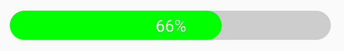
<view.CustomProgressBar
    Android:layout_height="30dp"
    Android:layout_width="match_parent"
    progressBarValue="66"/>
結果は次のとおりです。
これにもシークバーを使用できます
ここで私の投稿を確認してください: https://stackoverflow.com/a/41206481/6033946
これを試してみてください。xmlの親指とシークバーの色と幅と高さを変更することで、やりたいことができるかもしれません。
ProgressBarはClipDrawableを使用します。これは、長方形で描画可能なクリップです。したがって、角の長方形をプログレスバーにクリップするドローアブルを設定できます。方法は次のとおりです。
まず、プログレスバーのドローアブルで<clip>タグを削除します。
<layer-list xmlns:Android="http://schemas.Android.com/apk/res/Android">

<item Android:id="@Android:id/background">
    <shape>
        <solid Android:color="#20ffff00"/>
        <corners Android:radius="60dp"/>
    </shape>
</item>

<item Android:id="@Android:id/progress">
        <shape>
            <solid Android:color="#20ffffff"/>
            <corners Android:radius="60dp"/>
        </shape>
</item>
次に、次のようにプログレスバーを拡張します。
public class RoundIndicatorProgressBar extends ProgressBar {

    private static final float CORNER_RADIUS_DP = 60.0f;

    public RoundIndicatorProgressBar(Context context) {
        this(context, null);
    }

    public RoundIndicatorProgressBar(Context context, AttributeSet attrs) {
        this(context, attrs, 0);
    }

    public RoundIndicatorProgressBar(Context context, AttributeSet attrs, int defStyle) {
        super(context, attrs, defStyle);
    }


    @Override
    public void setProgressDrawable(Drawable d) {
        super.setProgressDrawable(tileify(d, false));
    }

    private Drawable tileify(Drawable drawable, boolean clip) {
        if (drawable instanceof LayerDrawable) {
            LayerDrawable background = (LayerDrawable) drawable;
            final int N = background.getNumberOfLayers();
            Drawable[] outDrawables = new Drawable[N];

            for (int i = 0; i < N; i++) {
                int id = background.getId(i);
                outDrawables[i] = tileify(background.getDrawable(i),
                        (id == Android.R.id.progress || id == Android.R.id.secondaryProgress));
            }

            LayerDrawable newBg = new LayerDrawable(outDrawables);

            for (int i = 0; i < N; i++) {
                newBg.setId(i, background.getId(i));
            }

            return newBg;

        } else {
            if (clip) {
                return new RoundClipDrawable(drawable, dp2px(getContext(), CORNER_RADIUS_DP));
            }
        }
        return drawable;
    }
    public static float dp2px(Context context, float dp) {
        final float scale = context.getResources().getDisplayMetrics().density;
        return dp * scale;
    }

}
これがRoundClipDrawableで、ClipDrawableから変更されています。