Angular 2 Material Dynamic Themes
私は独自のscssテーマを作成し、angular-cli.jsonで宣言しましたが、すべて正常に動作します。
次に、テーマを動的に変更する必要があります。
Angular-cli.jsonに2番目のテーマを追加しようとしましたが、予想どおり最初のテーマをオーバーライドします。
したがって、おそらく1つのオプションは、angular-cli.jsonからテーマ宣言を削除し、2つのコンポーネントを持ち、それぞれが独自のscssスタイルで、一方が他方をオーバーライドし、唯一の違いはstyleUrlsになることです。
または、scssを動的にロードする他の推奨方法はありますか?
Angular 5.1の時点で、これが動的なテーマの変更を実現する方法です。
*編集:これはAngular 7+
作業用の編集可能な例- https://stackblitz.com/edit/dynamic-material-theming
Theme.scssファイルに、デフォルトのテーマを含めます(クラス名の下に保持されていないことに注意してください-これはAngularがデフォルトとして使用します)。暗いテーマ。
theme.scss
_@import '~@angular/material/theming';
@include mat-core();

// Typography
$custom-typography: mat-typography-config(
  $font-family: Raleway,
  $headline: mat-typography-level(24px, 48px, 400),
  $body-1: mat-typography-level(16px, 24px, 400)
);
@include angular-material-typography($custom-typography);

// Default colors
$my-app-primary: mat-palette($mat-teal, 700, 100, 800);
$my-app-accent:  mat-palette($mat-teal, 700, 100, 800);

$my-app-theme: mat-light-theme($my-app-primary, $my-app-accent);
@include angular-material-theme($my-app-theme);

// Dark theme
$dark-primary: mat-palette($mat-blue-grey);
$dark-accent:  mat-palette($mat-amber, A200, A100, A400);
$dark-warn:    mat-palette($mat-deep-orange);

$dark-theme:   mat-dark-theme($dark-primary, $dark-accent, $dark-warn);

.dark-theme {
  @include angular-material-theme($dark-theme);
}

// Light theme
$light-primary: mat-palette($mat-grey, 200, 500, 300);
$light-accent: mat-palette($mat-brown, 200);
$light-warn: mat-palette($mat-deep-orange, 200);

$light-theme: mat-light-theme($light-primary, $light-accent, $light-warn);

.light-theme {
  @include angular-material-theme($light-theme)
}
_
App.componentファイルに、@ angular/cdk/overlayのOverlayContainerを含めます。このためのAngularのドキュメントはこちらにあります https://material.angular.io/guide/theming ;ただし、実装は少し異なります。また、app.moduleのインポートとしてOverlayModuleも含める必要があることに注意してください。
App.componentファイルでは、@HostBinding('class') componentCssClass;を変数として宣言しました。これは、テーマをクラスとして設定するために使用されます。
app.component.ts
_import {Component, HostBinding, OnInit} from '@angular/core';
import { HttpClient } from '@angular/common/http';
import { Version } from './classes/version';
import { OverlayContainer} from '@angular/cdk/overlay';

@Component({
  selector: 'app-root',
  templateUrl: './app.component.html',
  styleUrls: ['./app.component.css'],
})
export class AppComponent implements OnInit {

  constructor(private http: HttpClient, public overlayContainer: OverlayContainer) {}

  title = 'app';
  version: Version;
  @HostBinding('class') componentCssClass;

  ngOnInit() {
    this.getVersion();
  }

  onSetTheme(theme) {
    this.overlayContainer.getContainerElement().classList.add(theme);
    this.componentCssClass = theme;
  }

  getVersion() {
    this.http.get<Version>('/api/version')
      .subscribe(data => {
        this.version = data;
      });
  }

}
_
app.module.ts
_import { BrowserModule } from '@angular/platform-browser';
import { NgModule } from '@angular/core';

import { HttpClientModule } from '@angular/common/http';

import { BrowserAnimationsModule } from '@angular/platform-browser/animations';
import { MatCardModule } from '@angular/material/card';
import { MatButtonModule } from '@angular/material/button';

import { AppComponent } from './app.component';

import { OverlayModule} from '@angular/cdk/overlay';

@NgModule({
  declarations: [
    AppComponent,
  ],
  imports: [
    BrowserModule,
    HttpClientModule,
    BrowserAnimationsModule,
    MatCardModule,
    MatButtonModule,
    OverlayModule
  ],
  providers: [],
  bootstrap: [AppComponent]
})
export class AppModule {}
_
最後に、ビューからonSetTheme関数を呼び出します。
app.component.html
_<button mat-raised-button color="primary" (click)="onSetTheme('default-theme')">Default</button>
<button mat-raised-button color="primary" (click)="onSetTheme('dark-theme')">Dark</button>
<button mat-raised-button color="primary" (click)="onSetTheme('light-theme')">Light</button>
_
機能がより動的になるように、オブザーバブルの使用を検討することもできます。
答えは Angular 2 のマテリアルデザインテーマの変更)で見つかりました。 https://github.com/jelbourn/ material2-app 。
したがって、同じ単一のscssテーマファイルを使用しますが、新しいテーマの新しいクラスを追加しました。
.m2app-dark {
  $dark-primary: md-palette($md-pink, 700, 500, 900);
  $dark-accent:  md-palette($md-blue-grey, A200, A100, A400);
  $dark-warn:    md-palette($md-deep-orange);
  $dark-theme: md-dark-theme($dark-primary, $dark-accent, $dark-warn);
  @include angular-material-theme($dark-theme);
}
これはhtmlで使用され、ブール値の値に応じてアクティブまたは非アクティブになります。
<md-sidenav-layout [class.m2app-dark]="isDarkTheme">
更新:
このソリューションの新しいバージョンがここに公開されました。
https://github.com/mirismaili/angular-material-dynamic-themes

アーカイブされた回答:
@ K.Waiteに感謝します。 his/her answer を使用しました。私はそれを改善しようとしました。最も重要な編集は、.replace()の代わりに.add()をclassList(insetTheme()メソッド)。以下に示す他の機能もいくつかあります。
stackblitz here
最も重要な部分:
あなたのstyles.scss(またはthemes.scss あなたが持っている場合):
@import '~@angular/material/theming';
@include mat-core();
@mixin define-css-classes($theme) {
@include angular-material-theme($theme);
$primary: map-get($theme, primary);
$accent: map-get($theme, accent);
$warn: map-get($theme, warn);
$background: map-get($theme, background);
$foreground: map-get($theme, foreground);
// CSS THEME-DEPENDENT-STYLES ARE HERE:
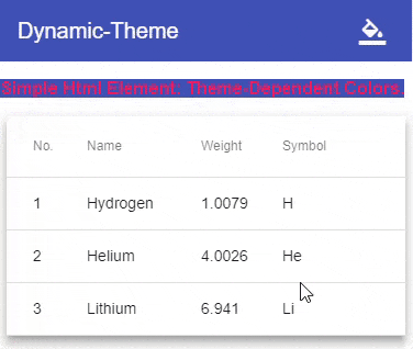
.theme-dependent-colors {
background: mat-color($primary);
color: mat-color($accent);
}
}
/**
* Define your custom themes in this map.
* The `key` of each member is the name of CSS class for that theme.
* To better understand the schema of the map, see `@each` loop below and especially pay attention to `map-has-key()` functions.
*/
$app-themes: (
Indigo-pink : (primary-base: $mat-Indigo, accent-base: $mat-pink),
deeppurple-amber: (primary-base: $mat-deep-purple, accent-base: $mat-amber),
pink-bluegrey : (primary-base: $mat-pink, accent-base: $mat-blue-gray, is-dark: true),
purple-green : (primary-base: $mat-purple, accent-base: $mat-green, is-dark: true),
);
@each $css-class, $theme in $app-themes {
$primary: if(map-has-key($theme, primary), map-get($theme, primary), mat-palette(map-get($theme, primary-base)));
$accent: if(map-has-key($theme, accent), map-get($theme, accent), mat-palette(map-get($theme, accent-base)));
$warn: if(map-has-key($theme, warn), map-get($theme, warn), mat-palette(
if(map-has-key($theme, warn-base), map-get($theme, warn-base), $mat-red)
));
.#{$css-class} {
@include define-css-classes(mat-light-theme($primary, $accent, $warn));
}
.#{$css-class}-dark {
@include define-css-classes(mat-dark-theme($primary, $accent, $warn));
}
.theme-primary.#{$css-class} {
background-color: mat-color($primary);
}
...
}
TypeScript( here を参照):
import {Component, HostBinding} from '@angular/core';
import {OverlayContainer} from "@angular/cdk/overlay";

const THEME_DARKNESS_SUFFIX = `-dark`;

export class AppComponent {
    @HostBinding('class') activeThemeCssClass: string;
    isThemeDark = false;
    activeTheme: string;

    setTheme(theme: string, darkness: boolean = null) {
        if (darkness === null)
            darkness = this.isThemeDark;
        else if (this.isThemeDark === darkness) {
            if (this.activeTheme === theme) return;
        } else
            this.isThemeDark = darkness;

        this.activeTheme = theme;

        const cssClass = darkness === true ? theme + THEME_DARKNESS_SUFFIX : theme;

        const classList = this.overlayContainer.getContainerElement().classList;
        if (classList.contains(this.activeThemeCssClass))
            classList.replace(this.activeThemeCssClass, cssClass);
        else
            classList.add(cssClass);

        this.activeThemeCssClass = cssClass;
    }

    constructor(overlayContainer: OverlayContainer) {
        this.setThemeClass('Indigo-pink', false); // Default theme
    }
}
stackblitz の他のことを参照してください。
警告:アプリに8つの動的マテリアルテーマ(4つのライト+ 4つのダーク)を追加すると、ビルドstyles.css by ~420 kB私の場合(1つの静的マテリアルテーマと比較して)。
現在のテーマに基づいて実行時にbodyタグでcssクラス(マテリアルテーマを含む)を追加または削除することにより、テーマを切り替えることができます。
たとえばステップ1。
要素ごとにファイルできるように、htmlファイルのbodyタグにidを追加します。
<body id="themeTag">
<app-root></app-root>
</body>
ステップ2。
scssファイルに2番目のテーマを作成します。このファイルはangular.json in angular 6 and .angular-cli.json in angular version lower than 6。
@include mat-core();
$primary: mat-palette($mat-blue);
$accent: mat-palette($mat-yellow);
$warn: mat-palette($mat-red);

$light-theme: mat-light-theme($primary, $accent, $warn);

@include angular-material-theme($light-theme);

$dark-theme: mat-dark-theme($primary, $accent, $warn);

.dark-theme { // css class for dark theme
  @include angular-material-theme($dark-theme);
}
ステップ3。
ボタンをクリックすると、bodyタグのクラスを変更します
toggleTheme(){
   this.isDarkTheme = !this.isDarkTheme;
   if(this.isDarkTheme){
     /* here themeTag is id of body tag and dark-theme is css class created in theme file */
     document.getElementById('themeTag').classList.add('dark-theme');
   }else{
     document.getElementById('themeTag').classList.remove('dark-theme');
   }
}
@Kウェイト(コメントするのに十分な担当者がいない..)
Angular 8(おそらくそれ以前?)
追加の行classList.remove(this.componentCssClass);を追加する必要があることがわかりました。テスト中に、動的テーマの変更をモーダルポップアップウィンドウに適用すると、モーダルウィンドウはclassListのlastテーマのみを適用することに気付きました。したがって、暗いテーマから明るいテーマに切り替えると、誤った状態になる可能性があります。
2つの要素(default-themeおよび現在アクティブなテーマ。これは解決されています)
onSetTheme(theme) {

  this.overlayContainer.getContainerElement().classList.remove(this.componentCssClass);
  this.overlayContainer.getContainerElement().classList.add(theme);
  this.componentCssClass = theme;
}