Angular Material 2 Card Header Buttons set Right
Angular Material 2を使用していますが、カードヘッダーのアイコンボタンが必要です。ボタンを右側に設定するにはどうすればよいですか?
私の計画: - 
現在のウェブサイト: 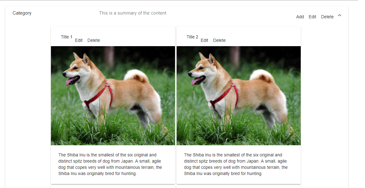
ボタンをヘッダーの右側に配置したい。どうすればできますか?問題がないため、カテゴリコードを除外します。 TypeScriptコードには、カードを追加するためのforループと、カードをクリックするためのダミーメソッドのみがあります。
.healthy-search {
    width: 100%
}

.healthy-card {
    margin-right: 5px;
    margin-bottom: 5px;
}
<div class="flex-container" fxLayout="row" fxLayout.xs="column" fxLayoutAlign="center center" fxLayoutAlign.xs="start">
<div class="flex-item" fxFlex="90%" fxFlex.xs="90%">
<mat-form-field class="healthy-search">
<textarea matInput placeholder="Suche"></textarea>
</mat-form-field>
</div>
</div>
<div class="flex-container" fxLayout="row" fxLayout.xs="column" fxLayoutAlign="center center" fxLayoutAlign.xs="start">
<div class="flex-item" fxFlex="85%" fxFlex.xs="85%">
<mat-expansion-panel>
<!-- Here is the Category -->
<!--Elements of Category -->
<div class="flex-container" fxLayoutWrap fxLayout="row" fxLayout.xs="column" fxLayoutAlign="center center" fxLayoutAlign.xs="start">
<div class="flex-item healthy-card" fxFlex="400px" *ngFor="let number of numbers" (click)="cardClick()">
<mat-card class="example-card">
<mat-card-header>
<mat-card-title>Title {{number}}</mat-card-title>
<button mat-icon-button fxLayoutAlign="right">
<mat-icon aria-label="Example icon-button with a heart icon">Edit</mat-icon>
</button>
<button mat-icon-button fxLayoutAlign="right">
<mat-icon aria-label="Example icon-button with a heart icon">Delete</mat-icon>
</button>
</mat-card-header>
<img mat-card-image src="https://material.angular.io/assets/img/examples/shiba2.jpg" alt="Photo of a Shiba Inu">
<mat-card-content>
<p>
The Shiba Inu is the smallest of the six original and distinct spitz breeds of dog from Japan. A small, agile dog that copes
very well with mountainous terrain, the Shiba Inu was originally bred for hunting.
</p>
</mat-card-content>
</mat-card>
</div>
</div>
</mat-expansion-panel>
</div>
</div>リラー
この投稿は非常に古いものですが、おそらく他の誰かがこれにつまずくかもしれません。 (この回答を書いている時点では、現在のバージョンはAngular Material 6)です。
<mat-card-title-group>属性を使用することをお勧めします。ドキュメントから( https://material.angular.io/components/card/overview ):
<mat-card-title-group>を使用して、タイトル、サブタイトル、および画像を単一のセクションに結合できます。
これにより、タイトルと説明が1つのdivにバンドルされ、fxFlexコンテナーが実際に機能します。これにより、ボタン/アイコンを左側に追加することもできます。
例は次のようになります。
<mat-card-header>
    <mat-icon>help</mat-icon>
    <mat-card-title-group>
        <mat-card-title>
            Title
        </mat-card-title>
        <mat-card-subtitle>
            Subtitle
        </mat-card-subtitle>
    </mat-card-title-group>
    <div fxFlex></div>
    <button mat-button>Click me!</button>
</mat-card-header>
まず、ボタンからfxLayoutAlign = "right"を取り除きます。 fxLayoutAlignはコンテナ用です。
タイトルとボタンの間にfxFlexを使用して、divまたはその他のプレースホルダーで行う必要があります。これにより、ボタンが最後まで押されます。
<md-card-header fxLayout="row">
  <md-card-title >Title </md-card-title>
  <div fxFlex></div>
  <button md-button>Something</button>
</md-card-header>
angular material 7で、これは私にとって良さそうです:
<mat-card>
 <mat-card-header>
  <mat-card-title-group>
    <mat-card-title>
      Title
    </mat-card-title>
    <mat-card-subtitle>
      Subtitle
    </mat-card-subtitle>
  </mat-card-title-group>
  <div fxFlex></div>
  <div fxLayoutAlign="center center">
    <button mat-stroked-button>Click me!</button>
  </div>
 </mat-card-header>
</mat-card>