テーブルセル内のCSSテキストオーバーフロー?
テキストを1行に収めるには長すぎる場合は、複数行に折り返すのではなく省略記号でクリップするように、テーブルセルでCSS text-overflowを使用したいと思います。これは可能ですか?
私はこれを試しました:
td {
  overflow: hidden;
  text-overflow: Ellipsis;
  white-space: nowrap;
}
しかしwhite-space: nowrapはテキスト(とそのセル)を継続的に右に拡大し、テーブルの全幅をそのコンテナの幅を超えてプッシュします。これがないと、テキストがセルの端に当たったときにテキストが複数行に折り返され続けます。
テーブルセルがオーバーフローしたときに省略記号でテキストを切り取るには、オーバーフローを機能させるために各tdクラスでmax-width CSSプロパティを設定する必要があります。追加のレイアウトdivは必要ありません
td {
    max-width: 100px;
    overflow: hidden;
    text-overflow: Ellipsis;
    white-space: nowrap;
}
レスポンシブレイアウト用。列の有効な最小幅を指定するにはmax-width CSSプロパティを使用するか、無制限の柔軟性のために単にmax-width: 0;を使用します。また、包含テーブルには特定の幅(通常はwidth: 100%;)が必要です。また、列の幅は通常、合計幅のパーセンテージとして設定されます。
table {
    width: 100%;
}
td {
    max-width: 0;
    overflow: hidden;
    text-overflow: Ellipsis;
    white-space: nowrap;
}
td.columnA {
    width: 30%;
}
td.columnB {
    width: 70%;
}
歴史的事項:IE 9(以下)の場合、IE特有のレンダリングの問題を解決するために、これをHTMLに含める必要があります。
<!--[if IE]>
<style>
    table {
        table-layout: fixed;
        width: 100px;
    }
</style>
<![endif]-->
max-widthまたは固定幅を指定しても、すべての状況で機能するわけではありません。また、テーブルは流動的で、そのセルには自動スペースが必要です。それがテーブルの目的です。
これを使用してください: http://jsfiddle.net/maruxa1j/ /
<td class="Ellipsis"><span>This Text Overflows and is too large for its cell.</span></td>
.Ellipsis {
position: relative;
}
.Ellipsis:before {
content: ' ';
visibility: hidden;
}
.Ellipsis span {
position: absolute;
left: 0;
right: 0;
white-space: nowrap;
overflow: hidden;
text-overflow: Ellipsis;
}
IE9や他のブラウザで動作します。
なぜこれは起こりますか?
w3.orgのこのセクション は、テキストオーバーフローはブロック要素にのみ適用されるを示唆しています。
11.1.  Overflow Ellipsis: the ‘text-overflow’ property

text-overflow      clip | Ellipsis | <string>
Initial:           clip
APPLIES TO:        BLOCK CONTAINERS               <<<<
Inherited:         no
Percentages:       N/A
Media:             visual
Computed value:    as specified
この jsfiddle にはコードがいくつかありますが(デバッグを少し修正しただけです)、divではなくtdに適用すれば問題なく動作します。 tdの内容を包含divブロックにラップすることによって、私がすぐに考えられる唯一の回避策もあります。しかし、それは私にとって "醜い"マークアップのように見えるので、私は他の誰かがより良い解決策を持っていることを願っています。これをテストするコードは次のようになります。
td, div {
  overflow: hidden;
  text-overflow: Ellipsis;
  white-space: nowrap;
  border: 1px solid red;
  width: 80px;
}
Works, but no tables anymore:
<div>Lorem ipsum and dim sum yeah yeah yeah. Lorem ipsum and dim sum yeah yeah yeah. Lorem ipsum and dim sum yeah yeah yeah. Lorem ipsum and dim sum yeah yeah yeah. Lorem ipsum and dim sum yeah yeah yeah.</div>
Works, but non-semantic markup required:
<table><tr><td><div>Lorem ipsum and dim sum yeah yeah yeah. Lorem ipsum and dim sum yeah yeah yeah. Lorem ipsum and dim sum yeah yeah yeah. Lorem ipsum and dim sum yeah yeah yeah. Lorem ipsum and dim sum yeah yeah yeah.</div></td></tr></table>固定幅を何も設定したくない場合
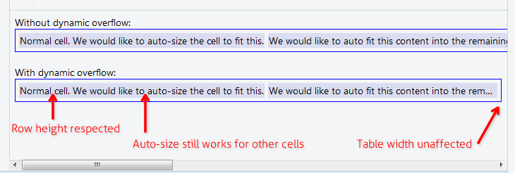
以下の解決策では、テーブルセルの内容を長くすることができますが、親テーブルの幅や親行の高さには影響しません。たとえば、他のすべてのセルに自動サイズ設定機能を適用するwidth:100%を含むテーブルが必要な場合です。 "Notes"または "Comment"列などを持つデータグリッドで役立ちます。
あなたのCSSにこれら3つの規則を加えなさい:
.text-overflow-dynamic-container {
    position: relative;
    max-width: 100%;
    padding: 0 !important;
    display: -webkit-flex;
    display: -moz-flex;
    display: flex;
    vertical-align: text-bottom !important;
}
.text-overflow-dynamic-Ellipsis {
    position: absolute;
    white-space: nowrap;
    overflow-y: visible;
    overflow-x: hidden;
    text-overflow: Ellipsis;
    -ms-text-overflow: Ellipsis;
    -o-text-overflow: Ellipsis;
    max-width: 100%;
    min-width: 0;
    width:100%;
    top: 0;
    left: 0;
}
.text-overflow-dynamic-container:after,
.text-overflow-dynamic-Ellipsis:after {
    content: '-';
    display: inline;
    visibility: hidden;
    width: 0;
}
動的テキストのオーバーフローが必要なテーブルセルに、このようにHTMLをフォーマットします。
<td>
  <span class="text-overflow-dynamic-container">
    <span class="text-overflow-dynamic-Ellipsis" title="...your text again for usability...">
      //...your long text here...
    </span>
  </span>
</td>
さらに、テーブルセルに必要なmin-width(またはまったくなし)を適用します。
もちろんフィドル: https://jsfiddle.net/9wycg99v/23/ /
table要素にtable-layout: fixed;を指定すると、tdのスタイルが有効になるはずです。これはセルの大きさにも影響します。
Sitepointがテーブルレイアウトの方法をここで少し議論します: http://reference.sitepoint.com/css/tableformatting
テーブルを自動レイアウトするだけの場合
なしmax-width、パーセント列幅の使用、またはtable-layout: fixedなど.
https://jsfiddle.net/tturadqq/
使い方:
ステップ1:テーブルの自動レイアウトを有効にするだけです。
多くのテキストを含む1つ以上の列がある場合、他の列をできるだけ縮小してから、長い列のテキストを折り返します。

ステップ2:セルの内容をdivで囲み、そのdivをmax-height: 1.1emに設定します
(余分な0.1emは、 'g'と 'y'の末尾のように、テキストベースより少し下にレンダリングされる文字用です。)

ステップ3:divにtitleを設定する
これはアクセシビリティにとって良いことであり、そして私たちがすぐに使う小さなトリックのために必要です。

ステップ4:divにCSSの::afterを追加する
これは注意が必要です。 CSSの::afterをcontent: attr(title)で設定し、それをdivの上に配置してtext-overflow: Ellipsisを設定します。わかりやすくするために、ここでは赤く着色しました。
(長い列の末尾に省略記号が付いていることに注意してください)

ステップ5:divテキストの色をtransparentに設定します
そしてこれで終わりです。

パーセンテージテーブル幅の場合、またはテーブルセルに固定幅を設定できない場合。それを機能させるためにtable-layout: fixed;を適用することができます。
table {
  table-layout: fixed;
  width: 100%;
}
td {
  text-overflow: Ellipsis;
  white-space: nowrap;
  overflow: hidden;
  border: 1px solid red;
}
<table>
<tr>
<td>Lorem ipsum and dim sum yeah yeah yeah. Lorem ipsum and dim sum yeah yeah yeah. Lorem ipsum and dim sum yeah yeah yeah. Lorem ipsum and dim sum yeah yeah yeah. Lorem ipsum and dim sum yeah yeah yeah.</td>
<td>Lorem ipsum and dim sum yeah yeah yeah. Lorem ipsum and dim sum yeah yeah yeah. Lorem ipsum and dim sum yeah yeah yeah. Lorem ipsum and dim sum yeah yeah yeah. Lorem ipsum and dim sum yeah yeah yeah.</td>
</tr>
</table>セルの内容をフレックスブロックでラップします。おまけとして、セルの自動表示幅に収まります。
table {
  width: 100%;
}

div.parent {
  display: flex;
}

div.child {
  flex: 1;
  width: 1px;
  overflow-x: hidden;
  text-overflow: Ellipsis;
}
<table>
<tr>
<td>
<div class="parent">
<div class="child">
xxxxxxxxxxxxxxxxxxxxxxxxxxxxxxxxxxxxxxxxxxxxxxxxxxxxxxxxxxxxxxxxxxxxxxxxxxxxxxxxxxxxxxxxxxxxxxxxxxxxxxxxxxxxxxxxxxxxxxxxxxxxxxxxxxxxxxxxxxxxxxxxxxxxxxxxxxxxxxxxxxxxxxxxxxxxxxxxxxxxxxxxxxxxxxxxxxxxxxxxxxxxxxxxxxxxxxxxxxxxxxxxxxxxxxxxxxxxxxxxxxxxxxxxxxxxxxxxxxxxxxxxxxxxxxxxxxxxxxxxxxxxxxxxxxxxxxxxxxxxxxxxxxxxxxxxxxxxxxxxxxxxxxxxxxxxxxxxxxxxxxxxxxxxxxxxxxxxxxxxxxxxxxxxxxxxxxxxxxxxxxxxxxxxxxxxxxxxxxxxxxxxxxxxxxxxxxxxxxxxxxxxxxxxxxxxxxxxxxxxxxxxxxxxxxxxxxxxxxxxxxxxxxxxxxxxxxxxxxxxxxxxxxxxxxxxxxxxxxxxxxxxxxxxxxxxxxxxxxxxxxxxxxxxxxxxxxxxxxxxxxxxxxxxxxxxxxxxxxxxxxxxxxxxxxxxxxxxxxxxxxxxxxxxxxxxxxxx
</div>
<div>
</td>
</tr>
</table>私はこれをセル内の絶対位置div(相対)を使って解決しました。
td {
    position: relative;
}
td > div {
    position: absolute;
    white-space: nowrap;
    overflow: hidden;
    text-overflow: Ellipsis;
    max-width: 100%;
}
それでおしまい。次に、divにtop:値を追加するか、垂直方向に中央揃えにします。
td > div {
    top: 0;
    bottom: 0;
    margin: auto 0;
    height: 1.5em; // = line height
}
右側にスペースを確保するには、最大幅を少し減らすことができます。