三角形の付いたツールチップ
この質問に対して jsFiddle を作成しました。
a.tip {
    position: relative;
}

a.tip span {
    display: none;
    position: absolute;
    top: -5px;
    left: 60px;
    width: 125px;
    padding: 5px;
    z-index: 100;
    background: #000;
    color: #fff;
    -moz-border-radius: 5px; /* this works only in camino/firefox */
    -webkit-border-radius: 5px; /* this is just for Safari */
}

a:hover.tip {
    font-size: 99%; /* this is just for IE */
}

a:hover.tip span {
    display: block;
}
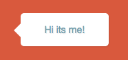
<center><a href="http://google.com/" class="tip">Link!<span>Hi its me!</span></a></center>基本的に、サイトにツールチップがあり、リンクの右側に表示されます。しかし、ブラックボックスの左側で、リンクを指すボックスに三角形を添付したいのですが、CSSのみを使用してこれを行うことは可能ですか?このように左に
css triangle trick を使用して、CSSでそれを行うことができます。
a.tip span:before{
    content:'';
    display:block;
    width:0;
    height:0;
    position:absolute;

    border-top: 8px solid transparent;
    border-bottom: 8px solid transparent;
    border-right:8px solid black;
    left:-8px;

    top:7px;
}
デモ() http://jsfiddle.net/dAutM/7/
ライブスニペット
a.tip {
  position: relative;
}

a.tip span {
  display: none;
  position: absolute;
  top: -5px;
  left: 60px;
  width: 125px;
  padding: 5px;
  z-index: 100;
  background: #000;
  color: #fff;
  -moz-border-radius: 5px;
  /* this works only in camino/firefox */
  -webkit-border-radius: 5px;
  /* this is just for Safari */
}

a.tip span:before {
  content: '';
  display: block;
  width: 0;
  height: 0;
  position: absolute;
  border-top: 8px solid transparent;
  border-bottom: 8px solid transparent;
  border-right: 8px solid black;
  left: -8px;
  top: 7px;
}

a:hover.tip {
  font-size: 99%;
  /* this is just for IE */
}

a:hover.tip span {
  display: block;
}
<center><a href="http://google.com/" class="tip">Link!<span>Hi its me!</span></a></center>CSStooltip.com を開発し、CSSのみで三角形のツールチップを作成しました。
例:
span.tooltip:after {
      content: "";
      position: absolute;
      width: 0;
      height: 0;
      border-width: 10px;
      border-style: solid;
      border-color: transparent #FFFFFF transparent transparent;
      top: 11px;
      left: -24px;
}
これを試してください: http://ecoconsulting.co.uk/examples/css-tooltip/
問題を説明し、問題を修正し、矢印付きの矢印とツールチップを枠線で表示します。
色と画像の両方を背景として配置し、その位置を設定することもできます。以下のコードでは、urlタグ内の画像を、必要な三角形のある画像に置き換えます。
a.tip span {
    display: none;
    position: absolute;
    top: -5px;
    left: 60px;
    width: 125px;
    padding: 5px;
    z-index: 100;
    background: #000 url("http://www.triangle-fr.com/img/tooltip.png");
    color: #fff;
    -moz-border-radius: 5px; /* this works only in camino/firefox */
    -webkit-border-radius: 5px; /* this is just for Safari */
}
詳細はこちら http://www.w3schools.com/cssref/pr_background-position.asp