透明な中空または切り取られた円
中空円を切り取る[〜#〜] css [〜#〜]のみを使用することは可能ですか?
これは私たち全員ができることです。
しかし、これを行うことはできますか?
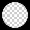
円は中空で透明でなければなりません。したがって、divの上に単色の円を配置しても問題は解決しません。
透明な切り抜き円を2つの異なるテクニックで実現できます:
1.SVG
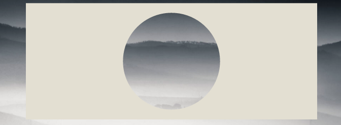
次の例では、 インラインsvg を使用しています。最初のスニペットは mask element を使用して透明な円を切り取り、2番目の白丸は path element で作成されます。円は2 arc commands で作成されます:
マスク要素の場合:
body{background:url('https://farm9.staticflickr.com/8760/17195790401_ceeeafcddb_o.jpg');background-size:cover;}<svg viewbox="0 0 100 50" width="100%">
<defs>
<mask id="mask" x="0" y="0" width="80" height="30">
<rect x="5" y="5" width="90" height="40" fill="#fff"/>
<circle cx="50" cy="25" r="15" />
</mask>
</defs>
<rect x="0" y="0" width="100" height="50" mask="url(#mask)" fill-opacity="0.7"/>
</svg>1つのパス要素で:
body{background: url('https://farm9.staticflickr.com/8760/17195790401_ceeeafcddb_o.jpg');background-size:cover;}
svg{
  display:block;
  width:70%;
  height:auto;
  margin:0 auto;
}
path{
  transition:fill .5s;
  fill:#E3DFD2;
}
path:hover{
  fill:pink;
}
<svg viewbox="-10 -1 30 12">
<path d="M-10 -1 H30 V12 H-10z M 5 5 m -5, 0 a 5,5 0 1,0 10,0 a 5,5 0 1,0 -10,0z"/>
</svg>この場合にSVGを使用する主な利点は次のとおりです。
- より短いコード
- 画像またはグラデーションを簡単に使用して、円マスクを塗りつぶすことができます
- シェイプの境界を維持し、マスクを考慮した塗りつぶしのみでマウスの出現をトリガーします(例では透明な切り抜き円にカーソルを合わせます)
2. BOX-SHADOWSのみを使用するCSS
overflow:hidden;でdivを作成し、その中にborder-radiusでラウンド擬似要素を作成します。それに巨大な箱影を付け、背景なし:
div{
    position:relative;
    width:500px; height:200px;
    margin:0 auto;
    overflow:hidden;
}
div:after{
    content:'';
    position:absolute;
    left:175px; top:25px;
    border-radius:100%;
    width:150px; height:150px;
    box-shadow: 0px 0px 0px 2000px #E3DFD2;
}

body{background: url('https://farm9.staticflickr.com/8760/17195790401_ceeeafcddb_o.jpg');background-size:cover;}<div></div>box-shadowsのブラウザサポートはIE9 +を参照してください canIuse
同じアプローチは、ボックスシャドウの代わりに境界線を使用することです。 IE8のようなボックスシャドウをサポートしていないブラウザをサポートする必要がある場合は興味深いです。テクニックは同じですが、円をdivの中心に保つために、上と左の値で補正する必要があります。
body{
    background: url('https://farm9.staticflickr.com/8760/17195790401_ceeeafcddb_o.jpg');
    background-size:cover;
}
div{
    position:relative;
    width:500px; height:200px;
    margin:0 auto;
    overflow:hidden;
}
div:after{
    content:'';
    position:absolute;
    left:-325px; top:-475px;
    border-radius:100%;
    width:150px; height:150px;
    border:500px solid #E3DFD2;
}<div></div>放射状グラデーション 背景とポインターイベントを使用して実行できます(サークルレイヤーの背後でのマウス操作、たとえばテキスト選択を可能にするため)。 デモページ とスクリーンショットです:
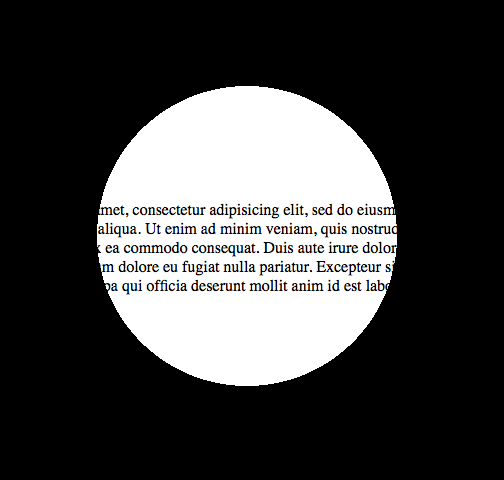
そして、これはそのためのコードになります:
<!DOCTYPE html>

<html>
<head>
<meta charset="UTF-8">
<style type="text/css" media="screen">
body {
  margin: 0;
  padding: 0;
}

.underneath {
  padding: 0;
  margin: 265px 0 0 0;
  width: 600px;
}

.overlay {
  top: 0;
  left: 0;
  position: absolute;
  width: 600px;
  height: 600px;
  background: -moz-radial-gradient(transparent 150px, rgba(0,0,0,1) 150px);
  background: -webkit-radial-gradient(transparent 150px, rgba(0,0,0,1) 150px);
  background: -ms-radial-gradient(transparent 150px, rgba(0,0,0,1) 150px);
  background: -o-radial-gradient(transparent 150px, rgba(0,0,0,1) 150px);
  pointer-events: none; /* send mouse events beneath this layer */
}
</style>
</head>
<body>

<p class="underneath">
  Lorem ipsum dolor sit amet, consectetur adipisicing elit, sed do eiusmod tempor
  incididunt ut labore et dolore magna aliqua. Ut enim ad minim veniam, quis
  nostrud exercitation ullamco laboris nisi ut aliquip ex ea commodo consequat.
  Duis aute irure dolor in reprehenderit in voluptate velit esse cillum dolore
  eu fugiat nulla pariatur. Excepteur sint occaecat cupidatat non proident, sunt
  in culpa qui officia deserunt mollit anim id est laborum.
</p>

<div class="overlay"></div>

</body>
</html>
Web-tikiの答えを参照すると、translate(-50%,-50%)でdivを常に中央に配置できるので、border- propertyを使用しても問題ありません。ブラウザのサポート。
div{
    position:relative;
    width:500px;
    height:200px;
    margin:0 auto;
    overflow:hidden;
}
div:after{
    content:'';
    position:absolute;
    left:50%;
    top: 50%;
    transform: translate(-50%,-50%);
    border-radius:50%;
    width:150px; height:150px;
    border: 1000px solid rebeccapurple;
}

body{background: url('https://farm9.staticflickr.com/8760/17195790401_ceeeafcddb_o.jpg');background-size:cover;}<div></div>このテクニックで本当に創造的になります:
document.addEventListener( "DOMContentLoaded", function(){
        setInterval(function(){
                if(document.getElementById("moving").style.height === "500px"){
                        document.getElementById("moving").style.height = "0px";
                } else {
                        document.getElementById("moving").style.height = "500px";
                }
        }, 2000);
});
#container {
width: 500px;
margin: 0 auto;
border: 1px solid black;
overflow:hidden;
position: relative;
}
#circle{
position:relative;
height:150px;
margin:0 auto;
clear:left;
overflow:hidden;
}
#circle::before, #circle::after {
content:'';
border-radius:50%;
position: absolute;
left: 50%;
top: 50%;
transform: translate(-50%,-50%);
}
#circle::before {
height: 140px;
width: 140px;
background: rebeccapurple;
}
#circle::after{
width:150px;
height:150px;
border: 2000px solid rebeccapurple;
}
#line {
margin: 0 auto;
width: 6px;
height: 200px;
position: relative;
}
#line::before, #line::after {
content: " ";
background-color: rebeccapurple;
height: 200px;
width:2000px;
position:absolute;
}
#line::before {
right: 100%;
}
#line::after {
left: 100%;
}
#moving {
height: 0px;
width: 100%;
background: blue;
transition: 2s height;
position: absolute;
top: 0px;
z-index: -1;
}
body{
background: url('https://farm9.staticflickr.com/8760/17195790401_ceeeafcddb_o.jpg');background-size:cover;
}<div id="container">
<div id="circle"></div>
<div id="line"></div>
<div id="circle"></div>
<div id="moving"></div>
</div>「Pius Nyakoojo」の「方法1」については、若干の改善(以下を参照)で機能します。私は個人的にこれが最も簡単な解決策だと思う:

<html>
<!-- Assuming the stuff to mask is a 100 pixel square -->
<style>
.mask {
    position: absolute;
    top: -50px;                     /* minus half the div size */
    left: -50px;                    /* minus half the div size */
    width: 100px;                   /* the div size */
    height: 100px;                  /* the div size */
    background-color: transparent;
    border-radius: 100px;           /* the div size */
    border: 50px solid white;       /* half the div size */
    pointer-events: none;           /* send mouse events beneath this layer */
}

.stuff {
    position: absolute;
    width: 100px;                   /* the div size */
    height: 100px;                  /* the div size */
    overflow: hidden;               /* hide the excess of the mask border */
    background-color: #CCC;
}
</style>
<body>
    <div class="stuff">
        <div class="mask"></div>
        blah blah blah blah blah
        blah blah blah blah blah
        blah blah blah blah blah
    </div>
</body>
</html>
方法1推奨
<div class="circle"></div>
$radius: 50px;
$thickness: 5px;

.circle {
    width: $radius;
    height: $radius;
    background-color: transparent;
    border-radius: $radius;
    border: $thickness solid gray;
}
方法2
<div class="circle"></div>
$radius: 50px;
$thickness: 5px;

.circle {
  width: $radius;
  height: $radius;
}

.circle::before, .circle::after {
  margin: -2px 0;
}
.circle::before {
    content: '';
    display: inline-block;
    width: $radius;
    height: calc(#{$radius} / 2);
    background-color: transparent;
    border-top-left-radius: calc(#{$radius} / 2);
    border-top-right-radius: calc(#{$radius} / 2);
    border: $thickness solid gray;
    border-bottom: 0;

    -webkit-box-sizing: border-box;
    -moz-box-sizing: border-box;
    box-sizing: border-box;
}

.circle::after {
  content: '';
  display: inline-block;
  width: $radius;
  height: calc(#{$radius} / 2);
  background-color: transparent;
  border-bottom-left-radius: calc(#{$radius} / 2);
  border-bottom-right-radius: calc(#{$radius} / 2);
  border: $thickness solid gray;
  border-top: 0;

  -webkit-box-sizing: border-box;
  -moz-box-sizing: border-box;
  box-sizing: border-box;
}