3Dボックスシャドウ効果
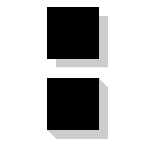
だから私はCSS3で基本的なボックスシャドウを行う方法を知っています。下の図の上部にそれが表示されています。
下の図の下部に示すように、私が達成しようとしている効果は3Dボックスシャドウです。
CSS3ボックスシャドウでこれを行う方法についてのアイデアはありますか?
残念ながら、ボックスシャドウは事実上単なるフラットレイヤーです。ただし、複数のボックスシャドウを適用して、この効果を作成できます。
.box-shadow-3d{
    box-shadow: 1px 1px 0px #999,
                2px 2px 0px #999,
                3px 3px 0px #999,
                4px 4px 0px #999,
                5px 5px 0px #999,
                6px 6px 0px #999;
}
疑似要素をシャドウとして使用できます
div {
  background: black;
  height: 100px;
  width: 100px;
  position: relative;
}
div:after,
div:before {
  content: '';
  background: grey;
  position: absolute;
}
div:after {
  width: 100%;
  height: 20px;
  left: 10px;
  bottom: 0;
  transform: translatey(100%) skewx(45deg);
}
div:before {
  width: 20px;
  height: 100%;
  right: 0;
  transform: translatex(100%) skewy(45deg);
  top: 10px;
}<div></div>これは、perspectiveと疑似要素:beforeを使用した実際の3Dシャドウです。
body {
  background: lightblue;
}
.foo {
  position: relative;
  display: inline-block;
  -webkit-perspective: 1000px;
  -moz-perspective: 1000px;
  persepctive: 1000px;
  margin: 20px;
  margin-top: 50px;
}
.foo .box {
  transform: rotateY(-40deg);
  height: 350px;
  width: 250px;
  background-color: black;
}
.foo:before {
  content: "";
  top: -15px;
  position: absolute;
  width: 50px;
  height: 375px;
  background-color: grey;
  transform: translateX(215px) translateY(2.7px) rotateY(55deg)
}
<div class="foo">
<div class="box"></div>
</div>それぞれが前のものよりわずかに大きいいくつかのボックスシャドウの水平/垂直オフセットを積み重ねることができます。追加するシャドウが多いほど、効果が顕著になります。これが フィドル の例です。
div {
    background: black;
    height: 100px;
    width: 100px;
    box-shadow:  0 01px gray,
                 01px 0 gray,
                 01px 02px gray,
                 02px 01px gray,
                 02px 03px gray,
                 03px 02px gray,
                 03px 04px gray,
                 04px 03px gray,
                 04px 05px gray,
                 05px 04px gray,
                 05px 06px gray,
                 06px 05px gray;
}
これらの2つのオプションでいくつか問題があったので、Lea Verouの優れた本CSS Secretsからいくつかの斜めのグラデーションを採用しました。 border-imageを介して左右の境界線の内側にグラデーションを作成することを考えましたが、そのプロパティでは、エッジターゲティング、àlaborder-right-imageなどは許可されていません。
そこで、2つの角が切り取られた疑似要素を使用することにしました。これはかなりうまく機能しているようです。これは正方形の対角線(2の平方根)になるため、グラデーションの幅をパディングの半分のサイズの1.414に調整するように注意する必要があります。また、これは疑似要素なので、正しい配置に注意してください。あなたの人々の考えを聞くことに興味があります。
div {
  background: #bbb;
  padding: 1em 1.2em;
  width: 50%;
  margin: 0 auto;
  color: #111;
  font: 150%/1.2 Georgia, Palatino, Times, serif;
  position: relative;
}

div:after {
  content:" ";
  position:absolute;
  top:0;
  left: 0;
  width:100%;
  height:100%;
  padding: 1.42em; /* (square root of gradient position) */
  background: #000; /* Fallback if not supported */
  background: linear-gradient(-135deg, transparent 2em, #000 0) top right,
    linear-gradient(#000, #000) padding-box bottom right,
    linear-gradient(45deg, transparent 2em, #000 0) bottom left;
    /*I have avoided adding -webkit-, -moz and -0 prefixs for linear-gradient.  You may put them in later to be extra safe*/
    background-size: 50% 50%; /* There is no reason to Paint the upper left quadrant, so I didn't. */
    background-repeat: no-repeat;
    -webkit-box-sizing: content-box;  -moz-box-sizing: content-box;  box-sizing: content-box;
    /*  Many people use border-box as default these days. Unfortunately, the box cannot be sized using border-box settings with the combination of padding in ems and percentages.  So this is reset to content-box, just in case.   */
    z-index: -1; /* To keep the shadow behind the div*/
<div>This is a short sentence to demonstrate that our little div is responsive.</div>これは、@ Vitorino fernandesに触発された、 stylus ..の小さな実装です。
offset = 10
border = 3
.offsetbox
   margin offset
   padding offset
   text-align center
   box-shadow inset 0 0 0 unit(border,px) black
   background white
   display inline-block
   position relative
   &:after,
   &:before
      content ''
      background black
      position absolute
   &:after
      width 100%
      height offset
      transform translatey(100%) skewx(-45deg)
      right (offset/2)
      bottom 0
   &:before
      height 100%
      width offset
      transform: translatex(-100%) skewy(-45deg)
      left 0
      top (offset/2)