CSSで部分的な円の輪郭を描くことは可能ですか?
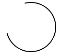
私はCSSでロードスピナーを完全に作成することに興味がありますが、そうするためには、次のような開いたリング形状を描くことができる必要があります:

リングは、円の周囲にそれ自身を描きます。これはCSSで実現可能ですか?
徐々に外側のパスを描く円を作成するには、SVGを使用します。
SVGのstroke-dasharrayプロパティは、任意のパスを破線に変換します。これは、ダッシュサイズをパス自体とほぼ同じ長さに設定することで有利に使用できます。
次に、CSSアニメーションを使用して、stroke-dashoffsetダッシュを円の周囲に移動します。
circle {
  fill: white;
  stroke: black;
  stroke-width: 2;
  stroke-dasharray: 250;
  stroke-dashoffset: 1000;
  animation: rotate 5s linear infinite;
}

@keyframes rotate {
  to {
    stroke-dashoffset: 0;
  }
}
<svg height="100" width="100">
<circle cx="50" cy="50" r="40" />
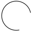
</svg>静止画像
単一のHTML要素とCSSクラスに依存する単純化された例は、次のようになります。
.arc {
  /* Border size and color */
  border: 2px solid #000;
  /* Creates a circle */
  border-radius: 50%;
  /* Circle size */
  height: 100px;
  width: 100px;
  /* Use transparent borders to define opening (more transparent = larger opening) */
  border-top-color: transparent;
  border-left-color: transparent;
  /* Use transform to rotate to adjust where opening appears */
  transform: rotate(300deg)
}
例
.arc {
  border: 2px solid #000;
  border-radius: 50%;
  height: 100px;
  width: 100px;
  border-top-color: transparent;
  transform: rotate(300deg)
}
<div class='arc'></div>画像の回転
@keyframesを使用してCSSベースのアニメーションを利用することにより、前の静的な例に基本的な回転を適用できます。
.arc {
  /* Border size and color */
  border: 2px solid #000;
  /* Creates a circle */
  border-radius: 50%;
  /* Circle size */
  height: 100px;
  width: 100px;
  /* Use transparent borders to define opening (more transparent = larger opening) */
  border-top-color: transparent;
  /* Rotate indefinitely (longer time = slower rotation) */
  animation: rotate 2s infinite linear;
}

@keyframes rotate {
  0%    { transform: rotate(0deg);  }
  100%  { transform: rotate(360deg);  }
}
例
.arc {
  border: 2px solid #000;
  border-radius: 50%;
  height: 100px;
  width: 100px;
  border-top-color: transparent;
  animation: rotate 2s infinite linear;
}

@keyframes rotate {
  0%    { transform: rotate(0deg);  }
  100%  { transform: rotate(360deg);  }
}
<div class='arc'></div>描画(SVGなし)
別のアプローチ 私が出会ったこと 。ただし、以前のアプローチほどエレガントではなく、望みどおりの効果が得られます。には、いくつかのアニメーションの使用と、必要に応じて円の異なるセクションの表示/非表示が含まれます。
コードスニペットには、それを示す例が含まれています。
例
#container {
  position: absolute;
  width: 100px;
  height: 100px;
  animation: colors 1s infinite;
}
#halfclip {
  width: 50%;
  height: 100%;
  right: 0px;
  position: absolute;
  overflow: hidden;
  transform-Origin: left center;
  animation: cliprotate 4s steps(2) infinite;
  -webkit-animation: cliprotate 4s steps(2) infinite;
}
.halfcircle {
  box-sizing: border-box;
  height: 100%;
  right: 0px;
  position: absolute;
  border: solid 2px transparent;
  border-top-color: #000;
  border-left-color: #000;
  border-radius: 50%;
}
#clipped {
  width: 200%;
  animation: rotate 2s linear infinite;
  -webkit-animation: rotate 2s linear infinite;
}
#fixed {
  width: 100%;
  transform: rotate(135deg);
  animation: showfixed 4s steps(2) infinite;
  -webkit-animation: showfixed 4s linear infinite;
}
@-webkit-keyframes cliprotate {
  0% {
    transform: rotate(0deg);
  }
  100% {
    transform: rotate(360deg);
  }
}
@keyframes cliprotate {
  0% {
    transform: rotate(0deg);
  }
  100% {
    transform: rotate(360deg);
  }
}
@-webkit-keyframes rotate {
  0% {
    transform: rotate(-45deg);
  }
  100% {
    transform: rotate(135deg);
  }
}
@keyframes rotate {
  0% {
    transform: rotate(-45deg);
  }
  100% {
    transform: rotate(135deg);
  }
}
@-webkit-keyframes showfixed {
  0% {
    opacity: 0;
  }
  49.9% {
    opacity: 0;
  }
  50% {
    opacity: 1;
  }
  100% {
    opacity: 1;
  }
}
<div id="container">
<div id="halfclip">
<div class="halfcircle" id="clipped">
</div>
</div>
<div class="halfcircle" id="fixed">
</div>
</div>描画(SVGを使用)
SVGはブラウザー内で描画を処理するように明示的に設計されているため、SVGを利用することがおそらくこの問題に対処する最良の方法です。 SVGサポートが利用可能な場合、このアプローチを強くお勧めします。
ディランの応答 この実装がどのように見えるかを詳しく説明します。
擬似要素 ::after は、開いている部分を作成し、circle要素を重ねるだけです。利点は、開いている部分を希望どおりに長くできることです(3/4の完全な円に限定されません)。
.circle {
  width: 100px;
  height: 100px;
  border: 2px solid;
  border-radius: 50%;
  margin: 30px;
  animation: rotate 1s infinite linear;
}
.circle::after {
  content: "";
  display: block;
  width: 80px;
  height: 80px;
  background: white;
  border-radius: 50%;
  margin: -30% 0 0 -30%;
}
@keyframes rotate {
  0%    { transform: rotate(0deg);  }
  100%  { transform: rotate(360deg);  }
}
<div class="circle"></div>擬似バージョンの場合は、linear-gradient(シェードを増減できます)およびbackground-clipも使用できます。
利用可能な場合、mix-blend-modeは半透明にすることができます。
currentcolorとanimationを使用して色をアニメーション化することもできます。
.loader {
  font-size: 1.5em;
  color: gray;
  position: relative;
  padding: 3px;
  /* make a square */
  height: 100px;
  width: 100px;
  /* center content*/
  display: flex;
  align-items: center;
  justify-content: center;
  animation: coloranim infinite 5s;
}

.circle {
  border-radius: 100%;
  overflow: hidden;
}

.loader:after {
  border-radius: inherit;
  color: inherit;
  content: '';
  position: absolute;
  top: 0;
  bottom: 0;
  left: 0;
  right: 0;
  padding: 3px;
  background: linear-gradient(white, white), linear-gradient(0deg, transparent 40%, currentcolor 60%), linear-gradient(50deg, transparent 50%, currentcolor 52%);
  background-clip: content-box, border-box, border-box;
  z-index: -1;
  mix-blend-mode: multiply;/* if avalaible, else bg remains white */
}

.spin:after {
  animation: spin 2s linear infinite;
}

@keyframes spin {
  to {
    transform: rotate(360deg);
  }
}

@keyframes coloranim {
  20% {
    color: tomato;
  }
  40% {
    color: purple;
  }
  60% {
    color: turquoise;
  }
  80% {
    color: green;
  }
}


/* demo purpose, use your own style wherever your loader is needed */

html {
  height: 100%;
  display: flex;
  background: url(http://lorempixel.com/800/800/food/3);
  background-size: cover;
  box-shadow: inset 0 0 0 2000px rgba(255, 255, 255, 0.3)
}

body {
  margin: auto;
}
<div class="spin circle loader coloranim"> loading... </div>