ヘッダーが固定されたページの下部にフッターを配置
ヘッダーが固定されているページの下部にフッターを配置したい...
position: fixedなし-画面上に残したくないので、ページの最後に配置し、スクロール時に正常に動作する必要があります。表示されている画面の下部ではない-ページの下部、つまり他のすべてのコンテンツの後。
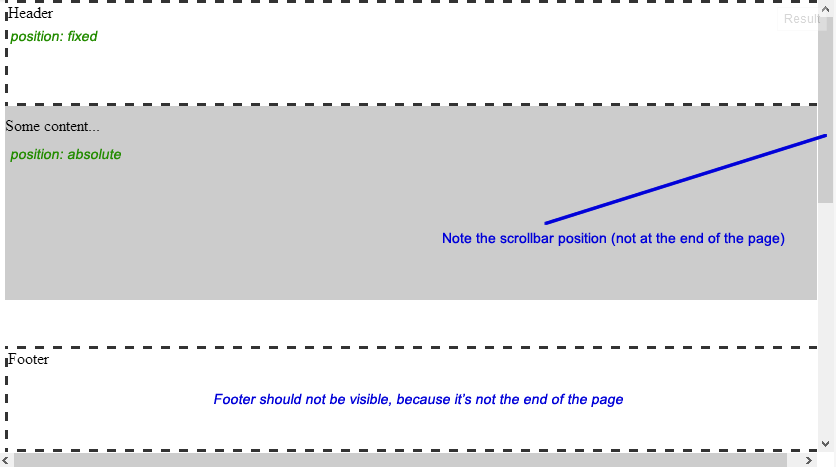
ここに、よりよく説明する図を示します:
コードはこちら:
- デモを準備しました:JSFiddle
- または以下をご覧ください
<div id="header">Header</div>
<div id="content">
    <p>Some content...</p>
</div>
<div id="footer">Footer</div>
body{
    /* Just to enable scrolling in JSFiddle */
    height: 1000px;
}

#header{
    width: 100%;
    height: 100px;
    position: fixed;
    top: 0px;
    z-index: 1;
}

#content{
    width: 100%;
    position: absolute;
    top: 100px; /*Height of header*/
    z-index: 0;
}

#footer{
    width: 100%;
    height: 100px;
    position: absolute;
    bottom: 0px;
}

/*For demo only*/
#header, #footer{
    border: 3px dashed #333333;
    background: #FFFFFF;
}

#content{
    background: #CCCCCC;
    height: 200px;
}
または、グーグルでこの投稿を見つけて、ラッパーなしでさらに短い答えを求めている人のために(あなたはそれらを必要としないので):
html { height: 100%; }
body { min-height: 100%; position: relative; padding-bottom: 3em; }
.footer { height: 3em; position: absolute; bottom: 0; }
これで、ページの画面の高さは少なくとも100%になり、フッターは「画面」の下部ではなく、ページの下部になります。ページが画面よりも長い場合、ページはまだ下部にあり、人為的な「ラッパー要素」や同類なしでそれを行いました。body要素はすでに必要なラッパーです=)
唯一の注意点は、ボディのマージンはフッターの高さと同じにする必要がありますが、「bottom:0」ルールはフッターを下部で開始するため、負の値としてベースラインアンカーの代わりに。次に、CSS、.lessまたは.stylとして、これは簡単に保証されます。
ほぼ手に入れました。必要なのはコンテナです。
これが私の改訂版です: JSFiddle Update
コンテナdivを追加します。
<div id="container">
    <div id="header"></div>
    <div id="page"></div>
    <div id="footer"></div>
</div>
次に、位置を相対にし、高さを100%にします。
#container {
    height: 100%;
    position: relative;
}
そして、フッターの位置が絶対であることを確認してください。
But if you want the footer to take full size of the screen while #wrapper is 1000px and centered you would do:


<body>
<div id="wrapper">
<div id="wrapper-inner">
<div id="header"></div>
<div id="content"></div>
<div id="footer"></div>
</div>
</div>
</body>

html,
body {
margin:0;
padding:0;
height:100%;
}
#wrapper {
min-height:100%;
position:relative;
}
#wrapper-inner {
margin: 0 auto;
width: 1000px;
}
#content {
padding:10px;
padding-bottom:80px; /* Height of the footer element */
}
#footer {
width:100%;
height:80px;
position:absolute;
bottom:0;
left:0;
}
私はウェブ開発はかなり新しく、これはすでに回答されていますが、これは私がそれを解決するために見つけた最も簡単な方法であり、何らかの形で異なっていると思います。フッターはウェブアプリのさまざまなセクションで異なる高さにできるため、柔軟なものが必要でした。そして、FlexBoxとスペーサーを使用しました。
- HTMLと本文の高さを設定することから始めます
html, body {
    height: 100%;
    display: flex;
    flex-direction: column;
    margin: 0px;
}
ヘッダー、ヒーロー、または垂直方向に配置されたコンテンツを追加する必要がある場合、アプリのcolumn動作を想定しています。
- スペーサークラスを作成する
.spacer {
    flex: 1;
}
- したがって、後でHTMLは次のようになります。
<html>
  <body>
    <header> Header </header>
    Some content...
    <div class='spacer'></div>
    <footer> Footer </footer>
  </body>
</html>
ここで遊ぶことができます https://codepen.io/anon/pen/xmGZQL
簡単にするには:
#header {
    position: fixed;
    width:100%;
    height:100px;
    top:0px;
    z-index:2;
}
#content, #footer {
    position: relative; /* or leave it static as by default */
    z-index:1;
}
body,div {
    margin:0; padding:0; /* http://jsfiddle.net/css/normalize.css */
}
#content {
    margin-top: 100px; /* the same value as header's height */
}