列flexboxのフレックスベース100%:Chromeではなく、Firefoxの全高
それぞれが親divの幅100%および高さ100%の任意の数のdivの列が欲しいので、最初は1つが表示されますが、他は親の下にオーバーフローします。これを実現するために、flex: 0 0 100%;とdisplay: flexを持つ親div内に、flex-direction: columnを持つようにdivを設定しました。
親div自体の高さは不明であるため、display: flexとflex-direction: columnの子でもあり、flex: 1 0 0に設定されて、コンテナー内の残りのスペースを取得します。
Firefoxでは、出力は希望どおりです。
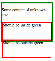
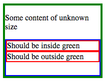
ただし、Chromeにはありません:
Javascriptを使用せずに、ChromeでFirefoxスタイルを実現するにはどうすればよいですか?
この動作は http://plnkr.co/edit/WnAcmwAPnFaAhqqtwhLL?p=preview で確認できます。また、FirefoxとChromeの両方で一貫して動作するflex-direction: rowの対応するバージョンも確認できます。
参考のために、完全なCSS
.wrapper {
  display: flex;
  flex-direction: column;
  height: 150px;
  width: 200px;
  border: 4px solid green;
  margin-bottom: 20px;
}

.column-parent {
  flex: 1 0 0;
  display: flex;
  flex-direction: column;
  border: 2px solid blue;
}

.column-child {
  flex: 0 0 100%;
  border: 2px solid red;
}
およびHTML
<div class="wrapper">
  <p>Some content of unknown size</p>
  <div class="column-parent">
    <div class="column-child">
      Should be inside green
    </div>
    <div class="column-child">
      Should be outside green
    </div>
  </div>
</div>
Abhitalksの応答で述べたように、Chromeはここでheight属性を処理する方法にバグ(または標準の別の解釈)があります。
Chrome FFとIEの両方で機能しているハックを見つけました
唯一の問題は、存在する可能性のある子と同じ数のルールを持っていることです。
トリックは、フレックス方向を行に設定し、フレックスベース(現在の幅)を100%に設定してから、要素を変換することです
.container {
    border: solid 2px blue;
    height: 200px;
    width: 200px;
    display: flex;
    flex-direction: column;
    position: relative;
}

.filler {
    border: solid 1px black;
    flex: 0 0 80px;
    background-color: lightgreen;
    transition: flex 1s;
}

.container:hover .filler {
    flex: 0 0 40px;
}

.test {
    border: solid 1px red;
    flex: 1 0 25px;
    display: flex;
    flex-direction: row;
    position: relative;
}

.child {
    background-color: rgba(200, 0, 0, 0.26);
    flex: 0 0 100%;
}

.child:nth-child(2) {
    background-color: rgba(255, 255, 0, 0.48);
    transform: translateX(-100%) translateY(100%);
}

.child:nth-child(3) {
    background-color: rgba(173, 216, 230, 0.28);
    transform: translateX(-200%) translateY(200%);
}
<div class="container">
<div class="filler"></div>
<div class="filler"></div>
<div class="test">
<div class="child">1</div>
<div class="child">2</div>
<div class="child">3</div>
</div>
</div>別の子が存在する可能性がある場合は、nth-child(4)ルールなどが必要になります。
ホバー効果を追加して、サイズの適応方法を確認しました
私の以前の答えは、必要なレイアウトの特定のセットアップを悪用するハックです。
これを回避する別の方法、より一般的なChromeバグはレイアウトで中間要素を使用し、この要素サイズをtop:0pxおよびbottom:0pxを使用して設定することです(高さの代わりに:100%)Chrome=微積分を処理する方法にはまだバグがあり、適切に調整するには偽のアニメーションが必要です
.container {
    border: solid 2px blue;
    height: 200px;
    width: 200px;
    display: flex;
    flex-direction: column;
    position: relative;
}

.filler {
    border: solid 1px black;
    flex: 0 0 94px;
    background-color: lightgreen;
    transition: 1s;
}

.container:hover .filler {
    flex: 0 0 50px;
}

.test {
    border: solid 1px red;
    flex: 1 0 25px;
    display: flex;
    flex-direction: row;
    position: relative;
}

@-webkit-keyframes adjust2 {
    0% {flex-basis: 100%;}
  100% {flex-basis: 100.1%;}
}
.child {
    background-color: rgba(200, 0, 0, 0.26);
    width:  100%;
    height: 100%;
    flex: 1 0 100%;
    -webkit-animation: adjust2 1s infinite; /* only needed for webkit bug */
}

.intermediate {
    width:  100%;
    position: absolute;
    top: 0px;
    bottom: 0px;
    display: flex;
    flex-direction: column;
}

.child:nth-child(n+2) {
    background-color: rgba(255, 255, 0, 0.48);
}

.child:nth-child(n+3) {
    background-color: rgba(173, 216, 230, 0.28);
}
<div class="container">
<div class="filler"></div>
<div class="test">
<div class="intermediate">
<div class="child"></div>
<div class="child"></div>
<div class="child"></div>
</div>
</div>
</div>コンテナに100%を追加するとどうなりますか:
.column-parent {
  flex: 1 0 100%;
}
そして、フレックス基底を調整せずに、含まれる要素でフレックスグローイングを1にします。
.column-child {
  flex: 1 0 0;
}
外観は次のとおりです。 http://plnkr.co/edit/H25NQxLtbi65oaltNVax?p=preview