別のdivの右上角に三角形を作成して、境界線で分割して表示する方法
この絵のような形を作りたい:
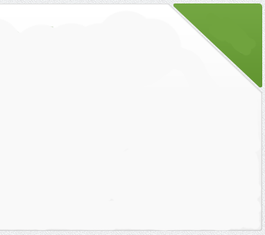
この写真のような三角形を作成し、余白を右上の角度に設定しましたが、図のように左のdivから分割して見えるようにする方法がわかりません。
灰色の境界線を維持し、緑色の三角形から分割されたように見えるようにするには、左のdivを「カット」する必要がありますか?
これを行う方法はありますか?
編集:
- ページ上の固定ナビゲーションバーを使用しているため、divがposition:absoluteの場合にスクロールすると、ナビゲーションバーがdivの後ろに移動します。
- ページの背景として画像を使用しているため、緑色の三角形と残りのdivの間のスペースは透明である必要があります
次のマークアップを考慮して、提案します。
#box {
    width: 10em;
    height: 6em;
    border: 4px solid #ccc;
    background-color: #fff;
    position: relative;
}

#box::before,
#box::after {
    content: '';
    position: absolute;
    top: 0;
    right: 0;
    border-color: transparent;
    border-style: solid;
}

#box::before {
    border-width: 1.5em;
    border-right-color: #ccc;
    border-top-color: #ccc;
}

#box::after {
    border-radius: 0.4em;
    border-width: 1.35em;
    border-right-color: #0c0;
    border-top-color: #0c0;
}
<div id="box"></div>相対位置のコンテナdiv内に絶対位置にある2つのdivを配置します。次に、外側の三角形が内側の三角形よりわずかに大きい三角形を作成します。次に、これらの要素をコンテナの右上隅に配置します。
[〜#〜] html [〜#〜]
<div class="container">
    <div class="inner-triangle"></div>
    <div class="outer-triangle"></div>
</div>
[〜#〜] css [〜#〜]
.container{
    border: 2px solid gray;
    position: relative;
    height: 100px;
}

.inner-triangle{
    border-left: 20px solid transparent;
    border-right: 20px solid green;
    border-bottom: 20px solid transparent;
    height: 0;
    width: 0;
    position: absolute;
    right: 0px;
    z-index: 2;
}

.outer-triangle{
    border-left: 22px solid transparent;
    border-right: 22px solid gray;
    border-bottom: 22px solid transparent;
    height: 0;
    width: 0;
    position: absolute;
    right: 0px;
    z-index: 1;
}
JSフィドル:http://jsfiddle.net/u8euZ/1
親のoverflow:hiddenに合わせて回転擬似要素を使用できます。
ここから、position:absoluteを使用して擬似を右上に配置することができます。
div {
  height: 250px;
  width: 300px;
  background: lightgray;
  border-radius: 10px;
  border: 5px solid dimgray;
  position: relative;
  overflow: hidden;
  margin: 30px auto;
}
div:before {
  content: "";
  position: absolute;
  top: -60px;
  right: -60px;
  height: 100px;
  width: 100px;
  background: green;
  border: 5px solid dimgray;
  transform: rotate(45deg);
}

/***********FOR DEMO ONLY*******************/


html, body {
    margin:0;
    padding:0;height:100%;
    vertical-align:top;overflow:hidden;
    background: rgb(79, 79, 79);
    background: -moz-radial-gradient(center, ellipse cover, rgba(79, 79, 79, 1) 0%, rgba(34, 34, 34, 1) 100%);
    background: -webkit-gradient(radial, center center, 0px, center center, 100%, color-stop(0%, rgba(79, 79, 79, 1)), color-stop(100%, rgba(34, 34, 34, 1)));
    background: -webkit-radial-gradient(center, ellipse cover, rgba(79, 79, 79, 1) 0%, rgba(34, 34, 34, 1) 100%);
    background: -o-radial-gradient(center, ellipse cover, rgba(79, 79, 79, 1) 0%, rgba(34, 34, 34, 1) 100%);
    background: -ms-radial-gradient(center, ellipse cover, rgba(79, 79, 79, 1) 0%, rgba(34, 34, 34, 1) 100%);
    background: radial-gradient(ellipse at center, rgba(79, 79, 79, 1) 0%, rgba(34, 34, 34, 1) 100%);
    filter: progid:DXImageTransform.Microsoft.gradient(startColorstr='#4f4f4f', endColorstr='#222222', GradientType=1);
}
<div></div>