指定されたパスのSVG塗りつぶしアニメーション
矢印を左から右にアニメーション化しようとしています。矢印のパスのコードを以下に示します。
<svg id="svg_circle" width="100%" height="100%" viewBox = '0 0 450 400'>
    <g transform = "translate(0,0)">
      <path class="path" stroke="#F0F0F0" fill="#fff" stroke-width="1" opacity="1" d="m34.97813,21.70979l-33.55223,0.47088l-0.0394,-13.57138l34.2665,-0.47295l-0.0208,-7.14282l14.50618,14.42226l-14.95643,15.04345l-0.20382,-8.74944z" id="svg_1">
          <animate id="project_anim1" attributeName="fill" from="#fff" to="#4DAF4C" begin="1s" dur="1s" fill="freeze" repeatCount="1"></animate>
      </path>
    </g>
</svg>
上記は私の矢印のsvgパスの内容です。
左から右への道を埋める方法を教えてください。迅速な対応を待っています
これは、<stop>の<linear gradient>sをアニメーション化するだけで実行できます。
<svg id="svg_circle" width="100%" height="100%" viewBox = '0 0 450 400'>

  <defs>
    <linearGradient id="left-to-right">
      <stop offset="0" stop-color="#4DAF4C">
        <animate dur="2s" attributeName="offset" fill="freeze" from="0" to="1" />
      </stop>
      <stop offset="0" stop-color="#fff">
        <animate dur="2s" attributeName="offset" fill="freeze" from="0" to="1" />
      </stop>

    </linearGradient>
  </defs>

  <path class="path" stroke="#F0F0F0" fill="url(#left-to-right)" stroke-width="1" opacity="1" d="m34.97813,21.70979l-33.55223,0.47088l-0.0394,-13.57138l34.2665,-0.47295l-0.0208,-7.14282l14.50618,14.42226l-14.95643,15.04345l-0.20382,-8.74944z" id="svg_1" />
</svg>
これが機能する方法は、緑から白への突然の変化を表す線形グラデーションがあることです。 <animation>要素は、その突然の変化の位置を矢印の左(offset = 0)から右(offset = "1")に移動します。
SVG <animate>要素はIEでは機能しないことに注意してください。 IEをサポートする必要がある場合は、FakeSmileライブラリを使用するか、別の方法(JSアニメーションライブラリなど)を使用する必要があります。
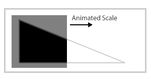
これはfill属性では不可能だと思います。ただし、代わりに、SVGパスを三角形の穴のある長方形に反転できます。次に、そのパスの後ろに2つ目の要素が必要です。この場合、穴を左から右に埋めるために、x方向にスケールを単にアニメーション化できます。
これはテクニックを示す画像です:
ここに実際の例があります:
<svg width="100%" height="100%" viewBox='0 0 450 400'>
  <rect x="0" y="0" width="1" height="22" style="fill: black;" >
    <animateTransform attributeName="transform" type="scale" from="1 1" to="50 1" begin="0s" dur="2s" repeatCount="indefinite" />
  </rect>
  <path fill="#ffffff" d="M0,0v29.8h86V0H0z M6.5,25V5.5L48.8,25H6.5z"/>
</svg>
注:回答は三角形から矢印に更新されました。テクニックはすべての図形で同じであるため、回答は更新しません。
andreas ' answer を基に構築します。あなたはそれを明らかにするためにアニメーション化された形であなたの矢を覆うことができます。
<svg id="svg_circle" width="450" height="400" viewBox='0 0 450 400'>
  <path class="path" stroke="#F0F0F0" fill="#fff"
    stroke-width="1" opacity="1" id="svg_1"
    d="m34.97813,21.70979l-33.55223,0.47088l-0.0394,
       -13.57138l34.2665,-0.47295l-0.0208,-7.14282
       l14.50618,14.42226l-14.95643,15.04345l-0.20382,
       -8.74944z">
   <animate id="project_anim1" attributeName="fill"
      from="#fff" to="#4DAF4C" begin="0s" dur="3s"
      fill="freeze" repeatCount="indefinite" />
  </path>
  <rect x="0" y="0" width="53" height="34" fill="#fff">
    <animate attributeType="XML" attributeName="x"
      from="0" to="53" begin="0s" dur="3s"
      repeatCount="indefinite" />
    <animate attributeType="XML" attributeName="width"
      from="53" to="0" begin="0s" dur="3s"
      repeatCount="indefinite" />
  </rect>
</svg>