CSSでテキストを縦方向に中央揃えする方法
テキストを含むdiv要素があり、このdivの内容を垂直方向の中央に揃えます。
これが私のdivスタイルです。
#box {
  height: 170px;
  width: 270px;
  background: #000;
  font-size: 48px;
  color: #FFF;
  text-align: center;
}
<div id="box">
Lorem ipsum dolor sit
</div>これを行うための最良の方法は何ですか?
この基本的な方法を試すことができます。
div {
  height: 90px;
  line-height: 90px;
  text-align: center;
  border: 2px dashed #f69c55;
}
<div>
Hello World!
</div>ただし、行の高さはそれを含むbox要素と同じ高さに設定されているためです。
より用途の広いアプローチ
これはテキストを垂直方向に揃えるもう1つの方法です。このソリューションは単一行および複数行のテキストに対して機能しますが、それでも固定高のコンテナが必要です。
div {
  height: 200px;
  line-height: 200px;
  text-align: center;
  border: 2px dashed #f69c55;
}
span {
  display: inline-block;
  vertical-align: middle;
  line-height: normal;
}
<div>
<span>Lorem ipsum dolor sit amet, consectetur adipiscing elit. Haec et tu ita posuisti, et verba vestra sunt. Non enim iam stirpis bonum quaeret, sed animalis. </span>
</div>CSSは<div>のサイズを変更するだけで、<span>の行の高さをその高さに等しく設定することで<div>を垂直方向に揃え、<span>をvertical-align: middleのインラインブロックにします。それから<span>の行の高さを通常の高さに戻すので、その内容はブロック内を自然に流れます。
テーブル表示のシミュレーション
そしてこれは別のオプションで、古い display: tableとdisplay: table-cellをサポートしていないブラウザ (基本的にはInternet Explorer 7のみ)では動作しないかもしれません。 CSSを使用してテーブルの動作をシミュレートします(テーブルは垂直方向の配置をサポートしているため)。HTMLは2番目の例と同じです。
div {
  display: table;
  height: 100px;
  width: 100%;
  text-align: center;
  border: 2px dashed #f69c55;
}
span {
  display: table-cell;
  vertical-align: middle;
}
<div>
<span>Lorem ipsum dolor sit amet, consectetur adipiscing elit.</span>
</div>絶対位置を使用する
この手法では、上下左右の0に絶対配置された要素設定を使用します。これについては、Smashing Magazineの記事で詳しく説明されています。CSSの絶対水平および垂直センタリング。
別の方法(ここではまだ言及していません)は Flexbox を使用します。
次のコードをcontainer要素に追加するだけです:
display: flex;
justify-content: center; /* align horizontal */
align-items: center; /* align vertical */
Flexboxデモ1
.box {
height: 150px;
width: 400px;
background: #000;
font-size: 24px;
font-style: oblique;
color: #FFF;
text-align: center;
padding: 0 20px;
margin: 20px;
display: flex;
justify-content: center;
/* align horizontal */
align-items: center;
/* align vertical */
}<div class="box">
Lorem ipsum dolor sit amet, consectetuer adipiscing elit, sed diam nonummy nibh
</div>または、containerを使用してコンテンツを整列する代わりに、flexboxはaflex item自動マージンで、flexコンテナにflex-itemが1つしかない場合(上の質問で与えられた例のように) 。
したがって、フレックスアイテムを水平方向と垂直方向の両方にセンタリングするには、margin:autoで設定します。
Flexbox Demo 2
.box {
height: 150px;
width: 400px;
background: #000;
font-size: 24px;
font-style: oblique;
color: #FFF;
text-align: center;
padding: 0 20px;
margin: 20px;
display: flex;
}
.box span {
margin: auto;
}<div class="box">
<span>margin:auto on a flex item centers it both horizontally and vertically</span>
</div>NB:上記のすべては、水平行にレイアウトしながらアイテムをセンタリングする場合に適用されます。これは、デフォルトでflex-directionの値がrowであるため、デフォルトの動作でもあります。ただし、flex-itemsをvertical columnsにレイアウトする必要がある場合は、flex-direction: columnをコンテナに設定してmain-列としての軸、さらにjustify-contentおよびalign-itemsプロパティが機能するようになりました反対に垂直に中央にjustify-content: centerとalign-items: center水平に中央揃え)
flex-direction: column demo
.box {
height: 150px;
width: 400px;
background: #000;
font-size: 18px;
font-style: oblique;
color: #FFF;
display: flex;
flex-direction: column;
justify-content: center;
/* vertically aligns items */
align-items: center;
/* horizontally aligns items */
}
p {
margin: 5px;
}<div class="box">
<p>
When flex-direction is column...
</p>
<p>
"justify-content: center" - vertically aligns
</p>
<p>
"align-items: center" - horizontally aligns
</p>
</div>Flexboxから始めて、その機能の一部を確認し、ブラウザーのサポートを最大限にするための構文を取得するのに適した場所は flexyboxes です
また、最近のブラウザサポートは非常に優れています。 caniuse
display: flexおよびalign-itemsのブラウザー間の互換性のために、次を使用できます。
display: -webkit-box;
display: -webkit-flex;
display: -moz-box;
display: -ms-flexbox;
display: flex;
-webkit-flex-align: center;
-ms-flex-align: center;
-webkit-align-items: center;
align-items: center;
次のCSSコードを追加することでこれを簡単に行うことができます。
display: table-cell;
vertical-align: middle;
つまり、CSSはついに次のようになります。
#box {
height: 90px;
width: 270px;
background: #000;
font-size: 48px;
font-style: oblique;
color: #FFF;
text-align: center;
margin-top: 20px;
margin-left: 5px;
display: table-cell;
vertical-align: middle;
}<div id="box">
Some text
</div>参考のために、そしてより簡単な答えを追加するために:
純粋なCSS:
.vertical-align {
position: relative;
top: 50%;
-webkit-transform: translateY(-50%);
-ms-transform: translateY(-50%);
transform: translateY(-50%);
}
SASS/SCSSミックスインとして:
@mixin vertical-align {
position: relative;
top: 50%;
-webkit-transform: translateY(-50%);
-ms-transform: translateY(-50%);
transform: translateY(-50%);
}
で使用する:
.class-to-center {
@include vertical-align;
}
SebastianEkströmのブログ投稿では、{たった3行のCSSで縦に並べる:
この方法では、要素が「ハーフピクセル」に配置されるため、要素がぼやけることがあります。これに対する解決策は、その親要素をpreserve-3dに設定することです。次のように:
.parent-element {
-webkit-transform-style: preserve-3d;
-moz-transform-style: preserve-3d;
transform-style: preserve-3d;
}
私たちは2015年+に住んでいると フレックスボックス はすべての主要な現代のブラウザによってサポートされています。
それはこれからウェブサイトが作られる方法です。
それを学んでください!
すべてのクレジットはこのリンクの所有者に行きます@SebastianEkström Link ;これを通過してください。実際に見てください codepen 。上記の記事を読むことで、私は デモフィドルも作成しました 。
たった3行のCSS(ベンダの接頭辞を除く)で、変換の助けを借りてそれを行うことができます。
CSSプロパティ変換は通常、要素の回転や拡大縮小に使用されますが、そのtranslateY関数を使用して要素を垂直方向に整列させることができます。通常これは絶対配置または行の高さを設定することで行われなければなりません、しかしこれらはあなたが要素の高さを知っているか、あるいは単一行のテキストだけで働くかのどちらかを必要とします。
だから、これをするために私達は書く:
.element {
position: relative;
top: 50%;
transform: translateY(-50%);
}
それだけで十分です。これは絶対位置法と似た手法ですが、要素の高さや親の位置プロパティを設定する必要がないという利点があります。 Internet Explorer 9 でさえ、それは箱から出してすぐに動作します。
さらに簡単にするために、ベンダープレフィックスを付けたミックスインとして記述することができます。
解決策はCSS 3で導入されたフレックスボックスです。
section {
display: flex;
display: -webkit-flex;
height: 200px;
width: 50%;
margin: auto;
border-radius: 20px;
border: 3px solid orange;
background-color: gold;
}
p {
margin: auto; /* Important */
text-align: center;
font-family: Calibri;
background-color: yellow;
border-radius: 20px;
padding: 15px;
}<section>
<p>
I'm centered!<br/>
Flexboxes are great!
</p>
</section>注 :テキストを中央揃えにする場合は、上の行のうち重要であるとマークされている行を、次のいずれかの行に置き換えます。
1)垂直方向のみ
margin: auto 0;
2)水平方向のみ
margin: 0 auto;
お気づきのとおり、このトリックはグリッド(display:grid)でも機能します。
柔軟なアプローチ
div {
width: 250px;
min-height: 50px;
line-height: 50px;
text-align: center;
border: 1px solid #123456;
margin-bottom: 5px;
}
span {
display: inline-block;
vertical-align: middle;
line-height: normal;
}<div>
<span>Lorem ipsum dolor sit amet, consectetur adipiscing elit.<br />
Lorem ipsum dolor sit amet, consectetur adipiscing elit.<br />
Lorem ipsum dolor sit amet, consectetur adipiscing elit.</span>
</div>
<div>
  <span>Lorem ipsum dolor sit amet, consectetur adipiscing elit.</span>
</div>
<div>
<span>Lorem ipsum dolor sit amet.</span>
</div>
<div>答えとして受け入れられている解決策はdivの高さと同じline-heightを使用するのに最適ですが、テキストが折り返されているORの場合はこの解決策は完全には機能しません。
テキストが折り返されているか、divの内側の複数の行にある場合はこれを試してください。
#box
{
display: table-cell;
vertical-align: middle;
}
詳しくは、以下を参照してください。
試してみてください{ この解決策 :
.EXTENDER {
    position: absolute;
    top: 0px;
    left: 0px;
    bottom: 0px;
    right: 0px;
    width: 100%;
    height: 100%;
    overflow-y: hidden;
    overflow-x: hidden;
}

.PADDER-CENTER {
    width: 100%;
    height: 100%;
    display: -webkit-box;
    display: -moz-box;
    display: -ms-flexbox;
    display: -webkit-flex;
    display: flex;
    -webkit-box-pack: center;
    -moz-box-pack: center;
    -ms-flex-pack: center;
    -webkit-justify-content: center;
    justify-content: center;
    -webkit-box-align: center;
    -moz-box-align: center;
    -ms-flex-align: center;
    -webkit-align-items: center;
    align-items: center;
}
<div class="EXTENDER">
<div class="PADDER-CENTER">
<div contentEditable="true">Edit this text...</div>
</div>
</div>CSS + を使用して構築されています。
以下のプロパティも使用できます。
display: flex;
align-content: center;
justify-content : center;
別の方法:
heightのdiv属性を設定しないで、代わりに効果を達成するためにpadding:を使用してください。行の高さと同様に、1行のテキストがある場合にのみ機能します。このようにしても、より多くのコンテンツがある場合でも、テキストは中央に配置されますが、div自体は少し大きくなります。
だから代わりに:
div {
  height: 120px;
  line-height: 120px;
}
あなたは言うことができます:
div {
   padding: 60px 0; // Maybe 60 minus font-size divided by two, if you want to be exact
}
これはpaddingの上下のdivを60pxに、そして左右のpaddingを0に設定し、divを120ピクセル(あなたのフォントの高さを加えたもの)を高くし、テキストをdivの中央に垂直に配置します。
以下のコードスニペットを参照として使用できます。それは私にとって魅力的なように働いています:
<!DOCTYPE html>
    <html lang="de">
        <head>
            <title>Vertically Center Text</title>
            <style>
                html, body {
                    height: 100%;
                    margin: 0;
                    padding: 0;
                    width: 100%;
                }
                body {
                    display: table;
                }
                .centered-text {
                    text-align: center;
                    display: table-cell;
                    vertical-align: middle;
                }
            </style>
        </head>

        <body style="background:#3cedd5">
            <div class="centered-text">
                <h1>Yes, it's my landing page</h1>
                <h2>Under construction, coming soon!!!</h2>
            </div>
        </body>
    </html>
上記のコードスニペットの出力は次のとおりです。
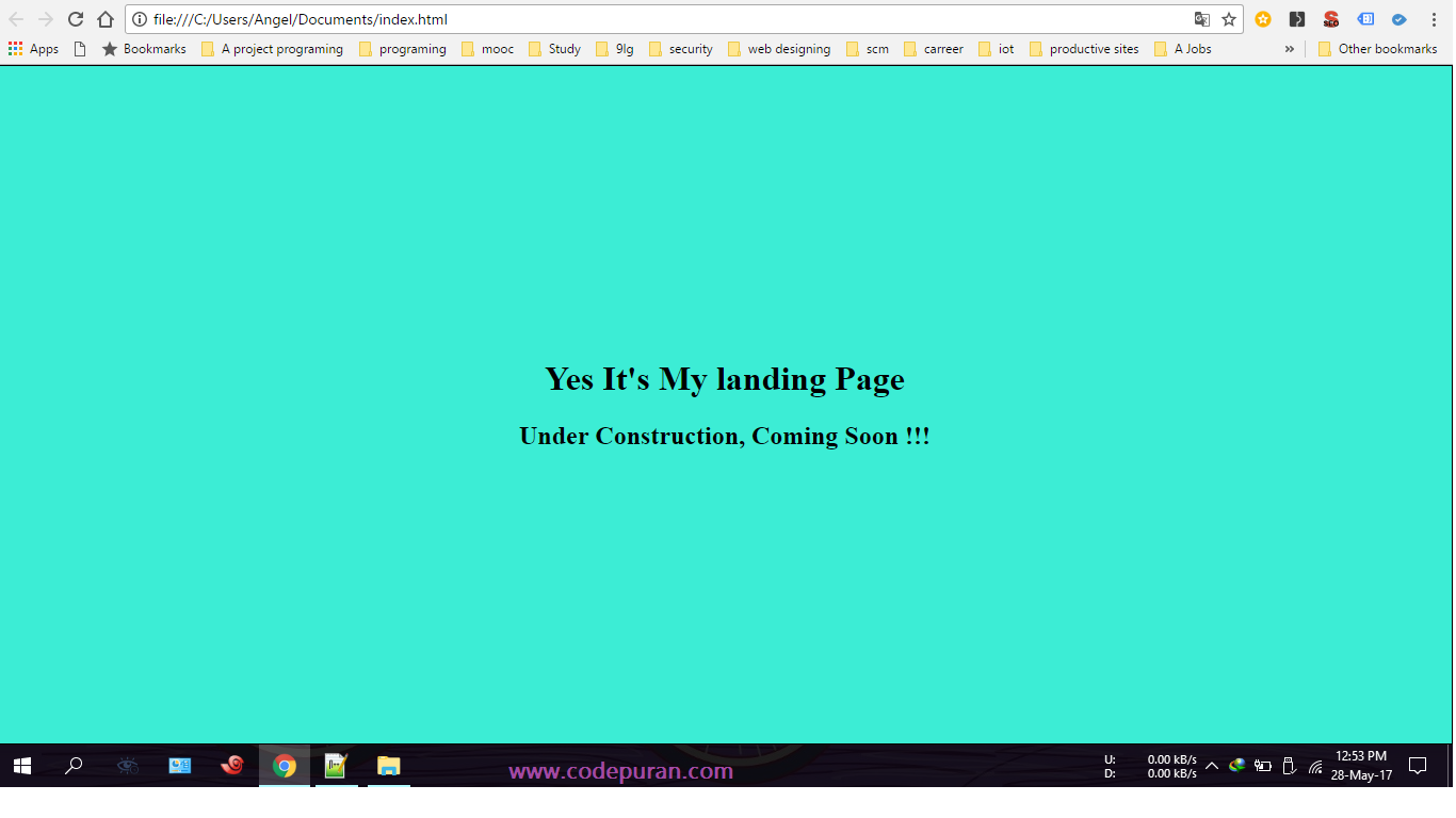
ソースコードのクレジット:CSSのテキストを縦に中央揃えするにはどうすればよいですか? - コードプラン
これについてはもっと良い考えです。あなたもこんなことができる
body,
html {
  height: 100%;
}

.parent {
  white-space: nowrap;
  height: 100%;
  text-align: center;
}

.parent:after {
  display: inline-block;
  vertical-align: middle;
  height: 100%;
  content: '';
}

.centered {
  display: inline-block;
  vertical-align: middle;
  white-space: normal;
}
<div class="parent">
<div class="centered">
<p>Lorem ipsum dolor sit amet.</p>
</div>
</div>誰かがwriting-modeルートを行ったのかどうかはわかりませんが、問題が明確に解決され、 幅広いサポート があると思います。
.vertical {
  //border: 1px solid green;
  writing-mode: vertical-lr;
  text-align: center;
  height: 100%;
  width: 100%;
}
.horizontal {
  //border: 1px solid blue;
  display: inline-block;
  writing-mode: horizontal-tb;
  width: 100%;
  text-align: center;
}
.content {
  text-align: left;
  display: inline-block;
  border: 1px solid #e0e0e0;
  padding: .5em 1em;
  border-radius: 1em;
}
<div class="vertical">
<div class="horizontal">
<div class="content">
I'm centered in the vertical and horizontal thing
</div>
</div>
</div>もちろん、これはあなたが必要とするどんな寸法でもうまくいくでしょう(親の100%を除いて)。境界線のコメントを外している場合は、慣れ親しんでおくと便利です。
JSFiddleデモ あなたがいじるために。
カニュースのサポート :85.22%+ 6.26%= 91.48% (Internet Explorerでも!)
すべての垂直方向の配置のニーズに応えます。
このMixinを宣言してください。
@mixin vertical-align($position: relative) {
  position: $position;
  top: 50%;
  -webkit-transform: translateY(-50%);
  -ms-transform: translateY(-50%);
  transform: translateY(-50%);
}
それからそれをあなたの要素に含めてください。
.element{
    @include vertical-align();
}
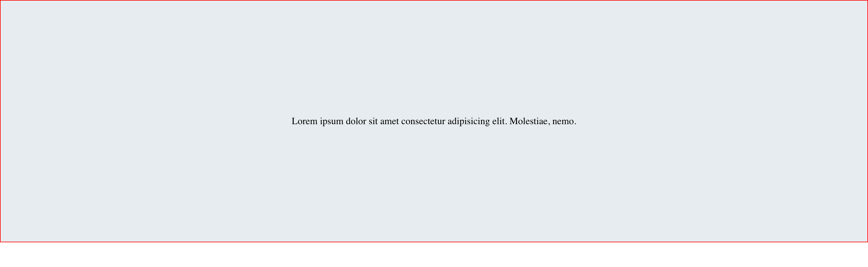
これはflexboxを使うもう一つのオプションです。
HTML
<div id="container">
  <div class="child">
    <span
      >Lorem ipsum dolor sit amet consectetur adipisicing elit. Molestiae,
      nemo.</span
    >
  </div>
</div>
CSS
  #container {
    display: flex;
  }

  .child {
    margin: auto;
  }
結果
次のコードは、画面サイズやdivサイズに関係なく、divを画面の中央に配置します。
.center-screen {
  display: flex;
  flex-direction: column;
  justify-content: center;
  align-items: center;
  text-align: center;
  min-height: 100vh;
}
<html>
<head>
</head>
<body>
<div class="center-screen">
I'm in the center
</div>
</body>
</html>flexの詳細はこちら をご覧ください。
簡単で多目的な方法は( Michielvooの表アプローチ として):
[ctrv]{
    display:table !important;
}

[ctrv] > *{ /* adressing direct discendents */
      display: table-cell;
      vertical-align: middle;
      // text-align: center; /* optional */
}
親タグでこの属性(またはそれと同等のクラス)を使用すると、多くの子でも整列できます。
<parent ctrv> <ch1/> <ch2/> </parent>
次のコードを試してください。
display: table-cell;
vertical-align: middle;
div {
  height: 80%;
  width: 100%;
  text-align: center;
  display: table-cell;
  vertical-align: middle;
  background: #4CAF50;
  color: #fff;
  font-size: 50px;
  font-style: italic;
}
<div>
Lorem Ipsum is simply dummy text of the printing and typesetting industry. Lorem Ipsum has been the industry's standard dummy text ever since the 1500s
</div>Transformプロパティを試してください。
 #box {
  height: 90px;
  width: 270px;
  position: absolute;
  top: 50%;
  left: 50%;
  transform: translate(-50%, -50%);
}
<div Id="box">
Lorem ipsum dolor sit amet, consectetur adipiscing elit.
</div>私は前の答えを見ました、そして、それらはスクリーンのその幅のためにだけ働くでしょう(反応しない)。レスポンシブにはflexを使う必要があります。
例:
div{ display:flex; align-item:center;}
単一行のテキスト(または単一の文字)の場合は、この手法を使用できます。
#boxが固定されていない場合、canを使用できます。%の相対的な高さ。
<div id="box"></div>
#box::before {
    display: block;
    content: "";
    height: 50%;
}

#box::after {
    vertical-align: top;
    line-height: 0;
    content: "TextContent";
}
ライブデモを見る JsBin (CSSの編集が簡単)または JsFiddle (結果フレームの高さの変更が簡単).
CSSではなくHTMLで内部テキストを配置したい場合は、追加のinline _要素でテキストコンテンツをラップし、それに合わせて#box::afterを編集する必要があります。 (そしてもちろん、content:プロパティは削除されるべきです。)
たとえば、<div id="box"><span>TextContent</span></div>です。この場合、#box::afterを#box spanに置き換える必要があります。
Internet Explorer 8をサポートするには、::を:に置き換える必要があります。
垂直方向に中央揃えするための非常にシンプルで最も強力なソリューション:
.outer-div {
  height: 200px;
  width: 200px;
  text-align: center;
  border: 1px solid #000;
}

.inner {
  position: relative;
  top: 50%;
  transform: translateY(-50%);
  color: red;
}
<div class="outer-div">
<span class="inner">No data available</span>
</div>Internet Explorer 9の奇妙さを回避するために、テーブルを使用せずに、縦に中央に配置されたクリック可能な象の列が必要でした。
私は最終的に(私のニーズに合った)最も良いCSSを見つけました、そしてそれはFirefox、Chrome、そしてInternet Explorer 11で素晴らしいです。
div {
  border: 1px dotted blue;
  display: inline;
  line-height: 100px;
  height: 100px;
}

span {
  border: 1px solid red;
  display: inline-block;
  line-height: normal;
  vertical-align: middle;
}

.out {
  border: 3px solid silver;
  display: inline-block;
}
<div class="out" onclick="alert(1)">
<div> <span><img src="http://www.birdfolk.co.uk/littleredsolo.png"/></span> </div>
<div> <span>A lovely clickable option.</span> </div>
</div>
<div class="out" onclick="alert(2)">
<div> <span><img src="http://www.birdfolk.co.uk/bang2/Ship01.png"/></span> </div>
<div> <span>Something charming to click on.</span> </div>
</div>明らかにあなたはボーダーを必要としません、しかしそれらはあなたがそれがどのように働くかを見るのを助けることができます。
行の高さとdivの高さの呼吸の必要性を解放するために、 Michielvooからの答え を拡張したいだけです。これは基本的にこのような単純化されたバージョンです。
div {
  width: 250px;
  /* height: 100px;
  line-height: 100px; */
  text-align: center;
  border: 1px solid #123456;
  background-color: #bbbbff;
  padding: 10px;
  margin: 10px;
}

span {
  display: inline-block;
  vertical-align: middle;
  line-height: normal;
}
<div>
<span>All grown-ups were once children... but only few of them remember it</span>
</div>
<div>
<span>And now here is my secret, a very simple secret: It is only with the heart that one can see rightly; what is essential is invisible to the eye.</span>
</div>注:cssを囲むfixed-heightに必要なdivの一部はコメントアウトされています。
視覚的な3D効果をあまり気にしないのであれば、buttonではなくdiv内に設定してください。
#box
{
  height: 120px;
  width: 300px;
  background: #000;
  font-size: 48px;
  font-style: oblique;
  color: #FFF;
}
<button Id="box" disabled>
Lorem ipsum dolor sit amet, consectetur adipiscing elit.
</button>CSSの位置付け方法を使用できます。
HTML:
<div class="relativediv">
  <p>
    Make me vertical align as center
  </p>
</div>
CSS:
.relativediv{position:relative;border:1px solid #ddd;height:300px;width:300px}
.relativediv p{position:absolute:top:50%;transfrom:translateY(-50%);}
あなたもこの方法を使ってください。
これは簡単でとても短いです。
.block {
  display: table-row;
  vertical-align: middle;
}

.tile {
  display: table-cell;
  vertical-align: middle;
  text-align: center;
  width: 500px;
  height: 100px;
}
<div class="body">
<span class="tile">
Hello middle world! :)
</span>
</div><!DOCTYPE html>
<html>
<head>
<style>
.main{
height:450px;
background:#f8f8f8;
display: -ms-flexbox;
display: -webkit-flex;
display: flex;
-ms-flex-align: center;
-webkit-box-align: center;
align-items: center;
justify-content: center;
width: 100%;
}
</style>
</head>
<body>
<div class="main">
<h1>Hello</h1>
</div>
</body>
</html>
.element{position: relative;top: 50%;transform: translateY(-50%);}
この小さなコードをあなたの要素のCSSプロパティに追加します。すばらしい。それを試してみてください!
最近のブラウザはCSSのcalc関数をサポートしています。これらのブラウザをターゲットにしている場合は、次のようなことを検討することをお勧めします。
<div style="position: relative; width: 400px; height: 400px; background-color: red">
  <span style="position: absolute; line-height: 40px; height: 80px; text-align: center; width: 300px; overflow: hidden; top: calc(50% - 40px); left: calc(50% - 150px);">
    Here are two lines that will be centered even if the parent div changes size.
  </span>
</div>重要なのは、絶対位置または相対位置の親divの中でstyle = "top: calc(50% - [innerFixedHeightInPX/2]px); height: [innerFixedHeightInPX]px;"を使用することです。
縦方向の中央スタイルが欲しいところならどこでもdisplay:table-cellとvertical-align:middleを試すことができます。
例:
#box
{
  display: table-cell;
  vertical-align: middle;
  height: 90px;
  width: 270px;
  background: #000;
  font-size: 48px;
  font-style: oblique;
  color: #FFF;
  text-align: center;
  margin-top: 20px;
  margin-left: 5px;
}
<div Id="box">
Lorem ipsum dolor sit amet, consectetur adipiscing elit.
</div>絶対位置とストレッチ
上記の方法と同様に、これは親要素と子要素の位置をそれぞれ相対と絶対として設定することから始まります。そこから物事は異なります。
以下のコードで、私はもう一度このメソッドを使用して子を水平方向と垂直方向の両方に中央揃えしましたが、この方法は垂直方向の中央揃えにのみ使用できます。
_ html _
<div id="parent">
    <div id="child">Content here</div>
</div>
_ css _
#parent {position: relative;}
#child {
    position: absolute;
    top: 0;
    bottom: 0;
    left: 0;
    right: 0;
    width: 50%;
    height: 30%;
    margin: auto;
}
このメソッドのアイデアは、上、下、右、左の値を0に設定して、子要素を4辺すべてに広げようとすることです。 4辺.
Autoを4辺すべてのマージンとして設定すると、反対側のマージンが等しくなり、親divの中央に子divが表示されます。
残念ながら、上記はInternet Explorer 7以下では機能しません。前の方法のように、子div内のコンテンツが大きくなりすぎて非表示になる可能性があります。
.box {
  width: 100%;
  background: #000;
  font-size: 48px;
  color: #FFF;
  text-align: center;
}

.height {
  line-height: 170px;
  height: 170px;
}

.transform {
  height: 170px;
  position: relative;
}

.transform p {
  margin: 0;
  position: absolute;
  top: 50%;
  left: 50%;
  -ms-transform: translate(-50%, -50%);
  transform: translate(-50%, -50%);
}
<h4>Using Height</h4>
<div class="box height">
Lorem ipsum dolor sit
</div>
<hr />
<h4>Using Transform</h4>
<div class="box transform">
<p>Lorem ipsum dolor sit</p>
</div>