CSSで最大幅と高さを画面サイズに制限する方法は?
私はPHPギャラリーを作ろうとしているので、後で写真を表示できる良いマスクが必要です。マスクが画面サイズより大きくならないようにします。つまり、スクロールしてはならず、<body>全体がブラウザウィンドウの幅と高さだけである必要があるため、<body>のすべての子オブジェクトはブラウザのフレームサイズに制限されます。オーバーフローした場合は縮小されます。 max-widthでmax-heightおよび<body>を試しましたが、機能しません。
index.htmlファイルの内容は次のとおりです。
<!DOCTYPE html>
<html>
<head>
  <link rel="stylesheet" type="text/css" href="style.css">
</head>
<body>
  <div id="mother">
    <div id="header">
      <div id="back-link">
        <a href="../">Home</a>
      </div>
      <div id="prev">
        <a href="">next picture</a>
      </div>
      <div id="next">
        <a href="">previous picture</a>
      </div>
      <div id="headline">
        <p class="h2">Our Galery</p>
      </div>
    </div>

    <!-- Content -->
    <div id="container-bild">
      <img src="./bilder/P1130079.JPG" id="img-bild" />
    </div>
  </div>
</body>
</html>
style.cssファイルの内容は次のとおりです。
body {
  max-width: 100%;
  max-height: 100%;
}

/* mother-container */
div#mother {
  max-width: 100%;
  max-height: 100%;
  margin: auto;
}

/* main-container */
#container-bild {
  max-width: 100%;
  max-height: 100%;
}

/* picture in main-container */
#img-bild {
  max-width: 100%;
  max-height: 100%;
  border: 1px solid #280198;
}
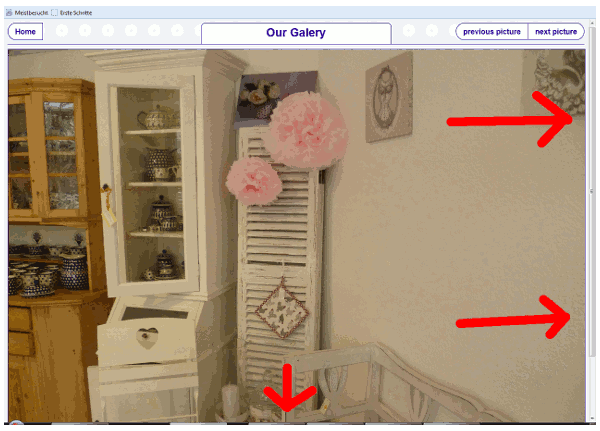
以下にスクリーンショットを示します:
高さおよび幅をウィンドウ(ビューポート)サイズの100%に設定するには、次を使用します。
height: 100vh;//100% view height
width: 100vw;// 100% view width
。
div {
  background-color: blue;
  height: 100vh;
  width: 100vw;
  position: absolute;
  top: 0;
  left: 0;
  color: white;
}
<div>some content here</div> 試してください:
html,
body {
  height: 100%;
}

body {
  overflow: hidden;
}
あなたのギャラリーにいくつの子要素があるか知っていますか?要素の数が静的な場合、vw単位とvh単位を使用してCSSで単純に寸法を設定できます。 JavaScriptを使用せず、要素が体をあふれさせることはありません。
これがcssで可能かどうかはわかりませんが、可能性があります。私はjavascriptで同様の問題を解決しました:
window.top.innerHeight;
ブラウザの利用可能な高さ、除外されたメニューバーなどを取得します。私が高さのためにどのようにしたかを見てください、私の問題は、コンテンツが空だったとしてもフッターが下にあるべきであるということでした->
<!doctype html>
<html>
<head>
<meta charset="utf-8">
<title>C-Driver Manager</title>
<meta name="keywords" content="Aygit,Device,Driver,Surucu,Download,Indir,yedekle,Unknown,Bilinmeyen,Backup,Back-up,stuurprogramma,apparaat,windows,w7,w8,w10,multilanguage,tool,free,gratis,ucretsiz">
<meta name="description" content="Windows 7/8/10 Device indentify, Driver backup, Driver info">
<link rel="stylesheet" type="text/css" href="main.css">
<link rel="icon" href="images/favicon.ico">
</head>

<body onResize="resizecontainer();">
    <div class="divtop">
        <div class="divtopcontainer">
            <div class="divlogo">

            </div>
            <div class="divHmenu">
                <style>
    .mnuHorizontal
    {
        list-style:none;
    }
    .mnuHorizontal li
    {
        float:left;
    }

    .mnuHorizontal .activemnu a,.mnuHorizontal li a:hover
    {
        background:#00B7EF;
        border-radius:5px;
        color:white;
    }


    .mnuHorizontal li a
    {
         display:inline-block;
         text-decoration:none;
         padding:5px 12px;
         text-align:center;
         font-weight:bold;
         color:#020042;
    }

    </style>

<ul class="mnuHorizontal">
    <li id="index.php"><a href="index.php">HOME</a></li>
    <li id="features.php"><a href="features.php">FEATURES</a></li>
    <li id="download.php" class="activemnu"><a href="download.php">DOWNLOAD</a></li>
    <li id="contact.php"><a href="contact.php">CONTACT</a></li>
</ul>
            </div>
        </div>
    </div>

    <div class="divblueline"></div>

    <div class="divcontainer">
<div style="float:left">
    <h2>What is C-Driver Manager</h2>
    C-Driver Manager is a simple tool that;
    <ul>
        <li>displays information about your devices</li>
        <li>identify unrecognized devices by windows</li>
        <li>Backups your devices driver</li>
    </ul>

<h2>Why C-Driver Manager?</h2>
<ul>
    <li>No installation needed</li>
    <li>No adware</li>
    <li>No spyware</li>
    <li>Absolutely freeware</li>
</ul>
</div>
<div>
    <img alt="" src="images/devmgr5.jpg" height="430" width="700">
</div>

</div>

    <div class="divblueline"></div>
    <div class="divbottom">
        <div id="chmx">
        </div>
    </div>
</body>
    <script>
        for (i=0;i<document.getElementsByClassName('mnuHorizontal').item(0).children.length; i++)
        {
            if (document.getElementsByClassName('mnuHorizontal').item(0).children[i].id ==
                "index.php")

            {
                document.getElementsByClassName('mnuHorizontal').item(0).children[i].className = 'activemnu';
            }
            else
            {
                document.getElementsByClassName('mnuHorizontal').item(0).children[i].className = '';
            }
        }

        resizecontainer();

        function resizecontainer()
        {
            avh     =   window.top.innerHeight;
            dbh     =   document.getElementsByClassName('divbottom').length *
                        document.getElementsByClassName('divbottom').item(0).clientHeight;

            dbt     =   document.getElementsByClassName('divtop').length    *
                        document.getElementsByClassName('divtop').item(0).clientHeight;

            dbbl    =   document.getElementsByClassName('divblueline').length   *
                        document.getElementsByClassName('divblueline').item(0).clientHeight;

            decrh = dbh + dbt + dbbl;

            document.getElementsByClassName('divcontainer').item(0).style.minHeight = (avh - decrh) + 'px';
        }
    </script>
</html>
上記の例の中でこの関数を探してください->
function resizecontainer()
        {
            avh     =   window.top.innerHeight;
            dbh     =   document.getElementsByClassName('divbottom').length *
                        document.getElementsByClassName('divbottom').item(0).clientHeight;

            dbt     =   document.getElementsByClassName('divtop').length    *
                        document.getElementsByClassName('divtop').item(0).clientHeight;

            dbbl    =   document.getElementsByClassName('divblueline').length   *
                        document.getElementsByClassName('divblueline').item(0).clientHeight;

            decrh = dbh + dbt + dbbl;

            document.getElementsByClassName('divcontainer').item(0).style.minHeight = (avh - decrh) + 'px';
        }
私の将来を思い出させるものとして:
.book {
    margin: auto;
    width: 100vh;
    max-width: 100vw;
    min-width: 500px;
}
これは完全に無関係ですが、リンクの場合、次のようなものを使用できます。
a[href^="#"] {
    text-decoration: none;
    color: black;
    background: url("http://www.yaml.org/spec/1.2/term.png") no-repeat bottom right;
}
a[href^="#"]:hover {
    text-decoration: underline;
    color: blue;
    background: none;
}
私のCSSソリューションは次のとおりです。
position: absolute;
width: 100%;
height: 100%;
overflow: hidden;
これはうまく機能します。これにより、画像が幅方向に大きくなりすぎるのを防ぎ、その比率を保ちます。
img {
    max-width: 100%;
    height: auto;
}