
これが JSFiddleのデモ とスニペットです。
.numberCircle {
border-radius: 50%;
behavior: url(PIE.htc);
/* remove if you don't care about IE8 */
width: 36px;
height: 36px;
padding: 8px;
background: #fff;
border: 2px solid #666;
color: #666;
text-align: center;
font: 32px Arial, sans-serif;
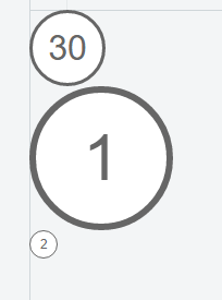
}<div class="numberCircle">30</div>これを IE8以前 で動作させるには、ダウンロードして CSS3 PIE を使用する必要があります。上記の私のデモはIE8では動作しませんが、それはjsFiddleがHost PIE.htcをホストしていないからです。
ここで他のほとんどの答えとの問題はあなたがそれが表示されるフォントサイズと文字数に基づいて完璧なサイズになるように外側のコンテナのサイズを微調整する必要があることです。あなたが1桁の数字と4桁の数字を混在させている場合、それは動作しません。フォントサイズとサークルサイズの比率が完璧ではない場合は、大きな円の上部に楕円形または小さな数を垂直に並べて配置します。これは、あらゆる量のテキストおよびあらゆるサイズの円に対してうまく機能するはずです。 widthとline-heightを同じ値に設定するだけです。
.numberCircle {
    width: 120px;
    line-height: 120px;
    border-radius: 50%;
    text-align: center;
    font-size: 32px;
    border: 2px solid #666;
}
<div class="numberCircle">1</div>
<div class="numberCircle">100</div>
<div class="numberCircle">10000</div>
<div class="numberCircle">1000000</div>コンテンツを長くしたり短くしたりする必要がある場合は、必要に応じてコンテナの幅を調整してうまく収まるようにします。
JSFiddle でそれを参照してください。
20以下の場合は、Unicode文字①②…...だけを使用できます。
内容に基づいて変化する円の大きさのためにこれは働くべきです:
<span class="numberCircle"><span>30</span></span>
<span class="numberCircle"><span>1</span></span>
<span class="numberCircle"><span>5435</span></span>
<span class="numberCircle"><span>2</span></span>
<span class="numberCircle"><span>100</span></span>

.numberCircle {
  display:inline-block;
  line-height:0px;

  border-radius:50%;
  border:2px solid;

  font-size:32px;
}

.numberCircle span {
  display:inline-block;

  padding-top:50%;
  padding-bottom:50%;

  margin-left:8px;
  margin-right:8px;
}
これは、コンテンツの幅とmargin-に基づいて半径を決定し、次にpadding-を使用して一致するように高さを拡張します。 margin-はfont-sizeに基づいて調整する必要があります。
内部要素を削除するように更新しました:
<span class="numberCircle">30</span>
<span class="numberCircle">1</span>
<span class="numberCircle">5435</span>
<span class="numberCircle">2</span>
<span class="numberCircle">100</span>

<style type="text/css">
.numberCircle {
    display:inline-block;

    border-radius:50%;
    border:2px solid;

    font-size:32px;
}

.numberCircle:before,
.numberCircle:after {
    content:'\200B';
    display:inline-block;
    line-height:0px;

    padding-top:50%;
    padding-bottom:50%;
}

.numberCircle:before {
    padding-left:8px;
}
.numberCircle:after {
    padding-right:8px;
}
</style>
高さを強制するために擬似要素を使用します。垂直方向の配置には幅ゼロのスペースが必要です。 line-height:0pxを外側から擬似に移動して、IE8のパフォーマンスが低下したときに少なくとも見えるようにしました。
最も簡単な方法はブートストラップとバッジクラスを使うことです
<span class="badge">1</span>
このバージョンは、ハードコードされた固定値ではなく、divのfont-sizeに対する相対サイズに依存しています。
CSS:
.numberCircle {
    font: 32px Arial, sans-serif;

    width: 2em;
    height: 2em;
    box-sizing: initial;

    background: #fff;
    border: 0.1em solid #666;
    color: #666;
    text-align: center;
    border-radius: 50%;

    line-height: 2em;
    box-sizing: content-box;
}
HTML:
<div class="numberCircle">30</div>
<div class="numberCircle" style="font-size: 60px">1</div>
<div class="numberCircle" style="font-size: 12px">2</div>
これにはborder-radiusを使うことができます。
<html>
  <head>
    <style type="text/css">

    .round
    {
        -moz-border-radius: 15px;
        border-radius: 15px;
        padding: 5px;
        border: 1px solid #000;
    }

  </style>
  </head>
  <body>
    <span class="round">30</span>
  </body>
</html>
あなたが結果に満足するまで、ボーダー半径とパディング値でプレーしてください。
しかし、これはすべてのブラウザで機能するわけではありません。 IEはまだ角丸をサポートしていないと思います。
ここに私の解決策 - これは簡単に異なるサイズと色を可能にし、編集制御のためにCMSに結びつきます。 IEの場合、正方形に分解されます。
HTML:
<div class="circular-label label-outer label-size-large label-color-pink">
    <div class="label-inner">
        <span>Fashion & Beauty</span>
    </div>
</div>
CSS:
.circular-label {
    overflow: hidden;
    z-index: 100;
    vertical-align: middle;
    font-size: 11px;
    -webkit-box-shadow:0 3px 3px rgba(0, 0, 0, 0.2);
    -moz-box-shadow:0 3px 3px rgba(0, 0, 0, 0.2);
    box-shadow: 3px 3px 3px rgba(0, 0, 0, 0.2);
}
.label-inner {
    width: 85%;
    height: 85%;
    -moz-border-radius: 50%;
    -webkit-border-radius: 50%;
    border-radius: 50%;
    border: 2px dotted white;
    vertical-align: middle;
    margin: auto;
    top: 5%;
    position: relative;
    overflow: hidden;
}
.label-inner > span {
    display: table;
    text-align: center;
    vertical-align: middle;
    font-weight: bold;
    text-transform: uppercase;
    width: 100%;
    position: absolute;
    margin: auto;
    margin-top: 38%;
    font-family:'ProximaNovaLtSemibold';
    font-size: 13px;
    line-height: 1.0em;
}
.circular-label.label-size-large {
    width: 110px;
    height: 110px;
    -moz-border-radius: 55px;
    -webkit-border-radius: 55px;
    border-radius: 55px;
    margin-top:-55px;
}
.circular-label.label-size-med {
    width: 76px;
    height: 76px;
    -moz-border-radius: 38px;
    -webkit-border-radius: 38px;
    border-radius: 38px;
    margin-top:-38px;
}
.circular-label.label-size-med .label-inner > span {
    margin-top: 33%;
}
.circular-label.label-size-small {
    width: 66px;
    height: 66px;
    -moz-border-radius: 33px;
    -webkit-border-radius: 33px;
    border-radius: 33px;
    margin-top:-33px;
}
これを行う方法を見ることはそれほど難しくありません。もっと大きな問題は、円の大きさを内容に合わせることが可能かどうかです。
現在私はそれが可能だとは思わない。誰でも?
あなたは標準的なブロック、それは正方形であるように働きます
.circle {
    width: 10em; height: 10em;
    -webkit-border-radius: 5em; -moz-border-radius: 5em;
  }
これはCSS 3の機能であり、あまり支持されていません。FirefoxとSafariを頼りにすることができます。
<div class="circle"><span>1234</span></div>
最初の答えを改善するには、パディングを削除してline-heightとvertical-alignを追加するだけです。
.numberCircle {
   border-radius: 50%;

   width: 36px;
   height: 36px;
   line-height: 36px;
   vertical-align:middle;

   background: #fff;
   border: 2px solid #666;
   color: #666;

   text-align: center;
   font: 32px Arial, sans-serif;
}
あなたのCSSでこのようなことをする
 div {
 width:10em;身長:10em。
 -webkit-border-radius:5em。 -moz-border-radius:5em;
}
 p {
 text-align:center; margin-top:4.5em;
}
段落タグを使用してテキストを書きます。それが役立つことを願っています
パーティーに遅刻するが、これは私のために働いてきたブートストラップのみのソリューションです。私はBootstrap 4を使っています:
<link href="https://maxcdn.bootstrapcdn.com/bootstrap/4.0.0/css/bootstrap.min.css" rel="stylesheet"/>

<body>
<div class="row mt-4">
<div class="col-md-12">
<span class="bg-dark text-white rounded-circle px-3 py-1 mx-2 h3">1</span>
<span class="bg-dark text-white rounded-circle px-3 py-1 mx-2 h3">2</span>
<span class="bg-dark text-white rounded-circle px-3 py-1 mx-2 h3">3</span>
</div>
</div>
</body>基本的にはbg-dark text-white rounded-circle px-3 py-1 mx-2 h3クラスを<span>(またはなんでも)要素に追加すれば完了です。
コンテンツに複数の数字が含まれている場合は、マージンクラスとパディングクラスを調整する必要があるかもしれません。
HTMLの例
<h3><span class="numberCircle">1</span> Regiones del Interior</h3>
コード
    .numberCircle {

    border-radius:50%;
    width:40px;
    height:40px;
    display:block;
    float:left;
    border:2px solid #000000;
    color:#000000;
    text-align:center;
    margin-right:5px;

}
ここで行ったこと のようなもの でうまくいく可能性があります(0から99までの数字の場合)。
CSS:
.circle {
    border: 0.1em solid grey;
    border-radius: 100%;
    height: 2em;
    width: 2em;
    text-align: center;
}

.circle p {
    margin-top: 0.10em;
    font-size: 1.5em;
    font-weight: bold;
    font-family: sans-serif;
    color: grey;
}
HTML:
<body>
    <div class="circle"><p>30</p></div>
</body>
私のやり方は、二乗法を使っています。逆に、値が異なると機能しますが、スパンが2つ必要です。
.circle {
  display: inline-block;
  border: 1px solid black;
  border-radius: 50%;
  position: relative;
  padding: 5px;
}
.circle::after {
  content: '';
  display: block;
  padding-bottom: 100%;
  height: 0;
  opacity: 0;
}
.num {
  position: absolute;
  top: 50%;
  transform: translateY(-50%);
}
.width_holder {
  display: block;
  height: 0;
  overflow: hidden;
}
<div class="circle">
<span class="width_holder">1</span>
<span class="num">1</span>
</div>
<div class="circle">
<span class="width_holder">11</span>
<span class="num">11</span>
</div>
<div class="circle">
<span class="width_holder">11111</span>
<span class="num">11111</span>
</div>
<div class="circle">
<span class="width_holder">11111111</span>
<span class="num">11111111</span>
</div>パーティーに遅れたが、ここで私が行った解決策がある https://codepen.io/jnbruno/pen/vNpPpW
Css:
.btn-circle.btn-xl {
    width: 70px;
    height: 70px;
    padding: 10px 16px;
    border-radius: 35px;
    font-size: 24px;
    line-height: 1.33;
}

.btn-circle {
    width: 30px;
    height: 30px;
    padding: 6px 0px;
    border-radius: 15px;
    text-align: center;
    font-size: 12px;
    line-height: 1.42857;
}
html:
<div class="panel-body">
                            <h4>Normal Circle Buttons</h4>
                            <button type="button" class="btn btn-default btn-circle"><i class="fa fa-check"></i>
                            </button>
                            <button type="button" class="btn btn-primary btn-circle"><i class="fa fa-list"></i>
                            </button>
</div>
追加の作業は必要ありません。ありがとうジョンノエルブルーノ
Thirtydotの答えは正しいですが、少しポイントが欠けています。円の中心に値を置き、異なる範囲の数を含める場合は、position:relativeを追加する必要があります。例えば123。
HTML:
<div class="numberCircle">30</div>
CSS:
.numberCircle {

border-radius: 50%;
behavior: url(PIE.htc); /* remove if you don't care about IE8 */
width: 36px;
height: 36px;
padding: 8px;
position: relative;
background: #fff;
border: 2px solid #666;
color: #666;
text-align: center;

font: 32px Arial, sans-serif;
}
しかし最も簡単な解決策はBootstrapを使うことです
<span class="badge" style ="float:right">123</span>