cssグリッドレイアウトの水平スクロール
ダッシュボードのレイアウトを変える必要があります。アイテムが表示されているビューポートに収まるように超えている場合は、layout-containerに水平スクロールのみが必要です。次の要件のあるレイアウトに出くわしました。
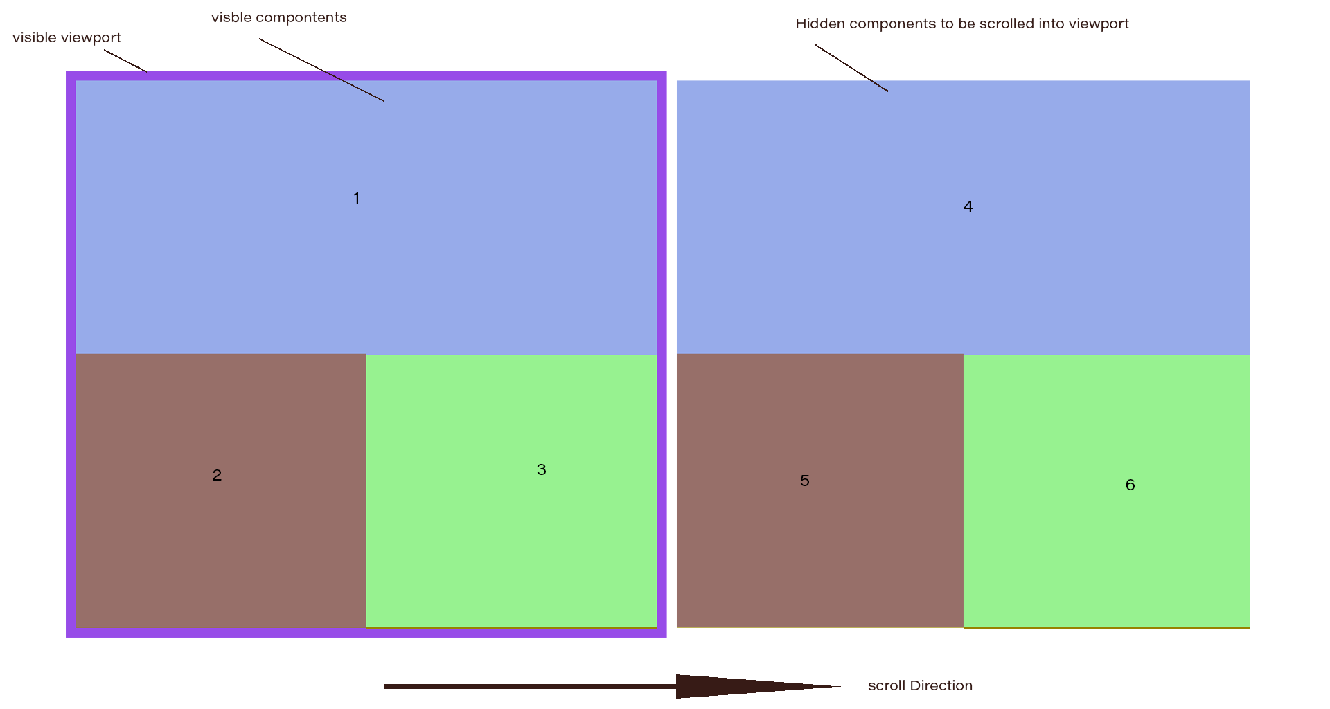
CSS-flexboxを使用してレイアウトスタイルを作成しましたが、水平スクロールを取得できず、垂直スクロールのみを取得しました。
html,
body {
  height: 100%;
  margin: 0px;
}
* {
  box-sizing: border-box;
}
.flexbox {
  height: 100%;
  width: 100%;
  display: flex;
  flex-wrap: wrap;
  overflow-x: auto;
  background-color: lightgreen;
}
.item {
  min-width: 50%;
  min-height: 50%;
  flex: 1 0 0;
  border: 1px solid;
}
.item:nth-child(odd) {
  background-color: lightblue;
}

.item:nth-child(even) {
  background-color: lightslategray;
}
.item1 {
  min-width: 100%;
}
<div class="flexbox">
<div class="item item1">1</div>
<div class="item item2">2</div>
<div class="item item3">3</div>
<div class="item item1">4</div>
<div class="item item2">5</div>
<div class="item item3">6</div>
</div>https://codepen.io/TechnoGeek/pen/GdZodo
だから、CSSグリッドがこれに役立つと思いました。だから私は何かを試しましたが、それを取得する方法がわかりませんでした。
html,
body {
  height: 100%;
  margin: 0px;
}

.grid {
  display: grid;
  height: 100%;
  background-color: lightgreen;
  grid-template-columns: repeat(2, 1fr);
  grid-template-row: repeat(2, 1fr);
  grid-gap: 5px;
  /*   grid-auto-flow: column; */
}

.item {
  border: 1px solid;
}

.item:nth-child(odd) {
  background-color: lightblue;
}

.item:nth-child(even) {
  background-color: lightslategray;
}

.item1 {
  grid-column: 1/3;
}
<div class="grid">
<div class="item item1">1</div>
<div class="item item2">2</div>
<div class="item item3">3</div>
<div class="item item1">4</div>
<div class="item item2">5</div>
<div class="item item3">6</div>
</div>https://codepen.io/TechnoGeek/pen/BxKoaG
グリッドレイアウトでは、アイテムはレイアウト内に収まるように縮小されています。
コンテナ内のアイテムの数は動的です。アイテム数に関係なく、レイアウトは表示されている各グループの構造を維持する必要があります。
誰かがこれを達成する方法を助けることができますか?
前もって感謝します。
水平スクロールの場合、最も簡単な解決策は、ビューごとに個別のコンテナーを作成することです。次に、コンテナ全体(body)を行方向のフレックスコンテナにします。
body {
  display: flex;
  margin: 0;
}

.flexbox {
  flex: 0 0 100vw;
  height: 100vh;
  display: flex;
  flex-wrap: wrap;
  background-color: lightgreen;
}

.item {
  flex: 1 0 50%;
  min-height: 50%;
  border: 1px solid;
}

.item1 {
  flex-basis: 100%;
}

.item:nth-child(odd) {
  background-color: lightblue;
}

.item:nth-child(even) {
  background-color: lightslategray;
}

* {
  box-sizing: border-box;
}
<div class="flexbox">
<div class="item item1">1</div>
<div class="item item2">2</div>
<div class="item item3">3</div>
</div>
<div class="flexbox">
<div class="item item1">4</div>
<div class="item item2">5</div>
<div class="item item3">6</div>
</div>