CSS / HTML:入力フィールドの周囲に輝く境界線を作成する
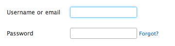
私は自分のフォームに適当な入力をいくつか作成したいのですが、Twitterが入力の周囲にどのようにして輝く境界線を作っているのか知りたいです。
Twitterの枠線の例/画像:
丸みを帯びた角を作成する方法もよくわかりません。
どうぞ:
.glowing-border {
    border: 2px solid #dadada;
    border-radius: 7px;
}

.glowing-border:focus {
    outline: none;
    border-color: #9ecaed;
    box-shadow: 0 0 10px #9ecaed;
}
ライブデモ:http://jsfiddle.net/simevidas/CXUpm/1/show/
(デモのコードを見るには、URLから "show /"を削除してください)
このようなものはどうですか... http://jsfiddle.net/UnsungHero97/Qwpq4/1207/
CSS
input {
    border: 1px solid #4195fc; /* some kind of blue border */

    /* other CSS styles */

    /* round the corners */
    -webkit-border-radius: 4px;
       -moz-border-radius: 4px;
            border-radius: 4px;


    /* make it glow! */
    -webkit-box-shadow: 0px 0px 4px #4195fc;
       -moz-box-shadow: 0px 0px 4px #4195fc;
            box-shadow: 0px 0px 4px #4195fc; /* some variation of blue for the shadow */

}
通常の青いborder、中程度のborder-radius、および位置がbox-shadowの青い0 0を使用します。
SLaksは頭を悩ませていますが、一般的にはCSS3での入力の変更点を調べたいと思うかもしれません。丸みを帯びた角とボックスシャドウは、どちらもCSS 3の新機能であり、探しているものとまったく同じにすることができます。私の個人的にお気に入りのCSS3/HTML5へのリンクの1つは http://diveintohtml5.ep.io/ です。
私は前の2つの答えをまとめました( jsfiddle )。
input {
/* round the corners */
border-radius: 4px;
-moz-border-radius: 4px;
-webkit-border-radius: 4px;
}
input:focus {
outline:none;
border: 1px solid #4195fc;
/* create a BIG glow */
box-shadow: 0px 0px 14px #4195fc;
-moz-box-shadow: 0px 0px 14px #4195fc;
-webkit-box-shadow: 0px 0px 14px #4195fc;
}
少し輝きの少ないバージョンの修正バージョン。
input {
    /* round the corners */
    //background-color: transparent;
    border: 1px solid;
    height: 20px;
    width: 160px;
    color: #CCC;
    border-radius: 4px;
    -moz-border-radius: 4px;
    -webkit-border-radius: 4px;
}

input:focus {
    outline:none;
    border: 1px solid #4195fc;
    /* create a BIG glow */
    box-shadow: 0px 0px 5px #4195fc;
    -moz-box-shadow: 0px 0px 5px #4195fc;
    -webkit-box-shadow: 0px 0px 5px #4195fc;
}
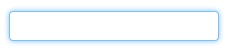
輝く入力フィールドとテキストエリアが作成されます。
textarea,textarea:focus,input,input:focus{
    transition: border-color 0.15s ease-in-out 0s, box-shadow 0.15s ease-in-out 0s;
    border: 1px solid #c4c4c4;
    border-radius: 4px;
    -moz-border-radius: 4px;
    -webkit-border-radius: 4px;
    box-shadow: 0px 0px 8px #d9d9d9;
    -moz-box-shadow: 0px 0px 8px #d9d9d9;
    -webkit-box-shadow: 0px 0px 8px #d9d9d9;
}

input:focus,textarea:focus {
    outline: none;
    border: 1px solid #7bc1f7;
    box-shadow: 0px 0px 8px #7bc1f7;
    -moz-box-shadow: 0px 0px 8px #7bc1f7;
    -webkit-box-shadow: 0px 0px 8px #7bc1f7;
}
以下はBootstrapが使用するコードです。色は少し異なりますが、概念は同じです。これはLESSを使ってCSSをコンパイルしている場合です。
// Form control focus state
//
// Generate a customized focus state and for any input with the specified color,
// which defaults to the `@input-focus-border` variable.
//
// We highly encourage you to not customize the default value, but instead use
// this to Tweak colors on an as-needed basis. This aesthetic change is based on
// WebKit's default styles, but applicable to a wider range of browsers. Its
// usability and accessibility should be taken into account with any change.
//
// Example usage: change the default blue border and shadow to white for better
// contrast against a dark gray background.

.form-control-focus(@color: @input-border-focus) {
  @color-rgba: rgba(red(@color), green(@color), blue(@color), .6);
  &:focus {
    border-color: @color;
    outline: 0;
    .box-shadow(~"inset 0 1px 1px rgba(0,0,0,.075), 0 0 8px @{color-rgba}");
  }
}
LESSを使用していないのであれば、これがコンパイル済みのバージョンです。
.form-control:focus {
    border-color: #66afe9;
    outline: 0;
    -webkit-box-shadow: inset 0 1px 1px rgba(0, 0, 0, 0.075), 0 0 8px rgba(102, 175, 233, 0.6);
    box-shadow: inset 0 1px 1px rgba(0, 0, 0, 0.075), 0 0 8px rgba(102, 175, 233, 0.6);
}
$('.form-fild input,.form-fild textarea').focus(function() {
    $(this).parent().addClass('open');
});

$('.form-fild input,.form-fild textarea').blur(function() {
    $(this).parent().removeClass('open');
});
.open {
color:red;
}
.form-fild {
position: relative;
margin: 30px 0;
}
.form-fild label {
position: absolute;
top: 5px;
left: 10px;
padding:5px;
}
.form-fild.open label {
top: -25px;
left: 10px;
/*background: #ffffff;*/
}
.form-fild input[type="text"] {
padding-left: 80px;
}
.form-fild textarea {
padding-left: 80px;
}
.form-fild.open textarea,
.form-fild.open input[type="text"] {
padding-left: 10px;
}
textarea,
input[type="text"] {
padding: 10px;
width: 100%;
}
textarea,
input,
.form-fild.open label,
.form-fild label {
-webkit-transition: all 0.2s ease-in-out;
-moz-transition: all 0.2s ease-in-out;
-o-transition: all 0.2s ease-in-out;
transition: all 0.2s ease-in-out;
}<script src="https://ajax.googleapis.com/ajax/libs/jquery/2.1.1/jquery.min.js"></script>
<div class="container">
<div class="row">
<form>
<div class="form-fild">
<label>Name :</label>
<input type="text">
</div>
<div class="form-fild">
<label>Email :</label>
<input type="text">
</div>
<div class="form-fild">
<label>Number :</label>
<input type="text">
</div>
<div class="form-fild">
<label>Message :</label>
<textarea cols="10" rows="5"></textarea>
</div>
</form>
</div>
</div>input[type="text"]{
@include transition(all 0.30s ease-in-out);
outline: none;
padding: 3px 0px 3px 3px;
margin: 5px 1px 3px 0px;
border: 1px solid #DDDDDD;
}
input[type="text"]:focus{
@include box-shadow(0 0 5px rgba(81, 203, 238, 1));
-webkit-box-shadow: 0px 0px 5px #007eff;
-moz-box-shadow: 0px 0px 5px #007eff;
box-shadow: 0px 0px 5px #007eff;
}