Divの内容を下に合わせるにはどうすればいいですか?
次のCSSとHTMLコードがあるとします。
#header {
  height: 150px;
}
<div id="header">
<h1>Header title</h1>
Header content (one or multiple lines)
</div>ヘッダーセクションは高さが固定されていますが、ヘッダーの内容は変わる可能性があります。ヘッダーの内容をヘッダーセクションの下部に垂直に揃えて配置したいので、テキストの最後の行がヘッダーセクションの下部に「貼り付いて」います。
したがって、テキストが1行しかない場合は、次のようになります。
-----------------------------
| Header title
|
|
|
| header content (resulting in one line)
-----------------------------
そして3行あれば:
-----------------------------
| Header title
|
| header content (which is so
| much stuff that it perfectly
| spans over three lines)
-----------------------------
CSSでこれをどのように行うことができますか?
相対位置+絶対位置が最善の策です。
#header {
  position: relative;
  min-height: 150px;
}

#header-content {
  position: absolute;
  bottom: 0;
  left: 0;
}

#header, #header * {
  background: rgba(40, 40, 100, 0.25);
}
<div id="header">
<h1>Title</h1>
<div id="header-content">Some content</div>
</div>しかし、あなたはそれに関して問題に遭遇するかもしれません。試してみると、コンテンツの下に表示されるドロップダウンメニューに問題がありました。きれいじゃない。
正直に言うと、垂直方向の中央揃えの問題や、アイテムとの垂直方向の配置の問題は高さが固定されていないため、テーブルを使用するほうが簡単です。
CSSポジショニングを使用してください。
/* creates a new stacking context on the header */
#header {
  position: relative;
}

/* positions header-content at the bottom of header's context */
#header-content {
  position: absolute;
  bottom: 0;
}
クレタス が指摘したように、この作業を行うにはヘッダの内容を識別する必要があります。
<span id="header-content">some header content</span>

<div style="height:100%; position:relative;">
    <div style="height:10%; position:absolute; bottom:0px;">bottom</div>
</div>
私はこれらのプロパティを使用しています、それは動作します!
#header {
  display: table-cell;
  vertical-align: bottom;
}
あなたがレガシーブラウザを心配していないならば、flexboxを使ってください。
親要素は、表示タイプをflexに設定する必要があります。
div.parent {
  display: flex;
  height: 100%;
}
次に、子要素のalign-selfをflex-endに設定します。
span.child {
  display: inline-block;
  align-self: flex-end;
}
これが私が習得したものです: http://css-tricks.com/snippets/css/a-guide-to-flexbox/ /
しばらくの間この同じ問題に苦労した後、私はついに私の要求のすべてを満たす解決策を考え出しました:
- 私はコンテナの高さを知っている必要はありません。
- 相対的な+絶対的な解決策とは異なり、コンテンツはそれ自身のレイヤに浮かぶことはありません(すなわち、通常コンテナのdivに埋め込まれます)。
- ブラウザ間で動作します(IE 8以降)。
- 実装が簡単です。
解決策はただ1つの<div>を取り、それを私は "アライナ"と呼びます。
CSS
.bottom_aligner {
    display: inline-block;
    height: 100%;
    vertical-align: bottom;
    width: 0px;
}
html
<div class="bottom_aligner"></div>
... Your content here ...
このトリックは、背の高い細いdivを作成することで機能します。これにより、テキストのベースラインがコンテナの下部にプッシュされます。
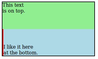
これは、OPが求めていたことを実現する完全な例です。私は "bottom_aligner"をデモンストレーション目的のためだけに太くて赤くしました。
CSS:
.outer-container {
  border: 2px solid black;
  height: 175px;
  width: 300px;
}

.top-section {
  background: lightgreen;
  height: 50%;
}

.bottom-section {
  background: lightblue;
  height: 50%;
  margin: 8px;
}

.bottom-aligner {
  display: inline-block;
  height: 100%;
  vertical-align: bottom;
  width: 3px;
  background: red;
}

.bottom-content {
  display: inline-block;
}

.top-content {
  padding: 8px;
}
HTML:
<body>
  <div class="outer-container">
    <div class="top-section">
      This text
      <br> is on top.
    </div>
    <div class="bottom-section">
      <div class="bottom-aligner"></div>
      <div class="bottom-content">
        I like it here
        <br> at the bottom.
      </div>
    </div>
  </div>
</body>
最新の方法は flexbox を使用することです。下記の例をご覧ください。フレックスコンテナに直接含まれるテキストは無名のフレックスアイテムにラップされるため、Some text...をHTMLタグにラップする必要さえありません。
header {
  border: 1px solid blue;
  height: 150px;
  display: flex;                   /* defines flexbox */
  flex-direction: column;          /* top to bottom */
  justify-content: space-between;  /* first item at start, last at end */
}
h1 {
  margin: 0;
}
<header>
<h1>Header title</h1>
Some text aligns to the bottom
</header>テキストがいくつかあるだけで、コンテナの下部に垂直に整列したい場合。
section {
  border: 1px solid blue;
  height: 150px;
  display: flex;                   /* defines flexbox */
  align-items: flex-end;           /* bottom of the box */
}
<section>Some text aligns to the bottom</section>親要素またはブロック要素の行の高さがインライン要素の行の高さより大きい場合、インライン要素またはインラインブロック要素をブロックレベル要素の一番下に揃えることができます。
マークアップ:
<h1 class="alignBtm"><span>I'm at the bottom</span></h1>
css:
h1.alignBtm {
  line-height: 3em;
}
h1.alignBtm span {
  line-height: 1.2em;
  vertical-align: bottom;
}
*標準モードになっていることを確認してください
display: flex;
align-items: flex-end;
あなたは単にフレックスを達成することができます
header {
  border: 1px solid blue;
  height: 150px;
  display: flex;                   /* defines flexbox */
  flex-direction: column;          /* top to bottom */
  justify-content: space-between;  /* first item at start, last at end */
}
h1 {
  margin: 0;
}
<header>
<h1>Header title</h1>
Some text aligns to the bottom
</header>動的な高さの項目が複数ある場合は、tableとtable-cellのCSS表示値を使用します。
_ html _
<html>
<body>

  <div class="valign bottom">
    <div>

      <div>my bottom aligned div 1</div>
      <div>my bottom aligned div 2</div>
      <div>my bottom aligned div 3</div>

    </div>
  </div>

</body>
</html>
_ css _
html,
body {
  width: 100%;
  height: 100%;
}
.valign {
  display: table;
  width: 100%;
  height: 100%;
}
.valign > div {
  display: table-cell;
  width: 100%;
  height: 100%;
}
.valign.bottom > div {
  vertical-align: bottom;
}
ここでJSBinデモを作成しました: http://jsbin.com/INOnAkuF/2/edit
このデモには、同じ手法を使用して垂直方向に中央揃えをする方法の例もあります。
非常に単純な1行の解決策は、divのテキストがすべて下に行くことを念頭に置いて、divにline-heigthを追加することです。
CSS:
#layer{width:198px;
       height:48px;
       line-height:72px;
       border:1px #000 solid}
#layer a{text-decoration:none;}
HTML:
<div id="layer">
    <a href="#">text at div's bottom.</a>
</div>
これは、div内のテキストを表示したくない場合に実用的で高速な解決策であることを覚えておいてください。画像とものを組み合わせる必要がある場合は、もう少し複雑でレスポンシブなCSSをコーディングする必要があります。
これを行うための簡単な方法は次のとおりです。ユーザーが7年前に必要としていたので、もちろん、それはIE8でサポートされていません。あなたが何をサポートする必要があるかに依存して、これらのいくつかは取り除かれることができます。
それでも、外側のコンテナなしでこれを実行する方法がある場合は、テキストを自分自身の内部に配置するだけでいいのです。
#header {
    -webkit-box-align: end;
    -webkit-align-items: flex-end;
    -ms-flex-align: end;
    align-items: flex-end;
    display: -webkit-box;
    display: -webkit-flex;
    display: -ms-flexbox;
    display: flex;
    height: 150px;
}
これはflexboxを使うがボトムアラインメントに flex-end を使わない別の解決策です。アイデアは、 h1 に auto にmargin-bottomを設定して、残りのコンテンツを一番下にプッシュすることです。
#header {
  height: 350px;
  display:flex;
  flex-direction:column;
  border:1px solid;
}

#header h1 {
 margin-bottom:auto;
}
<div id="header">
<h1>Header title</h1>
Header content (one or multiple lines) Header content (one or multiple lines)Header content (one or multiple lines) Header content (one or multiple lines)
</div>テキストのmargin-top:autoでも同じことができますが、この場合はdivまたはspanで囲む必要があります。
#header {
  height: 350px;
  display:flex;
  flex-direction:column;
  border:1px solid;
}

#header span {
 margin-top:auto;
}
<div id="header">
<h1>Header title</h1>
<span>Header content (one or multiple lines)</span>
</div>これには絶対+相対は必要ありません。コンテナとデータの両方に相対位置を使用することは非常に可能です。これがあなたのやり方です。
データの高さがxになるとします。あなたのコンテナは相対的で、フッターもまた相対的です。あなたがしなければならないのはあなたのデータに加えることだけです
bottom: -webkit-calc(-100% + x);
あなたのデータは常にあなたのコンテナの一番下にあります。動的な高さのコンテナがあっても機能します。
HTMLはこのようになります
<div class="container">
  <div class="data"></div>
</div>
CSSはこのようになります
.container{
  height:400px;
  width:600px;
  border:1px solid red;
  margin-top:50px;
  margin-left:50px;
  display:block;
}
.data{
  width:100%;
  height:40px;
  position:relative;
   float:left;
  border:1px solid blue;
  bottom: -webkit-calc(-100% + 40px);
   bottom:calc(-100% + 40px);
}
お役に立てれば。
動作しているようです。
HTML:私は一番下にいます
css:
h1.alignBtm {
  line-height: 3em;
}
h1.alignBtm span {
  line-height: 1.2em;
  vertical-align: bottom;
}
デフォルトのbootstrap開始テンプレートに基づいてこのソリューションを見つけました
/* HTML */

<div class="content_wrapper">
  <div class="content_floating">
    <h2>HIS This is the header<br>
      In Two Rows</h2>
    <p>This is a description at the bottom too</p>
  </div>
</div>

/* css */

.content_wrapper{
      display: table;
      width: 100%;
      height: 100%; /* For at least Firefox */
      min-height: 100%;
    }

.content_floating{
  display: table-cell;
  vertical-align: bottom;
  padding-bottom:80px;

}
#header {
    height: 150px;
    display:flex;
    flex-direction:column;
}

.top{
    flex: 1;
}

<div id="header">
    <h1 class="top">Header title</h1>
    Header content (one or multiple lines)
</div>
#header {
    height: 250px;
    display:flex;
    flex-direction:column;
    background-color:yellow;
}

.top{
    flex: 1;
}
<div id="header">
<h1 class="top">Header title</h1>
Header content (one or multiple lines)
</div>#header全体ではなく、コンテンツの折り返しdivの高さを設定できる場合(他の回答に示されているように#header-content)、次の方法を試してもかまいません。
_ html _
<div id="header">
    <h1>some title</h1>
    <div id="header-content">
        <span>
            first line of header text<br>
            second line of header text<br>
            third, last line of header text
        </span>
    </div>
</div>
_ css _
#header-content{
    height:100px;
}

#header-content::before{
  display:inline-block;
  content:'';
  height:100%;
  vertical-align:bottom;
}

#header-content span{
    display:inline-block;
}
私はこれが2歳以上であることを知っています、しかし私は言及されたものよりずっと簡単な方法を考案しました。
ヘッダdivの高さを設定します。次に、その中で、H1タグを次のようにスタイル設定します。
float: left;
padding: 90px 10px 11px
私はクライアントのためのサイトに取り組んでいます、そしてデザインはテキストが特定のdivの底にあることを要求します。私はこれらの2行を使って結果を達成しました、そしてそれはうまく働きます。また、テキストが拡大しても、余白は変わりません。
私がちょうどクライアントのためにしたサイトは、私がこれを単純なパディングで達成した一番下のテキストで、一番下のテキストが高いボックスであることを要求しました、すべてのブラウザのために働くべきです。
<div id="footer">
  some text here
</div>
#footer {
  padding: 0 30px;
  padding-top: 60px;
  padding-bottom: 8px;
}
完璧なクロスブラウザの例はおそらくこれです:
http://www.csszengarden.com/?cssfile=/213/213.css&page=0
考え方は、一番下にdivを表示することと、そこに貼り付けることの両方です。多くの場合、簡単な方法でスティッキーdivがメインコンテンツと共にスクロールアップします。
以下は完全に機能する最小限の例です。 div埋め込みのトリックが必要ないことに注意してください。多くのBRは単にスクロールバーを表示させるためのものです。
<!DOCTYPE html PUBLIC "-//W3C//DTD XHTML 1.0 Strict//EN"
    "http://www.w3.org/TR/xhtml1/DTD/xhtml1-strict.dtd">
<html>
<head>
    <style>
        * {
            margin: 0;
            padding: 0;
        }

        #floater {
            background: yellow;
            height: 200px;
            width: 100%;
            position: fixed;
            bottom: 0px;
            z-index: 5;
            border-top: 2px solid gold;
        }

    </style>
</head>


<body>
    <br/><br/><br/><br/><br/><br/><br/><br/><br/><br/><br/><br/>
    <br/><br/><br/><br/><br/><br/><br/><br/><br/><br/><br/><br/>
    <br/><br/><br/><br/><br/><br/><br/><br/><br/><br/><br/><br/>
    <br/><br/><br/><br/><br/><br/><br/><br/><br/><br/><br/><br/>


    <div id="floater"></div>
</body>
</html>
自分のコードがIEで機能しない可能性がある場合は、先頭にDOCTYPEタグを付けてください。これがIEで機能することが非常に重要です。また、これが最初のタグになり、その上には何も表示されません。
これらすべての答えはどれも私には役に立ちませんでした...私はflexboxの専門家ではありませんが、これを理解するのはかなり簡単で、理解しやすく使いやすいのは簡単です。他のコンテンツから何かを分離するには、空のdivを挿入し、スペースを埋めるように大きくします。
https://jsfiddle.net/8sfeLmgd/1/ /
.myContainer {
  display: flex;
  height: 250px;
  flex-flow: column;
}

.filler {
  flex: 1 1;
}
<div class="myContainer">
  <div>Top</div>
  <div class="filler"></div>
  <div>Bottom</div>
</div>
これは、コンテナのサイズが固定されていない場合にも、下部のコンテンツのサイズが固定されていない場合にも予想どおりに反応します。
試してみてください。
div.myclass { margin-top: 100%; }
修正するために%を変更してみてください。例:120%または90%...など。