IE 11 flexboxコンテンツを考慮しない子の幅(Safariも))
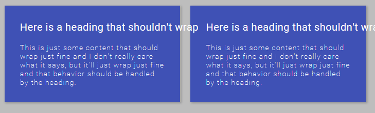
私はつまずきそうな奇妙なバグがあり、ここで実際に何が起こっているのか知りたいのですが。 flexboxコンテナ(行の折り返し)と2つの子div(フレックス:1)があります。折り返したくない見出しがある場合(空白:nowrap)、= IE 11を含むdivはその幅を考慮せず、ヘッダーの幅よりも小さくなります。これはChromeでは問題なく動作するようですが、SafariとIEのようです見出しの幅を尊重しないようにします。
ここにjsビンがあります: https://jsbin.com/bowodiz/edit?css,output
便宜上、主なスタイルとマークアップを下にインラインで配置しました。
HTML:
<div class="flex-container">

    <div class="left">
      <div class="heading">Here is a heading that shouldn't wrap</div>
      <div class="sub-text">This is just some content that should wrap just fine ..</div>
    </div>

    <div class="right">
      <div class="heading">Here is a heading that shouldn't wrap</div>
      <div class="sub-text">This is just some content that should wrap just fine ...</div>
    </div>

</div>
CSS(部分):
.flex-container {
  display: flex;
  flex-flow: row wrap;
  justify-content: space-between;
}

.flex-container > div {
  flex: 1;
}

.heading {
  white-space: nowrap;
}
希望:
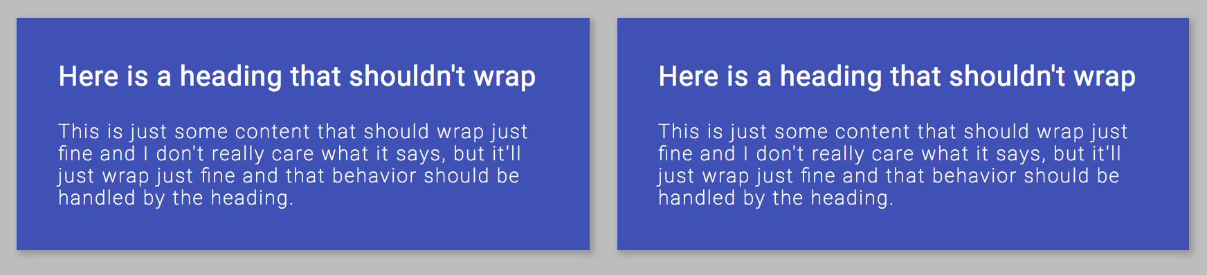
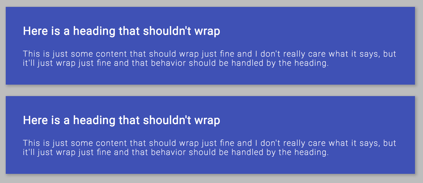
IE/Safariの動作:
flex: 1の代わりにflex-grow: 1; flex-basis: 0;を使用するか、省略形として必要な3つの値をすべて指定します。また、flex-basisを指定する場合は、必ず単位を指定してください。 https://jsbin.com/ketolifuhu/edit?html,css,output
いくつかのバグと不整合をカバーする良い記事があります https://philipwalton.com/articles/normalizing-cross-browser-flexbox-bugs/
:root {
    --dark-primary-color: #303F9F;
    --default-primary-color: #3F51B5;
    --light-primary-color: #C5CAE9;
    --text-primary-color: #FFFFFF;
    --accent-color: #FF4081;
    --primary-text-color: #212121;
    --secondary-text-color: #757575;
    --divider-color: #BDBDBD;
    --box-size: 150px;
    font-family: Roboto, 'sans-serif';
    font-size: 20px;
    letter-spacing: 1.25px;
    font-weight: 100;
    color: white;
}

body {
  background-color: #BDBDBD;
}

.flex-container {
  display: flex;
  flex-flow: row wrap;
  justify-content: space-between;
}

.flex-container > div {
  flex-grow: 1;
  margin: 10px;
  box-shadow: 2px 2px 6px 1px rgba(0,0,0,.2);
  padding: 30px;
  flex-basis: 0;
}

.left {
  background-color: #3F51B5;
}

.right {
  background-color: #3F51B5;
}

.heading {
  letter-spacing: .5px;
  font-weight: 400;
  white-space: nowrap;
}

.sub-text {
  margin-top: 20px;
  font-size: 14px;
}
<!DOCTYPE html>
<html>
<head>
<meta charset="utf-8">
<meta name="viewport" content="width=device-width">
<link href="https://fonts.googleapis.com/css?family=Roboto:100,400" rel="stylesheet">
<title>JS Bin</title>
</head>
<body>
<div class="flex-container">
<div class="left">
<div class="heading">Here is a heading that shouldn't wrap</div>
<div class="sub-text">This is just some content that should wrap just fine and I don't really care what it says, but it'll just wrap just fine and that behavior should be handled by the heading.</div>
</div>
<div class="right">
<div class="heading">Here is a heading that shouldn't wrap</div>
<div class="sub-text">This is just some content that should wrap just fine and I don't really care what it says, but it'll just wrap just fine and that behavior should be handled by the heading.</div>
</div>
</div>
</body>
</html>古いバージョンのブラウザにはデフォルト値が異なるため、「flex:1」の省略形を使用しないでください。問題が発生します。
他の多くの人がflex-basisの指定について言及していますが、単位を指定する必要があります。つまり「flex-basis:0」、「flex-basis:0%」、「flex-basis:0px」と記述しないでください。そうしないと、ブラウザによっては0の値の処理方法がわかりません。
ここで要点として、オーバーフローを避けるために、通常はflex-childにmax-width:100%を設定します。 flex-childにパディングがある場合、たとえばpadding-left:10px; padding-right:10px;次に、最大幅を100%からパディングを引いた値に設定します。つまり...
padding: 0 10px;
max-width: calc(100% - 20px);
これらの手順を実行して空白のnowrapを削除すると、バグを取り除くことができます。