ネストされたHTMLテーブルのマッチングテーブルの高さ
以下の例に示すように、単一のテーブルの外観を維持しながら、テーブル行内にテーブルをネストしようとしています(データ値を持つ単一行と2つのネストされたテーブルがあり、1つは2x2でもう1つは3x3です):
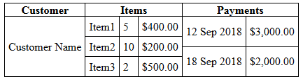
これは単なる例です。実際のテーブルには、かなり多くの行と列があります。コンテナーのサイズを気にすることなくテーブルのデータに合わせて列の幅と行の高さを自然にリフローするため(つまり、テーブルの幅= 100%)、テーブルを使用したいと思います。
私が抱えている問題は、最も高いテーブルが行の高さを設定しますが、他のテーブルはその高さに合わせて拡大されないため、このスニペットの結果に示すように、内部の境界線が上から下に伸びません。
.display {
        border-collapse: collapse;
}
.display, .display td, .display th {
        border: 1px solid black;
}
.subtable {
        border-collapse: collapse;
}
.subtable td {
        border-top: 0;
        border-bottom: 1px solid black;
        border-left: 0;
        border-right: 1px solid black;
}
.subtable tr td:last-of-type {
        border-top: 0;
        border-bottom: 1px solid black;
        border-left: 0;
  border-right: 0;
}
.subtable tr:last-of-type td {
        border-top: 0;
        border-bottom: 0;
        border-left: 0;
        border-right: 1px solid black;
}
.subtable tr:last-of-type td:last-of-type {
        border: 0;
}
td {
        padding: 5px;
}
td.d-subtable {
        padding: 0;
}
<table class="display" cellpadding="0">
<tr><th>Customer</th><th>Items</th><th>Payments</th></tr>
<tr><td>Customer Name</td>
<td class="d-subtable"><table class="subtable" cellpadding="0"><tr><td>Item1</td><td>5</td><td>$400.00</td></tr><tr><td>Item2</td><td>10</td><td>$200.00</td></tr><tr><td>Item3</td><td>2</td><td>$500.00</td></tr></table></td>
<td class="d-subtable"><table class="subtable" cellpadding="0"><tr><td>12 Sep 2018</td><td>$3,000.00</td></tr><tr><td>18 Sep 2018</td><td>$2,000.00</td></tr></table></td>
</tr>
</table>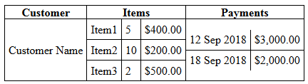
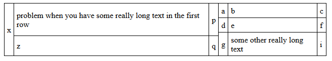
これで、rowspanを使用してこの問題を解決できることがわかりました(これが現在問題を解決している方法です)。これには、整列する行を事前に決定する必要があり、以下のスニペットによって生成されるような問題が発生する可能性があります。 2行のテーブルの最初の行(最後の行ではなく)にrowspan="2"を適用した場合、明らかに良いでしょう:
td {
  border: 1px solid black;
}

table {
  border-collapse: collapse;
  width: 500px;
}
<table cellpadding="5">
<tr><td rowspan="3">x</td>
<td>problem when you have some really long text in the first row</td><td>p</td><td>a</td><td>b</td><td>c</td></tr><tr><td rowspan="2">z</td><td rowspan="2">q</td><td>d</td><td>e</td><td>f</td></tr><tr><td>g</td><td>some other really long text</td><td>i</td>
</tr>
</table>
上記の表は次のようにするのがよいでしょう。
HTML/CSSを使用して私がやりたいことを達成する方法はありますか?テーブルにはたくさんの行があるので、レンダリングする前にブラウザで並べ替えてください。ただし、それが不可能な場合は、JavaScript/JQueryソリューションを利用できます。
更新
その時点で実行可能な解決策を見つけましたが(投稿された回答を参照)、列の幅を事前に(パーセンテージとしても)設定することが、可能なすべてのデータを予測できないために困難であるという状況に遭遇しました表示されます。だから私はそれをすることに依存しない答えを見つけたいと思っています。
必要なほど明確にしていないため、テーブルをネストする複数の行があり、列の幅だけでなく高さも一致させています。たとえば、2行の場合、次のようなレイアウトを作成できるようにしたいと思います。
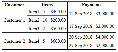
生のテーブルHTMLの場合、結果は次のようになります。
              .display {
                        border-collapse: collapse;
                }
                .display, .display td, .display th {
                        border: 1px solid black;
                }
                .subtable {
                        border-collapse: collapse;
                }
                .subtable td {
                        border-top: 0;
                        border-bottom: 1px solid black;
                        border-left: 0;
                        border-right: 1px solid black;
                }
                .subtable tr td:last-of-type {
                        border-top: 0;
                        border-bottom: 1px solid black;
                        border-left: 0;
                        border-right: 0;
                }
                .subtable tr:last-of-type td {
                        border-top: 0;
                        border-bottom: 0;
                        border-left: 0;
                        border-right: 1px solid black;
                }
                .subtable tr:last-of-type td:last-of-type {
                        border: 0;
                }
                td {
                        padding: 5px;
                }
                td.d-subtable {
                        padding: 0;
                }
<table class="display" cellpadding="0">
<tr><th>Customer</th><th>Items</th><th>Payments</th></tr>
<tr><td>Customer 1</td>
<td class="d-subtable"><table class="subtable" cellpadding="0"><tr><td>Item1</td><td>5</td><td>$400.00</td></tr><tr><td>Item2</td><td>100</td><td>$20.00</td></tr><tr><td>Item3</td><td>2</td><td>$500.00</td></tr></table></td>
<td class="d-subtable"><table class="subtable" cellpadding="0"><tr><td>12 Sep 2018</td><td>$3,000.00</td></tr><tr><td>18 Sep 2018</td><td>$2,000.00</td></tr></table></td>
</tr>
<tr><td>Customer 304</td>
<td class="d-subtable"><table class="subtable" cellpadding="0"><tr><td>Item4</td><td>5</td><td>$6.00</td></tr></table></td>
<td class="d-subtable"><table class="subtable" cellpadding="0"><tr><td>20 Sep 2018</td><td>$4.00</td></tr><tr><td>27 Sep 2018</td><td>$26.00</td></tr></table></td>
</tr>
</table>必要に応じてflexを使用することをお勧めします。 Flexは、コンテンツで簡単にガイドできるため、この種のレイアウトには非常に強力です。添付のスニペットをご覧ください。それは純粋にHTMLとCSSから作られています。固定サイズやJavascriptは必要ありません。
(古いスニペット)
.outer {
  display: flex;
  flex-wrap: wrap;

  /* For demo purposes */
  max-width: 500px;
  margin: 20px auto;
  border-left: 1px solid black;
  border-top: 1px solid black;
}

.column {
  flex: 1 1 auto;
  display: flex;
  flex-direction: column;
  flex-wrap: wrap;
}

.row {
  display: flex;
  flex-direction: row;
  flex: 1 1 auto;
}

.inner {
  flex: 1 1 auto;
  display: flex;
  flex-direction: column;
}

.item {
  border-right: 1px solid black;
  border-bottom: 1px solid black;
  text-align: center;
  padding: 3px;
}

.item.heading {
  font-weight: bold;
}

.item:not(.heading) {
  flex: 1 1 auto;
  justify-content: center;
  align-items: center;
  display: flex;
}

.fixed .narrow {
  flex-basis: 20px;
}
<div class="outer">
<div class="column">
<div class="item heading">Customer</div>
<div class="item">
<span>Customer Name</span>
</div>
</div>
<div class="column">
<div class="item heading">Items</div>
<div class="inner fixed">
<div class="row">
<div class="item">Item1</div>
<div class="item narrow">5</div>
<div class="item last">$400.00</div>
</div>
<div class="row">
<div class="item">Item2</div>
<div class="item narrow">10</div>
<div class="item last">$200.00</div>
</div>
<div class="row">
<div class="item">Item3</div>
<div class="item narrow">2</div>
<div class="item last">$500.00</div>
</div>
</div>
</div>
<div class="column">
<div class="item heading">Payments</div>
<div class="inner">
<div class="row">
<div class="item">12 sep 2018</div>
<div class="item">$3,000.00</div>
</div>
<div class="row">
<div class="item">
18 sep 2018
</div>
<div class="item">
$2,000.00
</div>
</div>
</div>
</div>
</div>更新:コメント/回答に応じて変更されます。 HTMLの構造によって多少異なります。見出しを独自の「.row.row-item "とそのため、列を揃えるためにフレックスベースを設定する必要がありました。これは、複数の" .row.row-item "。以下のスニペットを参照してください。
.outer {
  display: flex;
  flex-wrap: wrap;

  /* For demo purposes */
  max-width: 600px;
  margin: 20px auto;
  border-left: 1px solid black;
  border-top: 1px solid black;
}

.column {
  flex: 1 1 33.33%;
  display: flex;
  flex-direction: column;
  flex-wrap: wrap;
}

.row {
  display: flex;
  flex-direction: row;
  flex: 1 1 auto;
}

.row-item {
  flex-basis: 100%;
}

.inner {
  flex: 1 1 auto;
  display: flex;
  flex-direction: column;
}

.item {
  border-right: 1px solid black;
  border-bottom: 1px solid black;
  text-align: center;
}

.item.heading {
  font-weight: bold;
  flex: 1 1 33.33%;
}

.item:not(.heading) {
  flex: 1 1 33.33%;
  justify-content: center;
  align-items: center;
  display: flex;
}

.fixed .narrow {
  flex: 1 1 20px;
}
<div class="outer">
<div class="row row-item">
<div class="item heading">Customer</div>
<div class="item heading">Items</div>
<div class="item heading">Payments</div>
</div>
<div class="row row-item">
<div class="column">
<div class="item">
<span>Customer 1</span>
</div>
</div>
<div class="column">
<div class="inner fixed">
<div class="row">
<div class="item">Item1</div>
<div class="item narrow">5</div>
<div class="item last">$400.00</div>
</div>
<div class="row">
<div class="item">Item2</div>
<div class="item narrow">10</div>
<div class="item last">$200.00</div>
</div>
<div class="row">
<div class="item">Item3</div>
<div class="item narrow">2</div>
<div class="item last">$500.00</div>
</div>
</div>
</div>
<div class="column">
<div class="inner">
<div class="row">
<div class="item">12 sep 2018</div>
<div class="item">$3,000.00</div>
</div>
<div class="row">
<div class="item">
18 sep 2018
</div>
<div class="item">
$2,000.00
</div>
</div>
</div>
</div>
</div>
<div class="row row-item">
<div class="column">
<div class="item">
<span>Customer 304</span>
</div>
</div>
<div class="column">
<div class="inner fixed">
<div class="row">
<div class="item">Item4</div>
<div class="item narrow">5</div>
<div class="item last">$6.00</div>
</div>
</div>
</div>
<div class="column">
<div class="inner">
<div class="row">
<div class="item">20 sep 2018</div>
<div class="item">$4.00</div>
</div>
<div class="row">
<div class="item">
27 sep 2018
</div>
<div class="item">
$26.00
</div>
</div>
</div>
</div>
</div>
<div class="row row-item">
<div class="column">
<div class="item">
<span>Customer 605</span>
</div>
</div>
<div class="column">
<div class="inner fixed">
<div class="row">
<div class="item">Item5</div>
<div class="item narrow">50</div>
<div class="item last">$60.00</div>
</div>
<div class="row">
<div class="item">Item6</div>
<div class="item narrow">3</div>
<div class="item last">$260.00</div>
</div>
</div>
</div>
<div class="column">
<div class="inner">
<div class="row">
<div class="item">29 sep 2018</div>
<div class="item">$40.00</div>
</div>
<div class="row">
<div class="item">
30 sep 2018
</div>
<div class="item">
$206.00
</div>
</div>
</div>
</div>
</div>
</div>onload関数を記述して特定の行のすべてのネストされたテーブルの最大の高さを見つけ、その行のすべてのネストされたテーブルの高さを同じ値に設定することで、最終的にこれを解決できました。
window.onload=function () {
    let rows = document.querySelectorAll('tr');
    for (let r = 0; r < rows.length; r++) {
        let subtables = rows[r].querySelectorAll('.subtable');
        let maxHeight = 0;
        for (let i = 0; i < subtables.length; i++) {
            maxHeight = Math.max(maxHeight, subtables[i].clientHeight);
        }
        for (let i = 0; i < subtables.length; i++) subtables[i].style.height='' + maxHeight + 'px';
    }
};
このソリューションの唯一の欠点は、ネストされたテーブルの<td>sに幅を割り当てる必要があったことです。ただし、パーセンテージ幅を使用できるため、これはそれほど大きな問題ではありませんでした。
<table class="display" cellpadding="0">
    <tr><th>Customer</th><th>Items</th><th>Payments</th></tr>
    <tr><td>Customer 1</td>
        <td class="d-subtable"><table class="subtable" cellpadding="0"><tr><td width="35%">Item1</td><td width="20%">5</td><td width="45%">$400.00</td></tr><tr><td>Item2</td><td>10</td><td>$200.00</td></tr><tr><td>Item3</td><td>2</td><td>$500.00</td></tr></table></td>
        <td class="d-subtable"><table class="subtable" cellpadding="0"><tr><td width="60%">12 Sep 2018</td><td width="40%">$3,000.00</td></tr><tr><td>18 Sep 2018</td><td>$2,000.00</td></tr></table></td>
    </tr>
    <tr><td>Customer 2</td>
        <td class="d-subtable"><table class="subtable" cellpadding="0"><tr><td width="35%">Item4</td><td width="20%">5</td><td width="45%">$600.00</td></tr></table></td>
        <td class="d-subtable"><table class="subtable" cellpadding="0"><tr><td width="60%">20 Sep 2018</td><td width="40%">$4,000.00</td></tr><tr><td>27 Sep 2018</td><td>$2,000.00</td></tr></table></td>
    </tr>
</table>
最終出力:
この例は、フレックスボックス内でHTMLとネストされたCSSグリッドのみを使用するレスポンシブデザインです。
シナリオにヘッダーとページネーションプレースホルダーを自由に追加しました。これらは、残りのレイアウトに影響を与えることなく削除できます。
私はGitHubリポジトリ nested-CSS-Grid-and-Flexbox-Playground を作成しました。これには、Angularアプリケーションが動的データとこのレイアウトを使用して、蓄積した参照を使用しています)このプロジェクトを研究している間。
HTML
<!DOCTYPE html>
<html>
<head>
  <meta charset="utf-8" />
  <title></title>
</head>
<body>
  <div class="container">
    <div class="header">
      <h1>Customers List</h1>
    </div>
    <div class="list">
      <div class="customer-column-header">Customers</div>
      <div class="invoice-column-header">Invoices</div>
      <div class="payments-column-header">Payments</div>
      <div class="customer-row">
        <div class="customer-column">
          <div>Acme Widget Manufacturing, Inc.</div>
        </div>
        <ul class="invoice-column">
          <li class="invoice-row-header">
            <div>Description</div>
            <div>Quantity</div>
            <div>Price</div>
          </li>
          <li class="invoice-row">
            <div>Item 1</div>
            <div>5</div>
            <div>$400.00</div>
          </li>
          <li class="invoice-row">
            <div>Item 2</div>
            <div>10</div>
            <div>$200.00</div>
          </li>
          <li class="invoice-row">
            <div>Item 3</div>
            <div>2</div>
            <div>$500.00</div>
          </li>
        </ul>
        <ul class="payment-column">
          <li class="payment-row-header">
            <div>Date</div>
            <div>Amount</div>
          </li>
          <li class="payment-row">
            <div>12 Sep 2018</div>
            <div>$3,000.00</div>
          </li>
          <li class="payment-row">
            <div>18 Sep 2018</div>
            <div>$2,000.00</div>
          </li>
          <li class="payment-row">
            <div>12 Sep 2018</div>
            <div>$3,000.00</div>
          </li>
          <li class="payment-row">
            <div>18 Sep 2018</div>
            <div>$2,000.00</div>
          </li>
        </ul>
      </div>
      <div class="customer-row">
        <div class="customer-column">
          <div>Beta Company</div>
        </div>
        <ul class="invoice-column">
          <li class="invoice-row-header">
            <div>Description</div>
            <div>Quantity</div>
            <div>Price</div>
          </li>
          <li class="invoice-row">
            <div>Item 1</div>
            <div>5</div>
            <div>$400.00</div>
          </li>
          <li class="invoice-row">
            <div>Item 2</div>
            <div>10</div>
            <div>$200.00</div>
          </li>
          <li class="invoice-row">
            <div>Item 3</div>
            <div>2</div>
            <div>$500.00</div>
          </li>
        </ul>
        <ul class="payment-column">
          <li class="payment-row-header">
            <div>Date</div>
            <div>Amount</div>
          </li>
          <li class="payment-row">
            <div>12 Sep 2018</div>
            <div>$3,000.00</div>
          </li>
          <li class="payment-row">
            <div>18 Sep 2018</div>
            <div>$2,000.00</div>
          </li>
        </ul>
      </div>
    </div>
    <div class="pagination">
      <p>Pagination Placeholder</p>
    </div>
  </div>
</body>
</html>
CSS
*, *::before, *::after {
  margin: 0;
  padding: 0;
  box-sizing: inherit;
}

ul {
  list-style-type: none;
}

.container {
  width: 62.5rem;
  max-width: 80rem;
  margin: 0 auto;
  background-color: lightgray;
  display: flex;
  flex-direction: column;
  justify-content: center;
}

.header {
  padding: .5rem;
  background-color: darkgrey;
  align-self: center;
}

.list {
  background-color: darkcyan;
  display: grid;
  grid-template-columns: 1fr repeat(2, minmax(min-content, 1fr));
}

.customer-column-header {
  grid-column: 1 / 2;
}

.invoice-column-header {
  grid-column: 2 / 3;
}

.payments-column-header {
  grid-column: 3 / 4;
}

.customer-column-header,
.invoice-column-header,
.payments-column-header {
  padding: .5rem;
  text-align: center;
}

.customer-row {
  border-left: 1px solid;
  border-top: 1px solid;
  background-color: orangered;
  grid-column: 1 / -1;
  display: grid;
  grid-template-columns: 1fr repeat(2, minmax(min-content, 1fr));
}

.customer-column {
  grid-column: 1 / 2;
}

.invoice-column {
  grid-column: 2 / 3;
}

.payment-column {
  grid-column: 3 / 4;
}

.customer-column {
  align-self: center;
  justify-self: right;
}

  .customer-column > div {
    padding: 1rem;
  }

.invoice-column {
  border-left: 1px solid;
}

.invoice-row-header {
  background-color: darkcyan;
  border-bottom: 1px solid;
  display: grid;
  grid-template-columns: repeat(3, minmax(6rem, 1fr));
  justify-self: stretch;
}

  .invoice-row-header > div {
    text-align: right;
    padding: .5rem;
    justify-self: stretch;
    align-self: stretch;
  }

    .invoice-row-header > div:nth-child(2) {
      border-left: 1px solid;
      border-right: 1px solid;
    }

.invoice-row {
  border-bottom: 1px solid;
  display: grid;
  grid-template-columns: repeat(3, minmax(6rem, 1fr));
  justify-items: stretch;
  align-items: stretch;
}

  .invoice-row > div {
    text-align: right;
    padding: .5rem;
    justify-self: stretch;
    align-self: stretch;
  }

  .invoice-row div:nth-child(2) {
    border-left: 1px solid;
    border-right: 1px solid;
  }

.payment-column {
  border-left: 1px solid;
}

.payment-row-header {
  background-color: darkcyan;
  border-bottom: 1px solid;
  display: grid;
  grid-template-columns: repeat(2, minmax(6rem, 1fr));
  justify-self: stretch;
}

  .payment-row-header > div {
    text-align: right;
    padding: .5rem;
    justify-self: stretch;
    align-self: stretch;
  }

    .payment-row-header > div:nth-child(1) {
      border-right: 1px solid;
    }

.payment-row {
  border-bottom: 1px solid;
  display: grid;
  grid-template-columns: repeat(2, minmax(6rem, 1fr));
  justify-items: stretch;
  align-items: stretch;
}

  .payment-row > div {
    text-align: right;
    padding: .5rem;
    justify-self: stretch;
    align-self: stretch;
  }

    .payment-row > div:nth-child(1) {
      border-right: 1px solid;
    }

.pagination {
  padding: .5rem;
  background-color: darkgrey;
  align-self: center;
}

@media only screen and (min-width: 120rem) {

  .container {
    max-width: 80rem;
    margin: 0;
  }
}

@media only screen and (max-width: 80rem) {

  .container {
    max-width: 62.5rem;
    margin: 0 auto;
  }
}

@media only screen and (max-width: 62.5rem) {

  .container {
    max-width: 45rem;
    margin: 0 auto;
  }

  .list {
    grid-template-columns: repeat(autofit, 100%);
  }

  .customer-column-header,
  .invoice-column-header,
  .payments-column-header {
    grid-column: 1 / -1;
  }

  .customer-row {
    grid-template-columns: repeat(autofit, 100%);
    justify-content: center;
  }

    .customer-row .customer-column,
    .customer-row .invoice-column,
    .customer-row .payments-column {
      grid-column: 1 / -1;
    }

  .customer-column {
    justify-self: center;
  }
}

@media only screen and (max-width: 45rem) {

  .container {
    width: 100%;
    margin: 0 auto;
  }
}
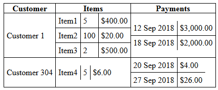
rowspansまたはcolspansはこのテーブルを作成するのに無害でした
以下は、テーブルとsanad theadの図です。
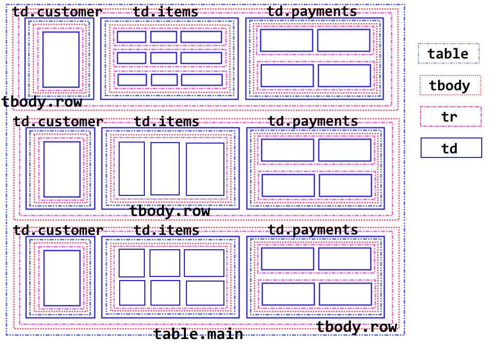
"列"という用語は、大まかに呼ばれています。例:列td.itemsはすべてを参照しますtd.itemsグループとして。
メインテーブルがあります...
...そして、各顧客行のtbody。複数のtbodyを持つことは有効です。
次はtrです...
... a td。このtdは列です:
.customer、.items、.payments。各td内には、サブテーブルとサブtbodyがあります。
最初の列
td.customerは、各tbody.rowは単なるお客様の名前です。この列のセルには、tbody.row高さ(デモのコメントを参照)。- 2番目の列
td.itemsは複数のサブ行を持つことができ、デモ機能は1〜3サブ行です。 - 最後の列
td.paymentsには複数のサブ行も含めることができ、デモにはそれぞれ2つのサブ行があります。
デモ
詳細はデモでコメントされています
デモは応答性があります(エッジケースとモバイルデバイスにはMQが必要な場合があります)。
有効なHTML/CSSで、意味的に適切です。
JavaScript/jQueryはありません。
純粋に
<table>、<thead>、<tbody>、<tr>、<th>、<td>タグ(divやspanでもありません)。
* { border: 0px none transparent; padding: 0px; margin: 0px; }

/*
|- table-layout: fixed;
|| Gives you more control over table behavior such as setting column widths and
|| table adhering to them.
===
|- height: 100%; width: 100%;
|| Applied to table.main as well as the nested tables. It facilitates all of
|| the nested tables to stretch evenly within tbody.row.
*/
table { border-collapse: collapse; border: 2px solid #000;
table-layout: fixed; height: 100%; width: 100%; }

table table { border: 1px solid #000; }

.main { min-height: 40vh; }

th { border-bottom: 2px solid #000; outline: 1px solid #000; }

/*
|| This rule set determines content wrapping behavior within each cell.
*/
td td { border: 1px solid #000; padding: 0px 5px; Word-wrap: break-Word;
Word-break:break-Word; overflow: hidden}

.items td:first-of-type { width: 30%; }

.items td:nth-of-type(2) { width: 25%; text-align: right; }

.items td:last-of-type { width: 45%; text-align: right; }

.payments td:last-of-type { text-align: right; }

.customer,
.items,
.payments { border: 0px none transparent; padding: 0px; }

th:first-of-type { border-left: 3px solid #000; width: 20%; }

th:nth-of-type(2) { width: 40%; }

th:last-of-type { border-right: 3px solid #000; width: 40%; }

/*
|| This allows the tr.row to always be equal in height as well as being
|| responsive. This column was the best choice as the one to stabilize height
|| since the content probably changes the least and it has the most space to use
|| hidden spacers (see next comment).
*/
.customer table { min-height: 20vh; }

/*
|| This sets a   within the cells in the first column. Although vh units
|| are very responsive, they will start collapsing if the viewport height is
|| reduced disproportionately vs. viewport width. Thus, this pseudo-element
|| ensures a minimum height of 60px for both tr.row.
*/
.customer td::after { content: '\a0'; display: inline-block; width:0.5px;
min-height: 60px; line-height: 60px; vertical-align: middle; }
<!DOCTYPE html>
<html>
<head>
<meta charset='utf-8'>
</head>
<body>
<table class='main'>
<thead>
<tr>
<th>Customer</th><th>Items</th><th>Payments</th>
</tr>
</thead>
<tbody class='row'>
<tr>
<td class='customer'>
<table><tr><td>
Customer 1
</td></tr></table>
</td>
<td class='items'>
<table>
<tr><td>Item1</td><td>5</td><td>$400.00</td></tr>
<tr><td>Item2</td><td>100</td><td>$20.00</td></tr>
<tr><td>Item3</td><td>2</td><td>$500.00</td></tr>
</table>
</td>
<td class='payments'>
<table>
<tr><td>12 Sep 2018</td><td>$3,000.00</td></tr>
<tr><td>18 Sep 2018</td><td>$2,000.00</td></tr>
</table>
</td>
</tr>
</tbody>
<tbody class='row'>
<tr>
<td class='customer'>
<table><tr><td>
Customer 304
</td></tr></table>
</td>
<td class='items'>
<table>
<tr><td>Item4</td><td>5</td><td>$6.00</td></tr>
</table>
</td>
<td class='payments'>
<table>
<tr><td>20 Sep 2018</td><td>$4.00</td></tr>
<tr><td>27 Sep 2018</td><td>$26.00</td></tr>
</table>
</td>
</tr>
</tbody>
<tbody class='row'>
<tr>
<td class='customer'>
<table><tr><td>
Customer 888
</td></tr></table>
</td>
<td class='items'>
<table>
<tr><td>Item5</td><td>50</td><td>$100.00</td></tr>
<tr><td>Item6</td><td>10</td><td>$500.00</td></tr>
</table>
</td>
<td class='payments'>
<table>
<tr><td>10 Nov 2018</td><td>$3,000.00</td></tr>
<tr><td>17 Nov 2018</td><td>$7,000.00</td></tr>
</table>
</td>
</tr>
</tbody>
</table>
</body>
</html>参考文献
以下は、行の高さと列の幅の両方を自動的に設定し(列の幅を指定する必要がない)、サイズ変更をサポートするJavaScriptソリューションです。
完全なソリューション/デモはここにあります: http://jsfiddle.net/ez0jqc1L/
ただし、すべての<td>セルの内容を<div class="content"></div>でラップする必要があることに注意してください(例については、jsfiddleを参照してください)。
まず、サブテーブルの高さを修正します。
let tbody = /* the tbody of the <table> containing subtables we are fixing */;
for(let r = 0; r < tbody.children.length; r++) {
    let row = tbody.children[r];
    let subtables = row.querySelectorAll('.subtable');
    let maxHeight = 0;
    for(let i = 0; i < subtables.length; i++) {
        maxHeight = Math.max(maxHeight, subtables[i].clientHeight);
    }
    for(let i = 0; i < subtables.length; i++) {
        subtables[i].style.height = maxHeight + 'px';
    }
}
次に、すべてのサブテーブル列を反復処理して、垂直方向に隣接するセルの各セットの最大幅を計算します(これをmaxColWidths配列に格納します。配列の各インデックスは、垂直方向に隣接するセルのセットに対応します)。
let forEachSubtableColumn = function(f) {
    for(let r = 0; r < tbody.children.length; r++) {
        let row = tbody.children[r];
        let subtables = row.querySelectorAll('.subtable');
        let c = 0;
        for(let i = 0; i < subtables.length; i++) {
            let subtable = subtables[i];
            if(subtable.children.length === 0 || subtable.children[0].children.length === 0) {
                continue;
            }
            let stbody = subtable.children[0];
            for(let j = 0; j < stbody.children.length; j++) {
                let srow = stbody.children[j];
                for(let k = 0; k < srow.children.length; k++) {
                    let td = srow.children[k];
                    f(c + k, td);
                }
            }
            c += stbody.children[0].children.length;
        }
    }
};
let maxColWidths = [];
forEachSubtableColumn(function(c, td) {
    if(c >= maxColWidths.length) {
        maxColWidths.Push(td.children[0].clientWidth);
    } else {
        maxColWidths[c] = Math.max(td.children[0].clientWidth, maxColWidths[c]);
    }
});
最後に、列幅を設定します。 <div class="content">の幅を設定してもブラウザがその正確な幅を保証するわけではないため、ここで<td>のラッピングが必要になりますが、display: inline-blockを持つ要素でこの保証を得ることができます。
forEachSubtableColumn(function(c, td) {
    td.children[0].style.width = maxColWidths[c] + 'px';
});
サイズ変更のサポートのために、すべての強制された幅と高さをクリアして、後で再計算できるようにします。
onresize = function() {
    let tables = document.querySelectorAll('.subtable');
    for(let i = 0; i < tables.length; i++) {
        let table = tables[i];
        table.style.removeProperty('height');
    }
    let tds = document.querySelectorAll('.subtable td');
    for(let i = 0; i < tds.length; i++) {
        let td = tds[i];
        td.children[0].style.removeProperty('width');
    }
    updateTables();
};
EDIT:onresizeコードを修正しました。
Googleスプレッドシートなどのオンラインスプレッドシートプログラムを使用すると見栄えが簡単になりますが、初めて使用したときははるかに複雑でした。各行に、row = "r_1"のような特別な属性と、row = "r_1" subrow = "sr_1_a"のようなサブ行固有の属性を与えました。 onkeyupイベントまたはonloadトリガーの数式で、querySelectorAllを使用してすべての親行を検索し、それらの高さがすべてのサブ行の高さの合計と等しくなるようにしました。
<table>タグの意味が、現在のHTMLと以前のHTMLの間で変更されました。 <table>はより多くのフォーマット機能を提供するために使用されていましたが、HTML5ではリテラルテーブルにのみ使用する必要があります。他の人が述べたように、あなたの設定は文字通りの意味で実際にはテーブルのようには見えません。したがって、ネストされた<table>要素の束を使用すると、期待どおりの結果が得られますが、おそらく最も効果的な方法ではありません。
いくつかの基本的なCSSとともに<div>要素をネストするだけでこれを実現できます。次に例を示します。
<div style="width: 1000px; height: 600px; border: 1px solid #000;">
  <div style="width: 100px; height: 600px; display: inline-block; border: 1px solid #000; margin: 0; padding: 0;">X</div>
  <div style="width: 100px; height: 300px; display: inline-block; border: 1px solid #000; margin: 0; padding: 0;">Y</div>
  <div style="width: 100px; height: 300px; display: inline-block; border: 1px solid #000; position: relative; top: 300px; margin: 0; padding: 0; left: -105px;">Z</div>
</div>
これにより、上で説明したディスプレイのX、Y、Z部分が生成されます。同じ手法を拡張して、ディスプレイの残りの部分を構築できます。
注意すべきいくつかの点:
- この例では、PXを使用して幅を決定します。これは、CSSパースペクティブを形成する本当に悪い習慣です。モバイルでは大きすぎ、大きなデスクトップでは小さすぎます。ただし、この手法を適応させて、より適応性の高い形式を使用することもできます。ただし、これによりソリューションが複雑になります。そのため、例としてPXを使用することにしました。
- この例は、ソリューションを示す最も簡単な方法であるため、インラインCSSを使用しています。ただし、これは本当に悪い習慣です。実際には行わないでください!
お役に立てれば。