外側のdivのサイズが変更されたときにスクロール可能なdivが下部に固定される
チャットアプリの例を次に示します->
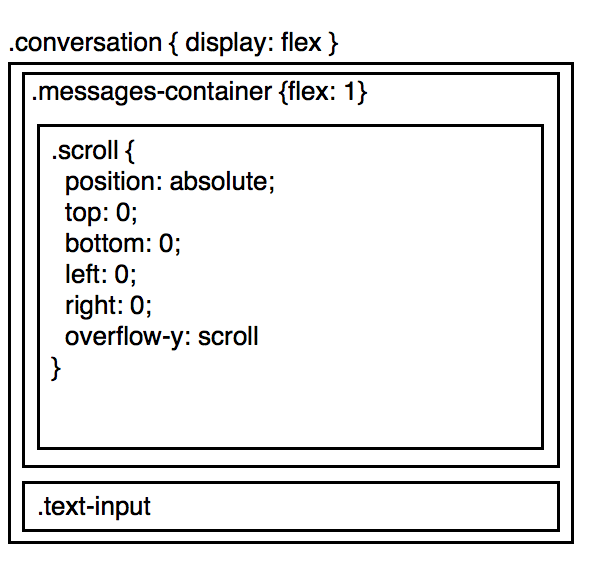
ここでのアイデアは、.messages-containerできるだけ多くの画面を占有します。以内に .messages-container、.scrollはメッセージのリストを保持し、画面のサイズよりも多くのメッセージがある場合にスクロールします。
さて、この場合を考えてみましょう:
- ユーザーは会話の一番下までスクロールします
.text-input、動的に大きくなります
これで、ユーザーが会話の下部までスクロールし続ける代わりに、テキスト入力が増加し、下部が表示されなくなります。
それを修正する1つの方法は、reactを使用している場合、text-inputの高さを計算し、何か変更があれば、.messages-containerに知らせます
componentDidUpdate() {
  window.setTimeout(_ => {
    const newHeight = this.calcHeight();
    if (newHeight !== this._oldHeight) {
      this.props.onResize();
    }
    this._oldHeight = newHeight;
  });
}
しかし、これは目に見えるパフォーマンスの問題を引き起こし、このようにメッセージを渡すのは悲しいことです。
もっと良い方法はありますか?このような方法でcssを使用して、.text-input-increasesの場合、本質的にshift upすべての.messages-container
2:この回答の2番目のリビジョン
ここであなたの友人はflex-direction: column-reverse;です。これは、たとえばSkypeや他の多くのチャットアプリと同じように、メッセージコンテナの下部でメッセージを調整しながら、あなたが尋ねるすべてを行います。
.chat-window{
  display:flex;
  flex-direction:column;
  height:100%;
}
.chat-messages{
  flex: 1;
  height:100%;
  overflow: auto;
  display: flex;
  flex-direction: column-reverse;
}

.chat-input { border-top: 1px solid #999; padding: 20px 5px }
.chat-input-text { width: 60%; min-height: 40px; max-width: 60%; }
flex-direction: column-reverse;のマイナス面はIE/Edge/Firefoxのバグです。スクロールバーは表示されません。詳細は Firebox/IEのFlexbox列反転とオーバーフローです。
利点は、モバイル/タブレットで約90%、デスクトップで約65%のブラウザをサポートしており、バグが修正されるとカウントされます...回避策があります。
// scroll to bottom
function updateScroll(el){
  el.scrollTop = el.scrollHeight;
}
// only shift-up if at bottom
function scrollAtBottom(el){
  return (el.scrollTop + 5 >= (el.scrollHeight - el.offsetHeight));
}
以下のコードスニペットでは、上記の2つの関数を追加して、IE/Edge/Firefoxがflex-direction: column-reverse;と同じように動作するようにしました。
function addContent () {
  var msgdiv = document.getElementById('messages');
  var msgtxt = document.getElementById('inputs');
  var atbottom = scrollAtBottom(msgdiv);

  if (msgtxt.value.length > 0) {
    msgdiv.innerHTML += msgtxt.value + '<br/>';
    msgtxt.value = "";
  } else {
    msgdiv.innerHTML += 'Long long content ' + (tempCounter++) + '!<br/>';
  }

  /* if at bottom and is IE/Edge/Firefox */
  if (atbottom && (!isWebkit || isEdge)) {
    updateScroll(msgdiv);
  }
}

function resizeInput () {
  var msgdiv = document.getElementById('messages');
  var msgtxt = document.getElementById('inputs');
  var atbottom = scrollAtBottom(msgdiv);

  if (msgtxt.style.height == '120px') {
    msgtxt.style.height = 'auto';
  } else {
    msgtxt.style.height = '120px';
  }

  /* if at bottom and is IE/Edge/Firefox */
  if (atbottom && (!isWebkit || isEdge)) {
    updateScroll(msgdiv);
  }
}


/* fix for IE/Edge/Firefox */
var isWebkit = ('WebkitAppearance' in document.documentElement.style);
var isEdge = ('-ms-accelerator' in document.documentElement.style);
var tempCounter = 6;

function updateScroll(el){
  el.scrollTop = el.scrollHeight;
}
function scrollAtBottom(el){
  return (el.scrollTop + 5 >= (el.scrollHeight - el.offsetHeight));
}
html, body { height:100%; margin:0; padding:0; }
.chat-window{
display:flex;
flex-direction:column;
height:100%;
}
.chat-messages{
flex: 1;
height:100%;
overflow: auto;
display: flex;
flex-direction: column-reverse;
}
.chat-input { border-top: 1px solid #999; padding: 20px 5px }
.chat-input-text { width: 60%; min-height: 40px; max-width: 60%; }
/* temp. buttons for demo */
button { width: 12%; height: 44px; margin-left: 5%; vertical-align: top; }
/* begin - fix for hidden scrollbar in IE/Edge/Firefox */
.chat-messages-text{ overflow: auto; }
@media screen and (-webkit-min-device-pixel-ratio:0) {
.chat-messages-text{ overflow: visible; }
/* reset Edge as it identifies itself as webkit */
@supports (-ms-accelerator:true) { .chat-messages-text{ overflow: auto; } }
}
/* hide resize FF */
@-moz-document url-prefix() { .chat-input-text { resize: none } }
/* end - fix for hidden scrollbar in IE/Edge/Firefox */<div class="chat-window">
<div class="chat-messages">
<div class="chat-messages-text" id="messages">
Long long content 1!<br/>
Long long content 2!<br/>
Long long content 3!<br/>
Long long content 4!<br/>
Long long content 5!<br/>
</div>
</div>
<div class="chat-input">
<textarea class="chat-input-text" placeholder="Type your message here..." id="inputs"></textarea>
<button onclick="addContent();">Add msg</button>
<button onclick="resizeInput();">Resize input</button>
</div>
</div>サイドノート1:検出方法は完全にはテストされていませんが、新しいブラウザーで動作するはずです。
サイドノート2:チャット入力のサイズ変更イベントハンドラーを添付する方が、updateScroll関数を呼び出すよりも効率的です。
注:彼のhtml構造を再利用したHaZardouSへのクレジット
CSSルールセットが1つだけ必要です:
.messages-container, .scroll {transform: scale(1,-1);}
これで完了です!
仕組み:最初に、コンテナ要素を垂直に反転させて、上部が下部になるようにし(目的のスクロール方向を与えます)、次にメッセージが逆さまにならないように、コンテンツ要素。
このアプローチは、最新のすべてのブラウザーで機能します。ただし、奇妙な副作用があります。メッセージボックスでマウスホイールを使用すると、スクロールの方向が逆になります。これは、以下に示すように、数行のJavaScriptで修正できます。
以下にデモと fiddle を示します:
//Reverse wheel direction
document.querySelector('.messages-container').addEventListener('wheel', function(e) {
  if(e.deltaY) {
    e.preventDefault();
    e.currentTarget.scrollTop -= parseFloat(getComputedStyle(e.currentTarget).getPropertyValue('font-size')) * (e.deltaY < 0 ? -1 : 1) * 2;
  }
});

//The rest of the JS just handles the test buttons and is not part of the solution
send = function() {
  var inp = document.querySelector('.text-input');
  document.querySelector('.scroll').insertAdjacentHTML('beforeend', '<p>' + inp.value);
  inp.value = '';
  inp.focus();
}
resize = function() {
  var inp = document.querySelector('.text-input');
  inp.style.height = inp.style.height === '50%' ? null : '50%';
}
html,body {height: 100%;margin: 0;}
.conversation {
display: flex;
flex-direction: column;
height: 100%;
}
.messages-container {
flex-shrink: 10;
height: 100%;
overflow: auto;
}
.messages-container, .scroll {transform: scale(1,-1);}
.text-input {resize: vertical;}<div class="conversation">
<div class="messages-container">
<div class="scroll">
<p>Message 1<p>Message 2<p>Message 3<p>Message 4<p>Message 5
<p>Message 6<p>Message 7<p>Message 8<p>Message 9<p>Message 10
</div>
</div>
<textarea class="text-input" autofocus>Your message</textarea>
<div>
<button id="send" onclick="send();">Send input</button>
<button id="resize" onclick="resize();">Resize input box</button>
</div>
</div>次のフィドルを試してください- https://jsfiddle.net/Hazardous/bypxg25c/ 。フィドルは現在、テキスト領域を拡大/サイズ変更するためにjQueryを使用していますが、cruxは、messages-containerおよびinput-containerクラスに使用されるflex関連のスタイルです-
.messages-container{
  order:1;
  flex:0.9 1 auto;
  overflow-y:auto;
  display:flex;
  flex-direction:row;
  flex-wrap:nowrap;
  justify-content:flex-start;
  align-items:stretch;
  align-content:stretch;
}

.input-container{
  order:2;
  flex:0.1 0 auto;
}
Flex-shrink値は、.messages-containerの場合は1に、.input-containerの場合は0に設定されます。これにより、サイズの再割り当てがある場合にメッセージコンテナが縮小されます。
text-inputをmessages内に移動し、コンテナの下部に絶対配置し、それに応じてスペースにmessages十分な下部パディングを指定しました。
いくつかのコードを実行してクラスをconversationに追加します。これにより、Nice CSS遷移アニメーションを使用して、text-inputの高さとmessagesの下部パディングが変更されます。
JavaScriptは、CSSトランジションの実行と同時に「scrollTo」関数を実行して、スクロールを下部に保持します。
スクロールが再び下に来たら、conversationからクラスを削除します
お役に立てれば。
https://jsfiddle.net/cnvzLfso/5/
var doScollCheck = true;
var objConv = document.querySelector('.conversation');
var objMessages = document.querySelector('.messages');
var objInput = document.querySelector('.text-input');

function scrollTo(element, to, duration) {
  if (duration <= 0) {
    doScollCheck = true;
    return;
  }
  var difference = to - element.scrollTop;
  var perTick = difference / duration * 10;

  setTimeout(function() {
    element.scrollTop = element.scrollTop + perTick;
    if (element.scrollTop === to) {
      doScollCheck = true;
      return;
    }
    scrollTo(element, to, duration - 10);
  }, 10);
}

function resizeInput(atBottom) {
  var className = 'bigger',
    hasClass;
  if (objConv.classList) {
    hasClass = objConv.classList.contains(className);
  } else {
    hasClass = new RegExp('(^| )' + className + '( |$)', 'gi').test(objConv.className);
  }
  if (atBottom) {
    if (!hasClass) {
      doScollCheck = false;
      if (objConv.classList) {
        objConv.classList.add(className);
      } else {
        objConv.className += ' ' + className;
      }
      scrollTo(objMessages, (objMessages.scrollHeight - objMessages.offsetHeight) + 50, 500);
    }
  } else {
    if (hasClass) {
      if (objConv.classList) {
        objConv.classList.remove(className);
      } else {
        objConv.className = objConv.className.replace(new RegExp('(^|\\b)' + className.split(' ').join('|') + '(\\b|$)', 'gi'), ' ');
      }
    }
  }
}

objMessages.addEventListener('scroll', function() {
  if (doScollCheck) {
    var isBottom = ((this.scrollHeight - this.offsetHeight) === this.scrollTop);
    resizeInput(isBottom);
  }
});
html,
body {
height: 100%;
width: 100%;
background: white;
}
body {
margin: 0;
padding: 0;
}
.conversation {
display: flex;
flex-direction: column;
justify-content: space-between;
height: 100%;
position: relative;
}
.messages {
overflow-y: scroll;
padding: 10px 10px 60px 10px;
-webkit-transition: padding .5s;
-moz-transition: padding .5s;
transition: padding .5s;
}
.text-input {
padding: 10px;
-webkit-transition: height .5s;
-moz-transition: height .5s;
transition: height .5s;
position: absolute;
bottom: 0;
height: 50px;
background: white;
}
.conversation.bigger .messages {
padding-bottom: 110px;
}
.conversation.bigger .text-input {
height: 100px;
}
.text-input input {
height: 100%;
}<div class="conversation">
<div class="messages">
<p>
This is a message content
</p>
<p>
This is a message content
</p>
<p>
This is a message content
</p>
<p>
This is a message content
</p>
<p>
This is a message content
</p>
<p>
This is a message content
</p>
<p>
This is a message content
</p>
<p>
This is a message content
</p>
<p>
This is a message content
</p>
<p>
This is a message content
</p>
<p>
This is a message content
</p>
<p>
This is a message content
</p>
<p>
This is a message content
</p>
<p>
This is a message content
</p>
<p>
This is the last message
</p>
<div class="text-input">
<input type="text" />
</div>
</div>
</div>あなたが書く;
Now, consider this case:

    The user scrolls to the bottom of the conversation
    The .text-input, dynamically gets bigger
.text-inputを動的に設定するメソッドは、this.props.onResize()を起動する論理的な場所ではありませんか。