純粋なQML + JSで円形のプログレスバーを作成するにはどうすればよいですか?
私のアプリケーションはQML + JSを使用して作成されており、円形のプログレスバーウィジェットを作成しようとしています。 QML Rectangleを使用して円を作成し、半径をwidth/2に設定して、円を作成できます。それからプログレスバーを作成するにはどうすればよいですか?
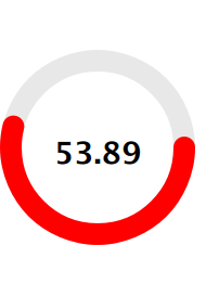
以下のモックアップを実装する予定です。

Canvasを使用して基本的な循環プログレスを実装しました。

import QtQml 2.2
import QtQuick 2.0

// draws two arcs (portion of a circle)
// fills the circle with a lighter secondary color
// when pressed
Canvas {
    id: canvas
    width: 240
    height: 240
    antialiasing: true

    property color primaryColor: "orange"
    property color secondaryColor: "lightblue"

    property real centerWidth: width / 2
    property real centerHeight: height / 2
    property real radius: Math.min(canvas.width, canvas.height) / 2

    property real minimumValue: 0
    property real maximumValue: 100
    property real currentValue: 33

    // this is the angle that splits the circle in two arcs
    // first arc is drawn from 0 radians to angle radians
    // second arc is angle radians to 2*PI radians
    property real angle: (currentValue - minimumValue) / (maximumValue - minimumValue) * 2 * Math.PI

    // we want both circle to start / end at 12 o'clock
    // without this offset we would start / end at 9 o'clock
    property real angleOffset: -Math.PI / 2

    property string text: "Text"

    signal clicked()

    onPrimaryColorChanged: requestPaint()
    onSecondaryColorChanged: requestPaint()
    onMinimumValueChanged: requestPaint()
    onMaximumValueChanged: requestPaint()
    onCurrentValueChanged: requestPaint()

    onPaint: {
        var ctx = getContext("2d");
        ctx.save();

        ctx.clearRect(0, 0, canvas.width, canvas.height);

        // fills the mouse area when pressed
        // the fill color is a lighter version of the
        // secondary color

        if (mouseArea.pressed) {
            ctx.beginPath();
            ctx.lineWidth = 1;
            ctx.fillStyle = Qt.lighter(canvas.secondaryColor, 1.25);
            ctx.arc(canvas.centerWidth,
                    canvas.centerHeight,
                    canvas.radius,
                    0,
                    2*Math.PI);
            ctx.fill();
        }

        // First, thinner arc
        // From angle to 2*PI

        ctx.beginPath();
        ctx.lineWidth = 1;
        ctx.strokeStyle = primaryColor;
        ctx.arc(canvas.centerWidth,
                canvas.centerHeight,
                canvas.radius,
                angleOffset + canvas.angle,
                angleOffset + 2*Math.PI);
        ctx.stroke();


        // Second, thicker arc
        // From 0 to angle

        ctx.beginPath();
        ctx.lineWidth = 3;
        ctx.strokeStyle = canvas.secondaryColor;
        ctx.arc(canvas.centerWidth,
                canvas.centerHeight,
                canvas.radius,
                canvas.angleOffset,
                canvas.angleOffset + canvas.angle);
        ctx.stroke();

        ctx.restore();
    }

    Text {
        anchors.centerIn: parent

        text: canvas.text
        color: canvas.primaryColor
    }

    MouseArea {
        id: mouseArea

        anchors.fill: parent
        onClicked: canvas.clicked()
        onPressedChanged: canvas.requestPaint()
    }
}
通常のQtQuickProgressBarコンポーネントのスタイリングにも使用できるプレーンQMLのちょっとエレガントなソリューションを見つけました。この背後にある考え方は、境界線でのみConicalGradientを使用することです-Rectangleのみ。
コードは次のとおりです。
import QtQuick 2.3
import QtQuick.Controls.Styles 1.2
import QtGraphicalEffects 1.0

ProgressBarStyle
{
   panel : Rectangle
   {
      color: "transparent"
      implicitWidth: 80
      implicitHeight: implicitWidth

      Rectangle
      {
         id: outerRing
         z: 0
         anchors.fill: parent
         radius: Math.max(width, height) / 2
         color: "transparent"
         border.color: "gray"
         order.width: 8
      }

      Rectangle
      {
         id: innerRing
         z: 1
         anchors.fill: parent
         anchors.margins: (outerRing.border.width - border.width) / 2
         radius: outerRing.radius
         color: "transparent"
         border.color: "darkgray"
         border.width: 4

         ConicalGradient
         {
            source: innerRing
            anchors.fill: parent
            gradient: Gradient
            {
               GradientStop { position: 0.00; color: "white" }
               GradientStop { position: control.value; color: "white" }
               GradientStop { position: control.value + 0.01; color: "transparent" }
               GradientStop { position: 1.00; color: "transparent" }
            }
         }
      }

      Text
      {
         id: progressLabel
         anchors.centerIn: parent
         color: "black"
         text: (control.value * 100).toFixed() + "%"
      }
   }
}

私は GitHubのDiego Dottaによる例 このユースケースでうまく機能するように見える2つの回転する円を使用していることに遭遇しました。これには、PropertyAnimationの期間の設定が含まれます。したがって、これは設定可能なタイマーではうまく機能しますが、所要時間がわからない場合は別のアプローチが必要になります。これは少し調整され、QtQuick2.0に移植されています。
main.qml:
import QtQuick 2.0
import Ubuntu.Components 0.1

Rectangle {
    width: units.gu(50)
    height: units.gu(50)

    property int seconds : 0

    LoadCircle {
        id: circle
        anchors.centerIn: parent
        loadtimer: 10*1000 // 10 seconds
        Component.onCompleted: start();
        onFinishedChanged: {
            timer.stop();
            borderColor = "green"
        }
    }

    Rectangle {
        id : theTimer
        anchors.centerIn: parent
        width : units.gu(10) ; height: units.gu(10)

        Label {
            text: seconds
            font.bold: true
            fontSize: "x-large"
            anchors.centerIn: parent
        }
    }

    Timer {
        id: timer
        interval: 1000; running: true; repeat: true;
        onTriggered: seconds++;
    }

}
LoadCircle.qml:
import QtQuick 2.0
import Ubuntu.Components 0.1

Row{
    id: circle

    property int loadtimer: 4000
    property color circleColor: "transparent"
    property color borderColor: "red"
    property int borderWidth: 10
    property alias running: initCircle.running
    property bool finished: false;

    width: units.gu(30)
    height: width

    function start(){
        part1.rotation = 180
        part2.rotation = 180
        initCircle.start()
    }

    function stop(){
        initCircle.stop()
    }

    Item{
        width: parent.width/2
        height: parent.height
        clip: true

        Item{
            id: part1
            width: parent.width
            height: parent.height
            clip: true
            rotation: 180
            transformOrigin: Item.Right

            Rectangle{
                width: circle.width-(borderWidth*2)
                height: circle.height-(borderWidth*2)
                radius: width/2
                x:borderWidth
                y:borderWidth
                color: circleColor
                border.color: borderColor
                border.width: borderWidth
                smooth: true
            }
        }
    }

    Item{
        width: parent.width/2
        height: parent.height
        clip: true

        Item{
            id: part2
            width: parent.width
            height: parent.height
            clip: true

            rotation: 180
            transformOrigin: Item.Left

            Rectangle{
                width: circle.width-(borderWidth*2)
                height: circle.height-(borderWidth*2)
                radius: width/2
                x: -width/2
                y: borderWidth
                color: circleColor
                border.color: borderColor
                border.width: borderWidth
                smooth: true
            }
        }
    }
    SequentialAnimation{
        id: initCircle
        PropertyAnimation{ target: part2; property: "rotation"; to:360; duration:loadtimer/2 }
        PropertyAnimation{ target: part1; property: "rotation"; to:360; duration:loadtimer/2 }
        ScriptAction { script: finished = true; }
    }
}

rotationプロパティを使用した解決策を知っています。例を見る
https://gitorious.org/apps-4-me/staq-me/source/fd20fe5b6fec053f364219842905e2afc5cfdc9d:ui.qml#L172
EEIoT( https://github.com/IndeemaSoftware/EEIoT )ノブコンポーネントを使用するだけです。パラメータをAngle:0からtoAngle:Math.PI * 2に変更します。逆にする:進行状況を逆にする必要がある場合はtrue
    Knob {
    id: knob
    x: 0
    y: 83
    width: 100
    height: 100
    from:0
    to: 100
    fromAngle: 0
    toAngle: Math.PI*2
    reverse: false
}