Angular Materialでmd-selectドロップダウン位置を制御する方法
オプションリストが従来の選択のように機能するように、md-selectをカスタマイズする必要があります。オプションは、要素の上にホバーするのではなく、選択要素の下に表示されます。誰かがこのようなものが存在すること、またはこれを達成する方法を知っていますか?
どうぞ- CodePen
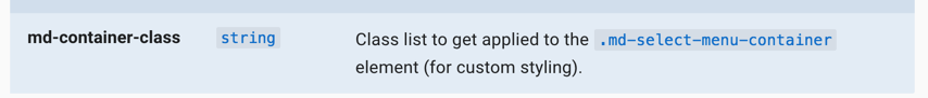
使用 md-container-class属性。 docs から:
Markup
<div ng-controller="AppCtrl" class="md-padding" ng-cloak="" ng-app="MyApp">
  <md-input-container>
    <label>Favorite Number</label>
    <md-select ng-model="myModel" md-container-class="mySelect">
      <md-option ng-value="myVal" ng-repeat="myVal in values">{{myVal.val}}</md-option>
    </md-select>
  </md-input-container>
</div>
CSS
.mySelect md-select-menu {
  margin-top: 45px;
}
JS
(function () {
  'use strict';
  angular
      .module('MyApp',['ngMaterial', 'ngMessages', 'material.svgAssetsCache'])
      .controller('AppCtrl', function($scope) {
        $scope.required = "required";
        $scope.values = [
          {val:1, des: 'One'},
          {val:2, des: 'Two'}
        ];
      });
})();
これは、Angular 2+のマテリアルに適用されます
次のようなdisableOptionCenteringオプションを使用します。
<mat-select disableOptionCentering>
  <mat-option *ngFor="let movie of movies" [value]="movie.value">
    {{ movie.viewValue }}
  </mat-option>
</mat-select>
Md-selectでcdk-overlay(cdk-panel)を持っている人に。
作業環境でAngular 2、TypeScript、PugおよびMaterial Design Lite(MDL)を使用するとします。
Md-selectをスタイルする機能は、クリック時に機能します。
コンポーネントのJavascript(TypeScript)
    @Component({
        selector: ..,
        templateUrl: ..,
        styleUrl: ..,
        // For re-calculating on resize
        Host: { '(window:resize)': 'onResize()' }
    })


    export class MyComponent  {

        //Function to style md-select BEGIN

        public styleSelectDropdown(event) {
    var bodyRect = document.body.getBoundingClientRect();
    let dropdown = document.getElementsByClassName("cdk-overlay-pane") as HTMLCollectionOf<HTMLElement>;
    if (dropdown.length > 0) {
        for(var i = 0; i < dropdown.length; i++) {
                dropdown[i].style.top = "auto";
                dropdown[i].style.bottom =  "auto";
                dropdown[i].style.left =  "auto";
        }
            for(var i = 0; i < dropdown.length; i++) {
                if (dropdown[i].innerHTML != "") {
                    var getDropdownId = dropdown[i].id;
                    document.getElementById(getDropdownId).classList.add('pane-styleSelectDropdown');
                }
        }
    }

    let target = event.currentTarget;

    let selectLine = target.getElementsByClassName("mat-select-underline") as HTMLCollectionOf<HTMLElement>;
    if (selectLine.length > 0) {
        var selectLineRect = selectLine[0].getBoundingClientRect();
    }
    let targetPanel = target.getElementsByClassName("mat-select-content") as HTMLCollectionOf<HTMLElement>;
    if (targetPanel.length > 0) {
        var selectLineRect = selectLine[0].getBoundingClientRect();
    }
    if (dropdown.length > 0) {
        for(var i = 0; i < dropdown.length; i++) {
            dropdown[i].style.top = selectLineRect.top + "px";
            dropdown[i].style.bottom = 0 + "px";
            dropdown[i].style.left = selectLineRect.left + "px";
        }
    }
    var windowHeight = window.outerHeight;
    if (targetPanel.length > 0) {
        targetPanel[0].style.maxHeight = window.outerHeight - selectLineRect.top + "px";
    }
}
public onResize() {
    this.styleSelectDropdown(event);
}
        //Function to style md-select END


    }
HTML(パグ)
        .form-container

            div.styleSelectDropdown((click)="styleSelectDropdown($event)")
                md-select.form-group(md-container-class="my-container", id = '...',
                    md-option(....)
Material Design Lite(MDL)cssをオーバーライドするCSS
.pane-styleSelectDropdown .mat-select-panel {
    border: none;
    min-width: initial !important;
    box-shadow: none !important;
    border-top: 2px #3f51b5 solid !important;
    position: relative;
    overflow: visible !important;
}

.pane-styleSelectDropdown .mat-select-panel::before {
    content: "";
    position: absolute;
    top: -17px;
    right: 0;
    display: block;
    width: 0;
    height: 0;
    border-left: 5px solid transparent;
    border-right: 5px solid transparent;
    border-top: 5px solid #3f51b5;
    margin: 0 4px;
    z-index: 1000;
}

.pane-styleSelectDropdown .mat-select-content {
    border: 1px solid #e0e0e0;
    box-shadow: 0 2px 1px #e0e0e0;
    position: relative;
}

@media screen and (max-height: 568px) {
    .pane-styleSelectDropdown .mat-select-content {
        overflow-y: scroll;
    }
}

.pane-styleSelectDropdown.cdk-overlay-pane {
    top: 0;
    bottom: 0;
    left: 0;
    overflow: hidden;
    padding-bottom: 5px;
    z-index: 10000;
}

.pane-styleSelectDropdown .mat-select-panel .mat-option.mat-selected:not(.mat-option-multiple),
.pane-styleSelectDropdown .mat-option:focus:not(.mat-option-disabled),
.pane-styleSelectDropdown .mat-option:hover:not(.mat-option-disabled) {
    background: #fff !important;
}

.pane-styleSelectDropdown .mat-option {
    line-height: 36px;
    height: 36px;
    font-size: 14px;
}
こんにちは、おそらく次のようなものを試してください:
    $('.dropdown-button2').dropdown({
      inDuration: 300,
      outDuration: 225,
      constrain_width: false, // Does not change width of dropdown to that of the activator
      hover: true, // Activate on hover
      Gutter: ($('.dropdown-content').width()*3)/2.5 + 5, // Spacing from Edge
      belowOrigin: false, // Displays dropdown below the button
      alignment: 'left' // Displays dropdown with Edge aligned to the left of button
    }
  );
https://jsfiddle.net/fb0c6b5b/
1つの投稿には同じ問題があるようです: MaterializeCSSドロップダウンでサブメニューを作成するにはどうすればよいですか?