Bootstrapスクロールのため、レスポンシブテーブル内のボタンドロップダウンが表示されない
overflow: auto;プロパティが原因でドロップダウンが表示されないため、レスポンシブでスクロールがアクティブな場合、テーブル内のドロップダウンボタンに問題があります。これが折りたたまれているときにボタンのドロップダウンオプションを表示するには、どうすれば修正できますか? jQueryを使用できますが、左右スクロールに問題があるため、別の解決策を見つけることにしました。理解を深めるために写真を添付しました。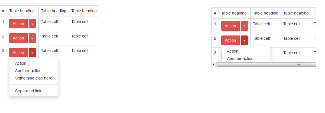
私はこれを自分で解決し、同じ問題を持つ他のユーザーを助けるためにスコープに答えを入れました:bootstrapにイベントがあり、そのイベントを使用してoverflow: inheritedを設定できますが、これは親コンテナにcssプロパティがありません。
$('.table-responsive').on('show.bs.dropdown', function () {
     $('.table-responsive').css( "overflow", "inherit" );
});

$('.table-responsive').on('hide.bs.dropdown', function () {
     $('.table-responsive').css( "overflow", "auto" );
})
info:このフィドルの例では奇妙に動作し、理由はわかりませんが、私のプロジェクトでは正常に動作します。
CSSのみの解決策は、y軸をオーバーフローさせることです。
http://www.bootply.com/YvePJTDzI
.table-responsive {
  overflow-y: visible !important;
}
EDIT
別のCSSのみの解決策は、ビューポートの幅に基づいてオーバーフローをレスポンシブに適用することです:
@media (max-width: 767px) {
    .table-responsive .dropdown-menu {
        position: static !important;
    }
}
@media (min-width: 768px) {
    .table-responsive {
        overflow: inherit;
    }
}
私は別のアプローチを取り、要素を親から切り離し、jQueryによって絶対位置に設定しました
Working JS fidle: http://jsfiddle.net/s270Lyrd/
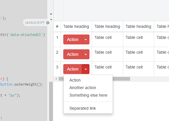
私が使用しているJSソリューション。
//fix menu overflow under the responsive table
// hide menu on click... (This is a must because when we open a menu )
$(document).click(function (event) {
    //hide all our dropdowns
    $('.dropdown-menu[data-parent]').hide();

});
$(document).on('click', '.table-responsive [data-toggle="dropdown"]', function () {
    // if the button is inside a modal
    if ($('body').hasClass('modal-open')) {
        throw new Error("This solution is not working inside a responsive table inside a modal, you need to find out a way to calculate the modal Z-index and add it to the element")
        return true;
    }

    $buttonGroup = $(this).parent();
    if (!$buttonGroup.attr('data-attachedUl')) {
        var ts = +new Date;
        $ul = $(this).siblings('ul');
        $ul.attr('data-parent', ts);
        $buttonGroup.attr('data-attachedUl', ts);
        $(window).resize(function () {
            $ul.css('display', 'none').data('top');
        });
    } else {
        $ul = $('[data-parent=' + $buttonGroup.attr('data-attachedUl') + ']');
    }
    if (!$buttonGroup.hasClass('open')) {
        $ul.css('display', 'none');
        return;
    }
    dropDownFixPosition($(this).parent(), $ul);
    function dropDownFixPosition(button, dropdown) {
        var dropDownTop = button.offset().top + button.outerHeight();
        dropdown.css('top', dropDownTop + "px");
        dropdown.css('left', button.offset().left + "px");
        dropdown.css('position', "absolute");

        dropdown.css('width', dropdown.width());
        dropdown.css('heigt', dropdown.height());
        dropdown.css('display', 'block');
        dropdown.appendTo('body');
    }
});
このソリューションは私にとってはうまくいきました:
@media (max-width: 767px) {
    .table-responsive .dropdown-menu {
        position: static !important;
    }
}
@media (min-width: 768px) {
    .table-responsive {
        overflow: visible;
    }
}
私はCSSのみを使用したソリューションを持っていますが、テーブルレスポンダ内のドロップダウンには相対的な位置を使用してください:
@media (max-width: 767px) {
  .table-responsive .dropdown-menu {
    position: relative; /* Sometimes needs !important */
  }
}
私の2¢クイックグローバルフィックス:
// drop down in responsive table

(function () {
  $('.table-responsive').on('shown.bs.dropdown', function (e) {
    var $table = $(this),
        $menu = $(e.target).find('.dropdown-menu'),
        tableOffsetHeight = $table.offset().top + $table.height(),
        menuOffsetHeight = $menu.offset().top + $menu.outerHeight(true);

    if (menuOffsetHeight > tableOffsetHeight)
      $table.css("padding-bottom", menuOffsetHeight - tableOffsetHeight);
  });

  $('.table-responsive').on('hide.bs.dropdown', function () {
    $(this).css("padding-bottom", 0);
  })
})();
説明: '.table-responsive'内のドロップダウンメニューが表示されると、テーブルの高さを計算し、(パディングを使用して)メニューを表示するために必要な高さに合わせて展開します。メニューのサイズは任意です。
私の場合、これは「.table-responsive」クラスを持つテーブルではなく、ラッピングdivです。
<div class="table-responsive" style="overflow:auto;">
    <table class="table table-hover table-bordered table-condensed server-sort">
したがって、スクリプトの$ table varは実際にはdivです! (ただ明確にするかどうか...):)
注:私はIDEが関数を折りたたむことができるように関数でラップします;)が必須ではありません!
参考のために、2018年であり、BS4.1を使用しています
data-boundary="viewport"をドロップダウンを切り替えるボタン(クラスdropdown-toggleを持つボタン)に追加してみてください。 https://getbootstrap.com/docs/4.1/components/dropdowns/#options を参照してください
推奨され選択されたソリューションは、常に最良のソリューションではありません。残念ながら、linkinが最近使用したソリューションは、状況に基づいてページ上に複数のスクロールバーを作成します。
私の方法はわずかに異なっていました。
テーブル応答divを別のdivに含めました。次に、高さ100%、幅:100%、表示ブロックと位置の絶対値を適用して、高さと幅がページサイズに基づいて、オーバーフローを非表示に設定しました。
次に、テーブルのレスポンシブdivに最小高さ100%を追加しました
<div class="table_container"
    style="height: 100%; width: 100%; display: block;position: absolute;overflow: hidden;">
<div class="table-responsive" style="min-height:100%;">
以下の作業例でわかるように、追加されたスクロールバー、おかしな動作はなく、実際にはその使用率として-画面サイズに関係なく動作するはずです。ただし、これについてはテストしていません。何らかの理由でそれが失敗した場合、100%をそれぞれ100vhと100vwに置き換えることができます。
<!-- Latest compiled and minified CSS -->
<link rel="stylesheet" href="//maxcdn.bootstrapcdn.com/bootstrap/3.3.5/css/bootstrap.min.css">

<!-- Optional theme -->
<link rel="stylesheet" href="//maxcdn.bootstrapcdn.com/bootstrap/3.3.5/css/bootstrap-theme.min.css">

            <script src="https://code.jquery.com/jquery-1.12.4.min.js"></script>
<script src="https://maxcdn.bootstrapcdn.com/bootstrap/3.3.5/js/bootstrap.min.js"></script>


<div class="table_container" style="height: 100%; width: 100%; display: block;position: absolute;overflow: hidden;">
<div class="table-responsive" style="min-height:100%;">
                <table class="table">
                    <thead>
                        <tr>
                            <th>Value1</th>
                            <th>Value2</th>
                            <th>Value3</th>
                            <th>Value4</th>
                        </tr>
                    </thead>
                    <tbody>
                        <tr>
                            <td>
                                DATA
                                <div class="btn-group btn-group-rounded">
                                    <button type="button" class="btn btn-default btn-xs" data-toggle="dropdown" aria-haspopup="true" aria-expanded="false" style="border-radius:3px;">
                                        <span class="caret"></span>
                                    </button>
                                    <ul class="dropdown-menu">
                                        <li><a href="#">One</a></li>
                                        <li><a href="#">Two</a></li>
                                        <li><a href="#">Three</a></li>
                                        <li role="seperator" class="divider"></li>
                                        <li><a href="#">Four</a></li>
                                    </ul>
                                </div>
                            </td>
                            <td>DATA</td>
                        </tr>
                        <tr>
                            <td>
                                DATA
                                <div class="btn-group btn-group-rounded">
                                    <button type="button" class="btn btn-default btn-xs" data-toggle="dropdown" aria-haspopup="true" aria-expanded="false" style="border-radius:3px;">
                                        <span class="caret"></span>
                                    </button>
                                    <ul class="dropdown-menu">
                                        <li><a href="#">One</a></li>
                                        <li><a href="#">Two</a></li>
                                        <li><a href="#">Three</a></li>
                                        <li role="seperator" class="divider"></li>
                                        <li><a href="#">Four</a></li>                                    </ul>
                                </div>
                            </td>

                            <td>
                                DATA
                                <div class="btn-group btn-group-rounded">
                                    <button type="button" class="btn btn-default btn-xs" data-toggle="dropdown" aria-haspopup="true" aria-expanded="false" style="border-radius:3px;">
                                        <span class="caret"></span>
                                    </button>
                                    <ul class="dropdown-menu">
                                        <li><a href="#">One</a></li>
                                        <li><a href="#">Two</a></li>
                                        <li><a href="#">Three</a></li>
                                        <li role="seperator" class="divider"></li>
                                        <li><a href="#">Four</a></li>
                                    </ul>
                                </div>
                            </td>
                            <td>DATA</td>
                        </tr>
                    </tbody>
                </table>
            </div>
</div>@Wazimeソリューションを少しクリーンアップしました。一般的なソリューションとして最適です。
$(document).on('shown.bs.dropdown', '.table-responsive', function (e) {
    // The .dropdown container
    var $container = $(e.target);

    // Find the actual .dropdown-menu
    var $dropdown = $container.find('.dropdown-menu');
    if ($dropdown.length) {
        // Save a reference to it, so we can find it after we've attached it to the body
        $container.data('dropdown-menu', $dropdown);
    } else {
        $dropdown = $container.data('dropdown-menu');
    }

    $dropdown.css('top', ($container.offset().top + $container.outerHeight()) + 'px');
    $dropdown.css('left', $container.offset().left + 'px');
    $dropdown.css('position', 'absolute');
    $dropdown.css('display', 'block');
    $dropdown.appendTo('body');
});

$(document).on('hide.bs.dropdown', '.table-responsive', function (e) {
    // Hide the dropdown menu bound to this button
    $(e.target).data('dropdown-menu').css('display', 'none');
});
このプロパティを定義します。幸運を!
data-toggle="dropdown" data-boundary="window"
これは、他の誰かに役立つ場合があります。 DatatablesJSを使用しています。テーブルの現在の高さに500pxを追加します。 Datatablesを使用すると、テーブルで10、20などのページを使用できるためです。したがって、テーブルの高さを動的に計算する必要があります。
ドロップダウンが表示されたら、高さを追加します。
ドロップダウンが非表示の場合、元のテーブルの高さをリセットします。
$(document).ready(function() {
    $('.table-responsive .dropdown').on('shown.bs.dropdown', function () {
          console.log($('#table-responsive-cliente').height() + 500)
          $("#table-responsive-cliente").css("height",$('#table-responsive-cliente').height() + 500 );
    })

    $('.table-responsive .dropdown').on('hide.bs.dropdown', function () {
           $("#table-responsive-cliente").css("height","auto");
    })
})
そして、HTML
<div class="table-responsive" id="table-responsive-cliente">
    <table class="table-striped table-hover">
     ....

     ....
    </table>
</div>
前: - 
ドロップダウンが表示された後: 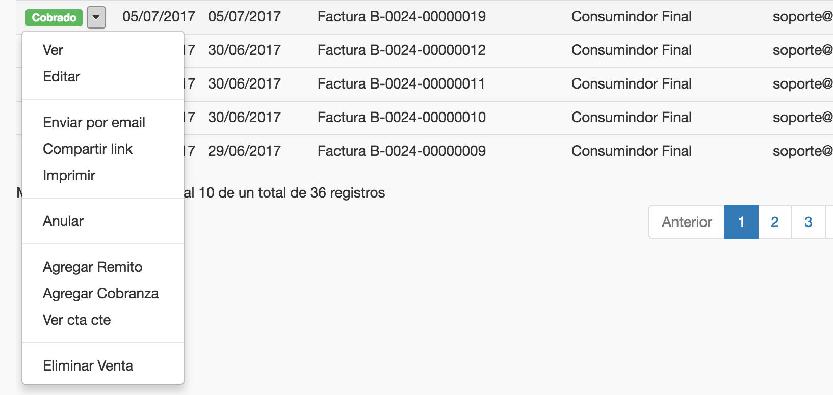
これはv3とは異なるブレークポイントを持っているので、Bootstrap 4で機能しました。
@media (min-width: 992px) {
    .table-responsive {
        overflow: inherit;
    }
}
Ios 8(iphone4s)ではBurebistarulerの応答は問題なく動作しますが、以前に動作していたAndroidでは正常に動作しません。私がios8(iphone4s)とandoirで私のために働くものは何ですか:
$('.table-responsive').on('show.bs.dropdown', function () {
 $('.table-responsive').css( "min-height", "400px" );
});

$('.table-responsive').on('hide.bs.dropdown', function () {
     $('.table-responsive').css( "min-height", "none" );
})
これを単に使用する
.table-responsive {
    overflow: inherit;
}
Chromeでは機能しますが、IE10またはEdgeでは機能しません。継承プロパティがサポートされていないためです。
受け入れられた答えと@LeoCaseiroの答えに基づいて、ここで私が最終的に使用したものです:
@media (max-width: 767px) {
    .table-responsive{
        overflow-x: auto;
        overflow-y: auto;
    }
}
@media (min-width: 767px) {
    .table-responsive{
        overflow: inherit !important; /* Sometimes needs !important */
    }
}
大きな画面ではドロップダウンはレスポンシブテーブルの後ろに隠れず、小さな画面では隠されますが、とにかくモバイルにはスクロールバーがあるので大丈夫です。
これが誰かを助けることを願っています。
ドロップダウンがテーブルの下部に近い場合、ドロップダウンに.dropupクラスを適用することで、この問題を解決しました。 ここに画像の説明を入力してください