CSS(およびJavaScript?)を使用して、ぼやけた「つや消し」の背景を作成する方法は?
Webkitブラウザーで動作するHTML5、CSS3、およびJavaScriptを使用して、iOS 7スタイルのつや消しの外観を作成しようとしています。
技術的には、次のHTMLが与えられます:
_<style>
  #partial-overlay {
    width: 100%;
    height: 20px;
    background: rgba(255, 255, 255, .2); /* TODO frost */
    position: fixed;
    top: 0;
    left: 0;
  }
</style>
<div id="main-view">
  <div style="width: 50px; height: 50px; background: #f00"></div>
  To my left is a red box<br>
  Now there is just text<br>
  Text that goes on for a few pixels <br>
  or even more
</div>
<div id="partial-overlay">
  Here is some content
</div>
__#main-view_の最初の20pxに-webkit-filter: blur(5px)のようなものを水平方向に適用したいと思います。
CSSが_#partial-overlay { width: 20px; height: 100%; ...}_に変更された場合、-webkit-filter: blur(5px)を最初の20pxに垂直に適用する必要があります。
明らかな解決策は、javascriptを使用して_#main-view_のクローンを作成し、_overflow: hidden_を設定してから、必要に応じて幅/高さを変更することですが、より複雑なページ/ CSS構造に一般化するのは難しいようです。
最小のパフォーマンスヒットと最大の一般化可能性でこれを達成するより良い方法はありますか?
[〜#〜] edit [〜#〜]:これは私が達成しようとしているものの例です: 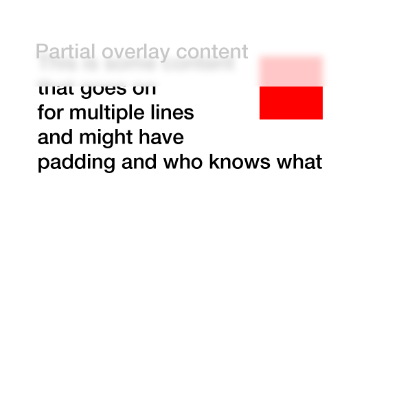
インスピレーションをありがとう...これに私を導いた canvas plugin これはトリックをする
新機能および改善点: -webkit-およびFirefoxの動作例、サイズ変更可能/流体になりました。
JS
$(document).ready(function () {
    frost = function () {
        var w = $('#main-view').width();
        html2canvas(document.body, {
            onrendered: function (canvas) {
                document.body.appendChild(canvas);
                $('canvas').wrap('<div id="contain" />');
            },
            width: w,
            height: 30
        });
        $('canvas, #partial-overlay, #cover').hide();
        $('#cover').fadeIn('slow', function () {
            $('#partial-overlay').fadeIn('slow');
        });
    };

    $('body').append('<div id="cover"></div><svg id="svg-image-blur"><filter id="blur-effect-1"><feGaussianBlur stdDeviation="2"/></filter></svg>');

    $('#main-view').click(function () {
        frost();
        $('#partial-overlay').addClass('vis');
        $(window).resize(function () {
            $('canvas, #partial-overlay, #cover').hide();
        });

        function onResize() {
            if ($('#partial-overlay').hasClass('vis')) {
                frost();
            }
        }
        var timer;
        $(window).bind('resize', function () {
            timer && clearTimeout(timer);
            timer = setTimeout(onResize, 50);
        });

    });

    $('#partial-overlay').click(function () {
        $('#partial-overlay').removeClass('vis');
        $('canvas, #partial-overlay, #cover').hide();
    });
});
CSS
#main-view {
    width:75%;
    height:50%;
    box-sizing: border-box;
    margin:8px;
}
#partial-overlay {
    display:none;
    width: 100%;
    height: 20px;
    position: absolute;
    top: 0;
    left: 0;
    z-index:99;
    background: rgba(255, 255, 255, 0.2);
    cursor:pointer;
}
canvas {
    position: absolute;
    top: 0;
    left: 0;
    -webkit-filter:blur(5px);
    filter: url(#blur-effect-1);
}
#cover {
    display:none;
    height:19px;
    width:100%;
    background:#fff;
    top:0;
    left:0;
    position:absolute;
}
#contain {
    height:20px;
    width:100%;
    overflow:hidden;
    position:absolute;
    top:0;
    left:0;
}
svg {
    height:0;
    width:0;
}
HTML
<div id="main-view">
    <div style="width: 10%; height: 20%; background: #f00; float: left"></div>To my left is a red box
    <br>Now there is just text
    <br>Text that goes on for a few pixels
    <br>or even more</div>
<div id="partial-overlay">Here is some content</div>
クリック機能に配置しました。最も可能性の高いユースケースになると考えたからです。ドキュメントの準備が整った状態でも同様に機能します。
キャンバスの表現はピクセルパーフェクトではありませんが、ぼやけているため、ほとんどの場合、それが実際に重要になるとは思いません。
Update:要求に応じて、これはサイズ変更可能になりました。カバーdivもJSに移動し、Firefoxのsvgフォールバックを追加しました。サイズ変更では、サイズ変更ごとにキャンバスを再描画する必要があるため、サイズ変更中はキャンバスやオーバーレイなどを非表示にし、サイズ変更が停止したら置き換えます。
基本的に、メインコンテンツを複製し、両方のdivのスクロールを同期するオーバーレイプレースホルダーを使用できます。CSSぼかしフィルターをオーバーレイにのみ適用します。
簡単なjavascriptでできます:
$(document).ready(function(){
  $('.overlay').append( $('.content').html() );
  $('.content').on('scroll', function(){
    $('.overlay').scrollTop($(this).scrollTop());
  });
});
CSSの場合:
.overlay {
    overflow:hidden;
    -webkit-filter: blur(.25em);
    background:#fff;
}
私はあなたのための実用的な例をまとめました(webkitのみ):
楽しむ! :)
最小のパフォーマンスヒットと最大の一般化可能性でこれを達成するより良い方法はありますか?
これに対する答えはnoです。
理由は、目的の処理を行うには、ブラウザウィンドウで使用するビットマップに直接アクセスして、ぼかしたい領域のピクセルを抽出または操作する必要があるためです(ブラウザの「aero」きちんと..)または適用する要素の背後にある要素で機能するフィルタ(またはそれに制限領域を設定することができます)。
これを行うためのネイティブサポートがないため(キャンバスと拡張API、またはhtmlからキャンバスイメージを生成するライブラリ->比較的遅い)、どちらの場合でもこれはトリック(イメージ、分割divなど)で行う必要があります。 。
キャンバス上のページのすべてを作成した場合、多くの興味深いことができますが、レイアウト、更新、フィルタリングなども自分で実行する必要があります。そのため、Javascriptがネイティブより遅いため、最適化されていません(言うまでもなく、エラーが発生しやすくなります)。
ブラウザーがウィンドウの一部をキャンバスとして取得できるようになるまで(そのページのすべてが同じものであるか、特別なacceptヘッダーが設定されたコンテンツを持っている必要がないため)、回避策はあります。
更新
Html2canvasなどを使用してそれを行うことができるが、妥協(->遅いパフォーマンス)を使用する必要があることを示すデモとして-デモはラフで実験的であり、うまく機能するために微調整が必要です-デモのみのため:
http://jsfiddle.net/AbdiasSoftware/RCaLR/
結果:
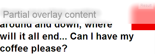
背景の一部を取得する一般化された関数:
getBlurredBG(x, y, width, height, id);
Html2canvasを使用してウィンドウの一部を取得します。
function getBlurredBG(x, y, w, h, id) {

    html2canvas(document.body, {
        onrendered: function (canvas) {
            process(canvas, x, y, w, h, id);
        },
        width: (x + w),
        height: (y + h)
    });
}
コンテンツを処理します。
function process(canvas, x, y, w, h, id) {

    //create new canvas to enable clipping
    //As html2canvas returns a canvas from 0,0 to width and height
    //we need to clip it.
    var ocanvas = document.createElement('canvas');
    ocanvas.width = w;
    ocanvas.height = h;
    ocanvas.style.left = x + 'px';
    ocanvas.style.top = y + 'px';
    ocanvas.style.position = 'absolute';
    ocanvas.id = id;

    var ctx = ocanvas.getContext('2d');
    ctx.drawImage(canvas, x, y, w, h,
                          0, 0, w, h);

    stackBlurCanvasRGB(ocanvas, x, y, w, h, 28)
    lighten(ocanvas);

    ctx.fillStyle = 'rgba(255,255,255,0.5)';
    ctx.fillRect(x, y, w, h);

    ctx.fillStyle = '#999';
    ctx.font = '32px arial';
    ctx.fillText("Partial overlay content", 10, 60);

    document.body.appendChild(ocanvas);
}
最近、新しい-webkit-backdrop-filter。これは現在、Safari 9.0でサポートされており、Chromeフラグの背後にあります。
デモ:
#blurred {
  -webkit-backdrop-filter: blur(10px);
  width: 200px;
  height: 100px;
  position: fixed;
  top: 50px;
  left: 50px;
  border: 3px solid white;
}
<img src="https://upload.wikimedia.org/wikipedia/commons/e/eb/Ash_Tree_-_geograph.org.uk_-_590710.jpg">
<div id="blurred"> Blurred </div>現在サポートされているのはSafariのみです。 Chrome and Operaこれはフラグの下にあります。
注:今日-webkit-backdrop-filterにはまだ十分なサポートがありませんので、今のところ、この効果を得たい場合、SVGのfeGaussianBlurを使用するのが最善の方法です
chromeはデフォルトでサポートしていないため、backdrop-filterなしでcss-trickを作成しました。
元のコードwith sass:https://codepen.io/mixal_bl4/pen/EwPMWo
$(()=>{
  let sdm = $('.some-draggable-modal');
  sdm.center().draggable();
});

jQuery.fn.center = function () {
    this.css("position","absolute");
    this.css("top", Math.max(0, (($(window).height() - $(this).outerHeight()) / 2) +
                                                $(window).scrollTop()) + "px");
    this.css("left", Math.max(0, (($(window).width() - $(this).outerWidth()) / 2) +
                                                $(window).scrollLeft()) + "px");
    return this;
};
body {
background: -webkit-repeating-linear-gradient(135deg, #fff, #fff 25px, #e2edc1 25px, #e2edc1 50px) fixed;
background: repeating-linear-gradient(-45deg, #fff, #fff 25px, #e2edc1 25px, #e2edc1 50px) fixed;
background-attachment: fixed;
background-size: cover;
}
html:before,
body:before {
content: "";
display: block;
position: absolute;
top: 0;
left: 0;
right: 0;
bottom: 0;
background: rgba(0, 0, 0, 0.3);
}
html .some-draggable-modal,
body .some-draggable-modal {
width: 150px;
height: 150px;
border: 1px solid Lime;
display: -webkit-box;
display: -ms-flexbox;
display: flex;
place-content: center;
-webkit-box-orient: vertical;
-webkit-box-direction: normal;
-ms-flex-direction: column;
flex-direction: column;
text-align: center;
border-radius: 6px;
cursor: move;
position: relative;
overflow: hidden;
}
html .some-draggable-modal .title,
body .some-draggable-modal .title {
position: relative;
z-index: 1;
color: black;
}
html .some-draggable-modal:before,
body .some-draggable-modal:before {
content: "";
position: absolute;
top: 0;
left: 0;
right: 0;
bottom: 0;
background: -webkit-repeating-linear-gradient(135deg, #fff, #fff 25px, #e2edc1 25px, #e2edc1 50px) fixed;
background: repeating-linear-gradient(-45deg, #fff, #fff 25px, #e2edc1 25px, #e2edc1 50px) fixed;
background-attachment: fixed;
background-size: cover;
}
html .some-draggable-modal:hover:before,
body .some-draggable-modal:hover:before {
-webkit-filter: blur(2px);
filter: blur(2px);
}
html .some-draggable-modal:hover:after,
body .some-draggable-modal:hover:after {
content: "filter: blur(2px)";
position: absolute;
left: 0;
right: 0;
bottom: 10px;
color: green;
}<script src="//cdnjs.cloudflare.com/ajax/libs/jquery/3.2.1/jquery.min.js"></script>
<script src="//cdnjs.cloudflare.com/ajax/libs/jqueryui/1.12.1/jquery-ui.min.js"></script>
<div class="some-draggable-modal">
<span class="title">You can drag me :)</span>
</div>私がやったことのライブサンプル(そして上の画像のように見えるように更新されました)
コード:
<style>
  #partial-overlay {
    width: 100%;
    height: 45px;
    background: #ffffff; /* TODO frost */
    -webkit-opacity:0.70;
    -webkit-filter: blur(5px);
    position: absolute;
    top: 20px;
    left: 0px;
    z-index:5;
  }
  #main-view
  {
   position: fixed;
   top: 20px;
   left: 80px;
   z-index:-1;
  }
</style>
<div id="main-view">
  <div style="width: 50px; height: 50px; background: #f00; position:fixed; left:10px; top: 40px; -webkit-filter: blur(2px); "></div>
    <div style="width: 80px; height: 60px; background: #fff; position:fixed; left:0px; top: 66px; -webkit-filter: blur(5px);"></div>
    <div style="width: 50px; height: 30px; background: #f00; position:fixed; left:10px; top: 60px;"></div>
  <p style="font-family:Sans, Arial, Verdana;">
  To my left is a red box<br>
  Now there is just text<br>
  Text that goes on for a few pixels <br>
  or even more
  </p>
</div>
<div id="partial-overlay">

</div>
必要以上にきれいに見えましたが、うまくいきました!
それはまだ非常に限られたサポート(Firefoxのみ)を持っていますが、それを取得する1つの方法はこれかもしれません:
Firefoxのみのデモ
CSSは非常に単純です。
#partial-overlay {
    width:400px;
    height:100px;
    background: -moz-element(#main-view);
    top: 0px;
    left: 200px;
    position: absolute;
    opacity: 0.3;
}
キーは、メインビュー要素の部分的なオーバーレイの背景として使用することです。
Firefoxではフィルターを使用できないため、このデモでは不透明度のみを使用します。
背景の要素プロパティはw3cによって承認されているため、将来Webkitで表示される可能性があります
デモでは、部分オーバーレイは、何が何であるかをより明確にするために右にシフトされました
残念ながら、これを行うための良い方法はありません。メインdivのコピーが必要になることがわかりました。
<div class="wrapper">
   <div class="overlay"></div>
   <div id="main-copy"></div>
</div>
オーバーレイはラッパーの幅をプッシュしますが、メインコピーはバックグラウンドでぼやけます。 main-copyのコンテンツが複雑な場合、明らかにパフォーマンスの問題が発生します。
CSSのみのソリューション:backdrop-filter: blur(4px);