Material-UI <TextField />の境界線の色を変更する方法
GitHubの問題を調べたアウトラインバリアントのアウトラインカラーを変更する方法がわからないようで、人々は "InputProps"プロパティを使用するように指示しているようですが、これは何もしないようです。  ここに現在の状態の私のコードがあります
import React from 'react';
import { withStyles } from '@material-ui/core/styles';
import TextField from '@material-ui/core/TextField';
import PropTypes from 'prop-types';

const styles = theme => ({
field: {
    marginLeft: theme.spacing.unit,
    marginRight: theme.spacing.unit,
    height: '30px !important'
},
});

class _Field extends React.Component {
      render() {
          const { classes, fieldProps } = this.props;
             return (
                <TextField
                {...fieldProps}
                label={this.props.label || "<Un-labeled>"}
                InputLabelProps={{ shrink: true }} // stop from animating.
                inputProps={{ className: classes.fieldInput }}
                className={classes.field}
                margin="dense"
               variant="outlined"
            />
        );
    }
}

_Field.propTypes = {
    label: PropTypes.string,
    fieldProps: PropTypes.object,
    classes: PropTypes.object.isRequired
}

export default withStyles(styles)(_Field);
classesプロパティのおかげで、Material-UIによって挿入されたすべてのクラス名をオーバーライドできます。詳細については、 クラスでオーバーライド セクションと コンポーネントの実装 をご覧ください。
そして最後に :
これを見て、簡単なデモを作成しました。
https://stackblitz.com/edit/material-ui-custom-outline-color
Material-UI TextFieldのデフォルトの境界線の色とラベルの色を変更しますが、フォーカスされたときにプライマリカラーを保持します。
また、このリンクを見てください、それは私に「アイデア」を与えました:
https://github.com/mui-org/material-ui/issues/13347
ドキュメントからこれらの例を見て、焦点を合わせたときに色を変更したい場合:
https://material-ui.com/demos/text-fields/#customized-inputs
const styles = theme => ({
notchedOutline: {
borderWidth: "1px",
borderColor: "yellow !important"
}
});
<TextField
variant="outlined"
rows="10"
fullWidth
InputProps={{
classes: {
notchedOutline: classes.notchedOutline
}
}}
id="standard-textarea"
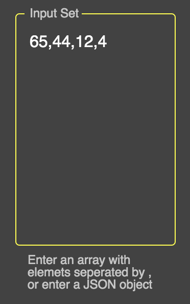
label="Input Set"
helperText="Enter an array with elemets seperated by , or enter a JSON object"
placeholder="Placeholder"
multiline
value={"" + this.props.input}
onChange={this.props.handleChangeValue("input")}
className={classes.textField}
margin="normal"
/>
https://codesandbox.io/s/6rx8p
                      <CssTextField

                       label="Username"

                       className="username"
                       name="username"
                       onChange={this.onChange}
                       type="text"
                       autoComplete="current-password"
                       margin="normal"
                       inputProps={{ style: { fontFamily: 'nunito', color: 'white'}}}

                    />
// constを宣言し、マテリアルUIスタイルを追加します
const CssTextField = withStyles({
  root: {
   '& label.Mui-focused': {
    color: 'white',
   },
   '& .MuiInput-underline:after': {
    borderBottomColor: 'yellow',
   },
  '& .MuiOutlinedInput-root': {
    '& fieldset': {
      borderColor: 'white',
    },
    '&:hover fieldset': {
      borderColor: 'white',
    },
    '&.Mui-focused fieldset': {
      borderColor: 'yellow',
    },
  },
},
})(テキストフィールド);
ピーターの拡張 answer 。 !importantなしですべてのイベントの色を変更することもできます。
 cssOutlinedInput: {
        "&:not(hover):not($disabled):not($cssFocused):not($error) $notchedOutline": {
          borderColor: "red" //default
        },
        "&:hover:not($disabled):not($cssFocused):not($error) $notchedOutline": {
          borderColor: "blue" //hovered
        },
        "&$cssFocused $notchedOutline": {
          borderColor: "purple" //focused
        }
      },
      notchedOutline: {},
      cssFocused: {},
      error: {},
      disabled: {}
https://stackblitz.com/edit/material-ui-custom-outline-color-c6zqxp
Mui.TextFieldには、標準、塗りつぶし、アウトラインの3つのスタイルがあります。上記のソリューションは、アウトラインスタイルでのみ機能します
inputProps={{ style: { fontFamily: 'nunito', color: 'white'}}}
Inputpropsは、テキストフィールドに入力された入力データのスタイルを設定することで機能し、カスタムの色付けにclassNameを使用することもできます。
      const CssTextField = withStyles({
     root: {
    '& label.Mui-focused': {
     color: 'white',
      },
     '& .MuiInput-underline:after': {
      borderBottomColor: 'yellow',
     },
    '& .MuiOutlinedInput-root': {
     '& fieldset': {
     borderColor: 'white',
     },
     '&:hover fieldset': {
      borderColor: 'white',
       },
     '&.Mui-focused fieldset': {
       borderColor: 'yellow',
     },
     },
    },
このconstスタイルは、ファイルされたテキストの外側の部分を機能させます...
素材UIの外側部分のスタイルは、上記の変更を求められています...