円のストロークで複数の色をSVG
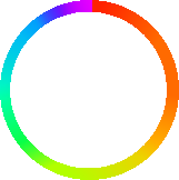
レインボーサークルを作りたい
下の写真のように:
しかし、どのようにしてカーブした複数のカラーストップグラデーションを描画できますか?
これが私の現在のコードです:
<svg width="500" height="500" xmlns="http://www.w3.org/2000/svg" xmlns:xlink="http://www.w3.org/1999/xlink">
<defs>
<linearGradient id="test">
<stop offset="0%" stop-color="#f00"/>
<stop offset="100%" stop-color="#0ff"/>
</linearGradient>

</defs>

<circle cx="50" cy="50" r="40" fill="none" stroke="url(#test)" stroke-width="6"/>

</svg>
このアプローチは機能しません。 SVGには円錐勾配はありません。効果をシミュレートするには、多数の小さな線セグメントでそれを偽造する必要があります。またはいくつかの同様のテクニック。
更新:
例を示します。 360度の色相を6つのパスで近似します。各パスには、円の60度をカバーする弧が含まれています。線形グラデーションを使用して、各パスの最初から最後まで色を補間します。それは完璧ではありません(色が出会うところに不連続性が見られます)が、ほとんどの人をだますかもしれません。 6つを超えるセグメントを使用すると、精度を向上させることができます。
    <svg xmlns="http://www.w3.org/2000/svg" version="1.1" width="100%" height="100%" viewBox="-10 -10 220 220">
      <defs>
        <linearGradient id="redyel" gradientUnits="objectBoundingBox" x1="0" y1="0" x2="1" y2="1">
            <stop offset="0%" stop-color="#ff0000"/>
            <stop offset="100%" stop-color="#ffff00"/>
        </linearGradient>
        <linearGradient id="yelgre" gradientUnits="objectBoundingBox" x1="0" y1="0" x2="0" y2="1">
            <stop offset="0%" stop-color="#ffff00"/>
            <stop offset="100%" stop-color="#00ff00"/>
        </linearGradient>
        <linearGradient id="grecya" gradientUnits="objectBoundingBox" x1="1" y1="0" x2="0" y2="1">
            <stop offset="0%" stop-color="#00ff00"/>
            <stop offset="100%" stop-color="#00ffff"/>
        </linearGradient>
        <linearGradient id="cyablu" gradientUnits="objectBoundingBox" x1="1" y1="1" x2="0" y2="0">
            <stop offset="0%" stop-color="#00ffff"/>
            <stop offset="100%" stop-color="#0000ff"/>
        </linearGradient>
        <linearGradient id="blumag" gradientUnits="objectBoundingBox" x1="0" y1="1" x2="0" y2="0">
            <stop offset="0%" stop-color="#0000ff"/>
            <stop offset="100%" stop-color="#ff00ff"/>
        </linearGradient>
        <linearGradient id="magred" gradientUnits="objectBoundingBox" x1="0" y1="1" x2="1" y2="0">
            <stop offset="0%" stop-color="#ff00ff"/>
            <stop offset="100%" stop-color="#ff0000"/>
        </linearGradient>
      </defs>

      <g fill="none" stroke-width="15" transform="translate(100,100)">
        <path d="M 0,-100 A 100,100 0 0,1 86.6,-50" stroke="url(#redyel)"/>
        <path d="M 86.6,-50 A 100,100 0 0,1 86.6,50" stroke="url(#yelgre)"/>
        <path d="M 86.6,50 A 100,100 0 0,1 0,100" stroke="url(#grecya)"/>
        <path d="M 0,100 A 100,100 0 0,1 -86.6,50" stroke="url(#cyablu)"/>
        <path d="M -86.6,50 A 100,100 0 0,1 -86.6,-50" stroke="url(#blumag)"/>
        <path d="M -86.6,-50 A 100,100 0 0,1 0,-100" stroke="url(#magred)"/>
      </g>
    </svg>
ここでフィドル: http://jsfiddle.net/Weytu/
更新2:
6つを超えるセグメントが必要な場合は、次のJavaScriptを使用して、必要な数のセグメントを持つホイールを生成します。
function makeColourWheel(numSegments)
{
    if (numSegments <= 0)
        numSegments = 6;
    if (numSegments > 360)
        numSegments = 360;

    var  svgns = xmlns="http://www.w3.org/2000/svg";
    var  svg = document.getElementById("colourwheel");
    var  defs = svg.getElementById("defs");
    var  paths = svg.getElementById("paths");

    var  radius = 100;
    var  stepAngle = 2 * Math.PI / numSegments;

    var  lastX = 0;
    var  lastY = -radius;
    var  lastAngle = 0;

    for (var i=1; i<=numSegments; i++)
    {
        var  angle = i * stepAngle;

        // Calculate this arc end point
        var x = radius * Math.sin(angle);
        var y = -radius * Math.cos(angle);
        // Create a path element
        var arc = document.createElementNS(svgns, "path");
        arc.setAttribute("d", "M " + lastX.toFixed(3) + "," + lastY.toFixed(3)
                              + " A 100,100 0 0,1 " + x.toFixed(3) + "," + y.toFixed(3));
        arc.setAttribute("stroke", "url(#wheelseg" + i + ")");
        // Append it to our SVG
        paths.appendChild(arc);

        // Create a gradient for this segment
        var grad = document.createElementNS(svgns, "linearGradient");
        grad.setAttribute("id", "wheelseg"+i);
        grad.setAttribute("gradientUnits", "userSpaceOnUse");
        grad.setAttribute("x1", lastX.toFixed(3));
        grad.setAttribute("y1", lastY.toFixed(3));
        grad.setAttribute("x2", x.toFixed(3));
        grad.setAttribute("y2", y.toFixed(3));
        // Make the 0% stop for this gradient
        var stop = document.createElementNS(svgns, "stop");
        stop.setAttribute("offset", "0%");
        hue = Math.round(lastAngle * 360 / Math.PI / 2);
        stop.setAttribute("stop-color", "hsl(" + hue + ",100%,50%)");
        grad.appendChild(stop);
        // Make the 100% stop for this gradient
        stop = document.createElementNS(svgns, "stop");
        stop.setAttribute("offset", "100%");
        hue = Math.round(angle * 360 / Math.PI / 2);
        stop.setAttribute("stop-color", "hsl(" + hue + ",100%,50%)");
        grad.appendChild(stop);
        // Add the gradient to the SVG
        defs.appendChild(grad);

        // Update lastx/y
        lastX = x;
        lastY = y;
        lastAngle = angle;
    }
}


makeColourWheel(60);
<svg id="colourwheel" xmlns="http://www.w3.org/2000/svg" version="1.1" width="100%" height="100%" viewBox="-10 -10 220 220">
<defs id="defs">
</defs>
<g id="paths" fill="none" stroke-width="15" transform="translate(100,100)">
</g>
</svg>円錐勾配を使ってそれを解くことができます:
.color-wheel {
  display: inline-block;
  padding: 25px;
  border-radius: 100%;
  background: conic-gradient(red, yellow, Lime, aqua, blue, Magenta, red);
  background-repeat: no-repeat;
  background-size: cover;
  background-position: center center;
  background-size: auto;
}

.color-wheel::after {
  content: '';
  display: block;
  padding: 75px;
  border-radius: 100%;
  background: #ffffff;
}
<div class="color-wheel"></div>ただし、これは現在Chromeでのみサポートされています。詳細については、こちらをご覧ください: https://caniuse.com/#feat=css-conic-gradients
また、簡単に解決できるjavascript/svgソリューションも作成しました。
const resolution = 1;
const outerRadius = 100;
const innerRadius = 75;

function polarToCartesian(centerX, centerY, radius, angleInDegrees) {
    const angleInRadians = (angleInDegrees - 90) * Math.PI / 180.0;

    return {
        x: centerX + radius * Math.cos(angleInRadians),
        y: centerY + radius * Math.sin(angleInRadians)
    };
}

function describeArc(x, y, radius, startAngle, endAngle) {
    const start = polarToCartesian(x, y, radius, endAngle);
    const end = polarToCartesian(x, y, radius, startAngle);

    const arcSweep = endAngle - startAngle <= 180 ? '0' : '1';

    const d = [
        'M', start.x, start.y,
        'A', radius, radius, 0, arcSweep, 0, end.x, end.y,
        'L', x, y,
        'L', start.x, start.y
    ].join(' ');

    return d;
}

function generateConicGradiant(radius, resolution, target) {
    for (var i = 0; i < 360 * resolution; i++) {
        const path = document.createElementNS('http://www.w3.org/2000/svg', 'path');

        path.setAttribute(
            "d",
            describeArc(
                radius,
                radius,
                radius,
                i / resolution,
                (i + 2) / resolution
            )
        );
        path.setAttribute('fill', 'hsl(' + (i / resolution) + ', 100%, 50%)');

        target.appendChild(path);
    }
}

function generateOverlay(outerRadius, innerRadius, target) {
    const circle = document.createElementNS('http://www.w3.org/2000/svg', 'circle');

    circle.setAttribute('cx', outerRadius);
    circle.setAttribute('cy', outerRadius);
    circle.setAttribute('r', innerRadius);
    circle.setAttribute('fill', 'white');

    target.appendChild(circle);
}

var root = document.getElementById('color-wheel');

generateConicGradiant(outerRadius, resolution, root);
generateOverlay(outerRadius, innerRadius, root);
#color-wheel {
width: 200px;
height: 200px;
}<svg viewBox="0 0 200 200" version="1.1" id="color-wheel"></svg>