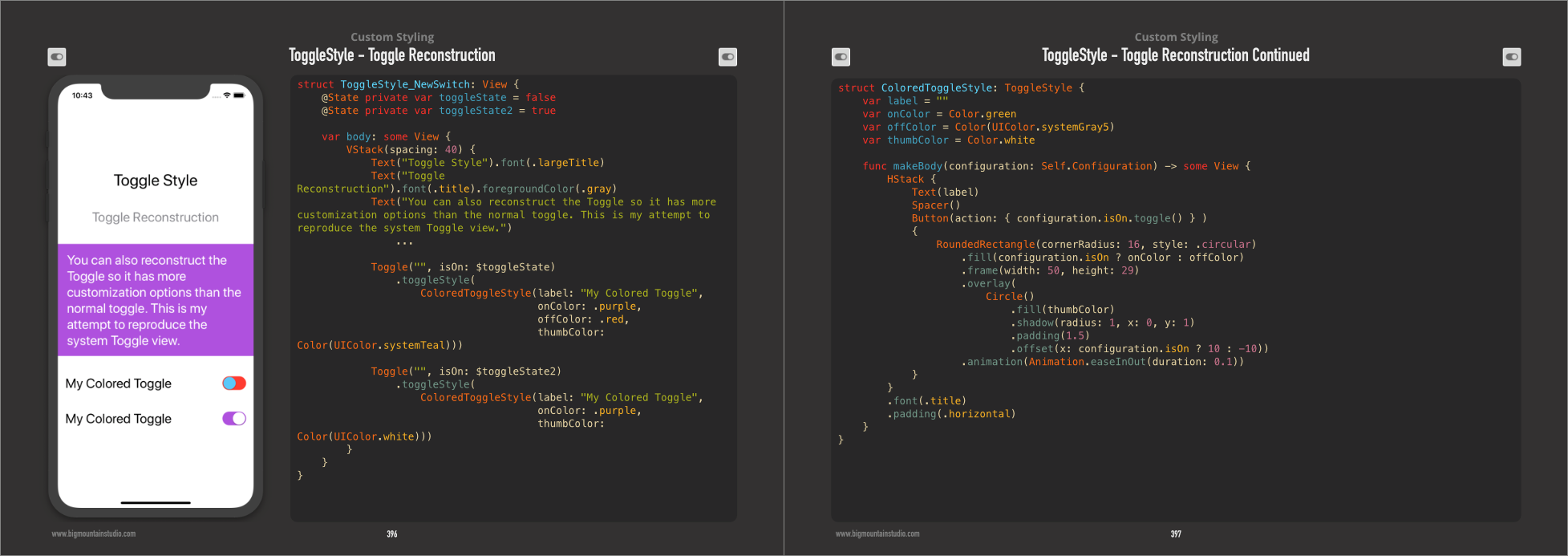
SwiftUIでトグル色を設定する
Appleの ユーザー入力のチュートリアル に従ってトグルを実装しました。現在、次のようになっています。

これは、このUIを生成するコードです。
NavigationView {
    List {
        Toggle(isOn: $showFavoritesOnly) {
            Text("Show Favorites only")
        }
    }
}
さて、Toggleのon-colorを緑ではなく青にしたいと思います。
私は試した:
Toggle(isOn: $showFavoritesOnly) {
    Text("Show Favorites only")
}
.accentColor(.blue)
.foregroundColor(.blue)
.background(Color.blue)
これらはどれも機能せず、tintColorなどの他の修飾子を見つけることができませんでした。
Toggleの色を変更するにはどうすればよいですか?
SwiftUI 1.0
ToggleStyleの使用
トグルの3色(オンカラー、オフカラー、つまみ)を変更する新しいToggleStyleを作成しました。
struct ColoredToggleStyle: ToggleStyle {
    var label = ""
    var onColor = Color(UIColor.green)
    var offColor = Color(UIColor.systemGray5)
    var thumbColor = Color.white

    func makeBody(configuration: Self.Configuration) -> some View {
        HStack {
            Text(label)
            Spacer()
            Button(action: { configuration.isOn.toggle() } )
            {
                RoundedRectangle(cornerRadius: 16, style: .circular)
                    .fill(configuration.isOn ? onColor : offColor)
                    .frame(width: 50, height: 29)
                    .overlay(
                        Circle()
                            .fill(thumbColor)
                            .shadow(radius: 1, x: 0, y: 1)
                            .padding(1.5)
                            .offset(x: configuration.isOn ? 10 : -10))
                    .animation(Animation.easeInOut(duration: 0.1))
            }
        }
        .font(.title)
        .padding(.horizontal)
    }
}
使用例
Toggle("", isOn: $toggleState)
    .toggleStyle(
        ColoredToggleStyle(label: "My Colored Toggle",
                           onColor: .green,
                           offColor: .red,
                           thumbColor: Color(UIColor.systemTeal)))

Toggle("", isOn: $toggleState2)
    .toggleStyle(
        ColoredToggleStyle(label: "My Colored Toggle",
                           onColor: .purple))
SwiftUI Bookから
UIAppearance APIを使用するだけです。
UISwitch.appearance().onTintColor = UIColor.blue
もちろん、デフォルトでは、UISwitchのドキュメントに従って、UIAppearanceのすべてのインスタンスの外観を変更します。
注:Xcode 11ベータ5以降でテストされています。
Toggleの色を直接変更する方法はまだ見つかりませんが、青色のスイッチまたは他のカスタムビューを使用する別の方法は、独自のカスタムビューを作成することです。最も簡単な形式でカスタムの青いトグルを作成するには:
struct BlueToggle : UIViewRepresentable {
  func makeUIView(context: Context) -> UISwitch {
    UISwitch()
  }

  func updateUIView(_ uiView: UISwitch, context: Context) {
    uiView.onTintColor = UIColor.blue
  }
}

struct ContentView : View {
    var body: some View {
      BlueToggle()
    }
}
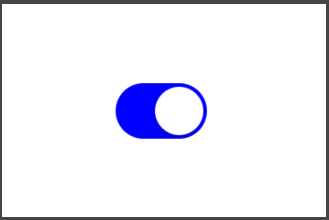
結果:
Init()内のすべてのUISwitchオブジェクトのグローバルonTintColorを変更できます。
@State var enable_dhcp = true

init()
{
    UISwitch.appearance().onTintColor = .red
}

var body: some View
{
    Toggle("DHCP", isOn: $enable_dhcp)
}

@ mohammad-reza-farahaniのソリューションを基に、SwiftUIの場合、実装プロトコルを使用してUISwitchの構成可能性を確保するための完全な妥協のないアプローチを次に示します。
最初にUISwitchをUIViewRepresentableで囲み、希望する色を設定します。
final class CustomToggleWrapper: UIViewRepresentable {
    var isOn: Binding<Bool>

    init(isOn: Binding<Bool>) {
        self.isOn = isOn
    }

    func makeUIView(context: Context) -> UISwitch {
        UISwitch()
    }

    func updateUIView(_ uiView: UISwitch, context: Context) {
        // On color
        uiView.onTintColor = UIColor.blue
        // Off color
        uiView.tintColor = UIColor.red
        uiView.layer.cornerRadius = uiView.frame.height / 2
        uiView.backgroundColor = UIColor.red
        uiView.isOn = isOn.wrappedValue

        // Update bound boolean
        uiView.addTarget(self, action: #selector(switchIsChanged(_:)), for: .valueChanged)
    }

    @objc
    func switchIsChanged(_ sender: UISwitch) {
        isOn.wrappedValue = sender.isOn
    }
}
次に、ラップされたUISwitchを使用して カスタムトグルスタイル を作成します。
struct CustomToggleStyle: ToggleStyle {
    func makeBody(configuration: Self.Configuration) -> some View {
        let toggle = CustomToggleWrapper(isOn: configuration.$isOn)

        return HStack {
            configuration.label
            Spacer()
            toggle
        }
    }
}
通常どおりにToggleを実装し、CustomToggleStyleを適用します。
struct TestView: View {
    @State private var isOn: Bool = true

    var body: some View {
        Toggle(
            isOn: $isOn
        ) {
            Text("Test: \(String(isOn))")
        }.toggleStyle(CustomToggleStyle()).padding()
    }
}
Karol KuleszaとGeorge Valkovは、非常に簡単に実装できるソリューションを提供しています。以下のコードをアプリデリゲートのdidFinishLaunchingメソッド内にも配置できることを追加したいと思います。
UISwitch.appearance().onTintColor = .blue
また、より具体的な外観設定を作成することもできます
appearance(whenContainedInInstancesOf:)
https://www.hackingwithswift.com/example-code/uikit/what-is-the-uiappearance-proxy を参照してください
これは https://stackoverflow.com/a/56480720/5941807 (今のところXcode 11ベータ6)が解決策です。オプションをすばやく切り替えるには、if/elseの代わりにブール値を使用します。
showFavoritesOnly ? .red : .blue
前景の場合:
Toggle(isOn: $showGreeting) {
  Text("Show Favorites only").foregroundColor(showFavoritesOnly ? .blue : .gray)
}
色合いの場合:
uiView.onTintColor = showFavoritesOnly ? UIColor.blue : UIColor.gray
元の質問は、色の切り替えを変更することだけであり、完全なToggle視覚的なカスタマイズではなかったので、次のようなことで実現できると思います。
import SwiftUI

struct CustomToggle: UIViewRepresentable {
  @Binding var isOn: Bool

  func makeCoordinator() -> CustomToggle.Coordinator {
    Coordinator(isOn: $isOn)
  }

  func makeUIView(context: Context) -> UISwitch {
    let view = UISwitch()
    view.onTintColor = UIColor.red
    view.addTarget(context.coordinator, action: #selector(Coordinator.switchIsChanged(_:)), for: .valueChanged)

    return view
  }

  func updateUIView(_ uiView: UISwitch, context: Context) {
    uiView.isOn = isOn
  }

  class Coordinator: NSObject {
    @Binding private var isOn: Bool

    init(isOn: Binding<Bool>) {
      _isOn = isOn
    }

    @objc func switchIsChanged(_ sender: UISwitch) {
      _isOn.wrappedValue = sender.isOn
    }
  }
}

// MARK: - Previews

struct CustomToggle_Previews: PreviewProvider {
  static var previews: some View {
    ViewWrapper()
  }

  struct ViewWrapper: View {
    @State(initialValue: false) var isOn: Bool

    var body: some View {
      CustomToggle(isOn: $isOn)
        .previewLayout(.fixed(width: 100, height: 100))
    }
  }
}