WinForms TreeViewとしてWPF TreeViewスタイルを作成する方法
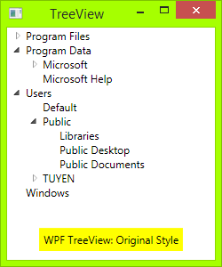
WPFのデフォルトのTreeViewは非常に優れていますが、WindowsフォームのTreeViewのように、子要素ごとに線がつながっている必要があります。インターネットで検索していくつかの例を挙げましたが、十分に設計されていませんでした。
WPFでそれを実現するにはどうすればよいですか?
私自身の質問に答えさせてください。
コード
必要なのは、XAMLファイルとコードビハインドだけです。
まず、トグルボタンを描画する必要があります:三角形ボタンからプラスマイナスボタン:暗い境界線のある長方形を描画してから、縦線と横線の2本の線を描きます。 TreeViewItemが展開されると、垂直線が非表示になります。
<!-- Toggle Button -->
<Style x:Key="ExpandCollapseToggleStyle" TargetType="ToggleButton">
    <Setter Property="Focusable" Value="False"/>
    <Setter Property="Template">
        <Setter.Value>
            <ControlTemplate TargetType="ToggleButton">
                <Grid Width="15" Height="13" SnapsToDevicePixels="True">
<!-- Rectangle 9x9 pixels -->
                    <Rectangle Width="9" Height="9" Stroke="#919191" SnapsToDevicePixels="true">
                        <Rectangle.Fill>
                            <LinearGradientBrush EndPoint="0.5,2" StartPoint="0.5,0">
                                <GradientStop Color="White" Offset="0"/>
                                <GradientStop Color="Silver" Offset="0.5"/>
                                <GradientStop Color="LightGray" Offset="1"/>
                            </LinearGradientBrush>
                        </Rectangle.Fill>
                    </Rectangle>
<!-- Vertical line inside rectangle -->
                    <Rectangle x:Name="ExpandPath" Width="1" Height="5" Stroke="Black" SnapsToDevicePixels="true"/>
<!-- Horizontal line inside rectangle -->
                    <Rectangle Width="5" Height="1" Stroke="Black" SnapsToDevicePixels="true"/>
                </Grid>
                <ControlTemplate.Triggers>
                    <Trigger Property="IsChecked" Value="True">
                        <Setter Property="Visibility"  TargetName="ExpandPath" Value="Collapsed"/>
                    </Trigger>
                </ControlTemplate.Triggers>
            </ControlTemplate>
        </Setter.Value>
    </Setter>
</Style>
上記のコードでは、トリガーを確認できます。トグルボタン内の垂直線が、アイテムが展開されている場合は非表示になり、子が折りたたまれている場合に表示されます。
次に、ノード間に垂直および水平の接続線を描画する必要があります。TreeViewItemコントロールを再設計する必要があります。これらの接続線を追加します。
<!-- Horizontal line -->
<Rectangle x:Name="HorLn" Margin="9,1,0,0" Height="1" Stroke="#DCDCDC" SnapsToDevicePixels="True"/>
<!-- Vertical line -->
<Rectangle x:Name="VerLn" Width="1" Stroke="#DCDCDC" Margin="0,0,1,0" Grid.RowSpan="2" SnapsToDevicePixels="true" Fill="White"/>
このようなTreeViewItemテンプレートに:
<!-- TreeViewItem -->
<Style x:Key="{x:Type TreeViewItem}" TargetType="{x:Type TreeViewItem}">
    <Setter Property="Template">
        <Setter.Value>
            <ControlTemplate TargetType="{x:Type TreeViewItem}">
                <Grid>
                    <Grid.ColumnDefinitions>
                        <ColumnDefinition MinWidth="19" Width="Auto"/>
                        <ColumnDefinition Width="Auto"/>
                        <ColumnDefinition Width="*"/>
                    </Grid.ColumnDefinitions>
                    <Grid.RowDefinitions>
                        <RowDefinition Height="Auto"/>
                        <RowDefinition/>
                    </Grid.RowDefinitions>

                    <!-- Connecting Lines -->
                    <!-- Horizontal line -->
                    <Rectangle x:Name="HorLn" Margin="9,1,0,0" Height="1" Stroke="#DCDCDC" SnapsToDevicePixels="True"/>
                    <!-- Vertical line -->
                    <Rectangle x:Name="VerLn" Width="1" Stroke="#DCDCDC" Margin="0,0,1,0" Grid.RowSpan="2" SnapsToDevicePixels="true" Fill="White"/>
                    <!-- Insert Toggle Button -->
                    <ToggleButton Margin="-1,0,0,0" x:Name="Expander" Style="{StaticResource ExpandCollapseToggleStyle}" IsChecked="{Binding Path=IsExpanded, RelativeSource={RelativeSource TemplatedParent}}" ClickMode="Press"/>
                    <Border Name="Bd" Grid.Column="1" Background="{TemplateBinding Background}" BorderBrush="{TemplateBinding BorderBrush}" BorderThickness="{TemplateBinding BorderThickness}" Padding="{TemplateBinding Padding}" SnapsToDevicePixels="True">
                        <ContentPresenter x:Name="PART_Header" ContentSource="Header" HorizontalAlignment="{TemplateBinding HorizontalContentAlignment}" MinWidth="20"/>
                    </Border>
                    <ItemsPresenter x:Name="ItemsHost" Grid.Row="1" Grid.Column="1" Grid.ColumnSpan="2"/>
                </Grid>
            </ControlTemplate>
        </Setter.Value>
    </Setter>
</Style>
次に、クラスTreeViewLineConverterを名前空間に配置する必要があります。このクラスは、項目がリストの最後の場合、接続線を変更します。
using System;
using System.Windows;
using System.Windows.Controls;
using System.Windows.Data;

namespace TreeViewEx
{
    public partial class MainWindow : Window
    {
        public MainWindow()
        {
            InitializeComponent();
        }
    }

    class TreeViewLineConverter : IValueConverter
    {
        public object Convert(object value, Type targetType, object parameter, System.Globalization.CultureInfo culture)
        {
            TreeViewItem item = (TreeViewItem)value;
            ItemsControl ic = ItemsControl.ItemsControlFromItemContainer(item);
            return ic.ItemContainerGenerator.IndexFromContainer(item) == ic.Items.Count - 1;
        }

        public object ConvertBack(object value, Type targetType, object parameter, System.Globalization.CultureInfo culture)
        {
            return false;
        }
    }

}
名前空間をXAMLに挿入します。つまり、
<Window x:Class="TreeViewEx.MainWindow"
        xmlns="http://schemas.Microsoft.com/winfx/2006/xaml/presentation"
        xmlns:x="http://schemas.Microsoft.com/winfx/2006/xaml"
        xmlns:local="clr-namespace:TreeViewEx"/>
次の行をWindow.Resourcesに追加します。
<local:TreeViewLineConverter x:Key="LineConverter"/>
TreeViewItemテンプレートにトリガーを追加します。このトリガーは、項目がリストの最後の場合、接続線を変更します。
<!-- This trigger changes the connecting lines if the item is the last in the list -->
<DataTrigger Binding="{Binding RelativeSource={RelativeSource Self}, Converter={StaticResource LineConverter}}" Value="true">
    <Setter TargetName="VerLn" Property="Height" Value="9"/>
    <Setter TargetName="VerLn" Property="VerticalAlignment" Value="Top"/>
</DataTrigger>
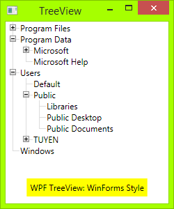
TreeViewはWinFormsスタイルになります。必要に応じて、さらにトリガーを追加してTreeViewの動作を制御できます。完全なトリガーは添付ファイルにあります。
ToDo
WinForms TreeViewでは、接続線は点線です。これらの線を点線にするには、次のように変更します。
<!-- Connecting Lines -->
<Rectangle x:Name="HorLn" Margin="9,1,0,0" Height="1" Stroke="#DCDCDC" SnapsToDevicePixels="True"/>
<Rectangle x:Name="VerLn" Width="1" Stroke="#DCDCDC" Margin="0,0,1,0" Grid.RowSpan="2" SnapsToDevicePixels="true" Fill="White"/>
に:
<!-- Connecting Lines -->
<Rectangle x:Name="HorLn" Margin="9,1,0,0" Height="1" Stroke="Blue" StrokeDashCap="Square" StrokeDashArray="0,2" StrokeDashOffset="1" SnapsToDevicePixels="True"/>
<Rectangle x:Name="VerLn" Width="1"  Stroke="Blue" StrokeDashCap="Square" StrokeDashArray="0,2" Margin="0,0,1,0" Grid.RowSpan="2" SnapsToDevicePixels="true" Fill="White"/>
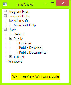
しかし、あなたが見るように、それはきれいではありません。私はWPFの初心者なので、これらのラインを完璧にスタイルする方法がわかりません。
問題!
TreeViewItemをTreeViewに追加すると、垂直線に問題があります。
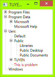
縦線のサイズを変更することをお勧めしますが、フォントサイズを変更しても機能しません。
ソースコード
ここに私のソースコードをダウンロードできます: https://tuyentk.googlecode.com/files/TreeViewEx.Zip (4.4 KB)
参照
これは、独自のコードを作成する前に参照したコードです。SocialMSDN: 点線で接続されたTreeViewノードを表示
いい例です。点線のソリューションの問題は、幅または高さが1に設定された線として長方形を使用していることです。その場合、左と右の境界が同じピクセル上にあります。これらの線が実線の場合は問題ありませんが、点線の場合、同じ場所にドットを配置する必要はありません(つまり、左の境界はピクセル0のドットで始まり、右の境界はピクセル1です)。この動作により、線が作成されますきれいではない。
解決策は、長方形とは異なる点線を作成することです。たとえば、Borderを使用できます。 こちら から解決策を取った。
接続線を次のように変更します。
<!-- Connecting Lines -->
<Border x:Name="HorLn" Margin="9,0,0,0" HorizontalAlignment="Stretch" Height="1" BorderThickness="0,0,0,1">
    <Border.BorderBrush>
        <LinearGradientBrush StartPoint="0,0" EndPoint="2,0" SpreadMethod="Repeat" MappingMode="Absolute">
            <GradientStop Color="Transparent" Offset="0" />
            <GradientStop Color="Transparent" Offset="0.499" />
            <GradientStop Color="#999" Offset="0.5" />
        </LinearGradientBrush>
    </Border.BorderBrush>
</Border>
<Border x:Name="VerLn" Margin="0,0,1,0" Grid.RowSpan="2" VerticalAlignment="Stretch" Width="1" BorderThickness="0,0,1,0">
    <Border.BorderBrush>
        <LinearGradientBrush StartPoint="0,0" EndPoint="0,2" SpreadMethod="Repeat" MappingMode="Absolute">
            <GradientStop Color="Transparent" Offset="0" />
            <GradientStop Color="Transparent" Offset="0.499" />
            <GradientStop Color="#999" Offset="0.5" />
        </LinearGradientBrush>
    </Border.BorderBrush>
</Border>
回答が少し修正されました。垂直線のサイズはアイテムの高さと動的に相関し、長方形は境界線で置き換えられます
<Style x:Key="ExpandCollapseToggleStyle" TargetType="ToggleButton">
    <Setter Property="Focusable" Value="False"/>
    <Setter Property="Template">
        <Setter.Value>
            <ControlTemplate TargetType="ToggleButton">
                <Grid Width="15" Height="13" SnapsToDevicePixels="True">
                    <Rectangle Width="9" Height="9" Stroke="#919191" SnapsToDevicePixels="true" Fill="White"/>
                    <Rectangle x:Name="ExpandPath" Width="1" Height="5" Stroke="Black" SnapsToDevicePixels="true"/>
                    <Rectangle Width="5" Height="1" Stroke="Black" SnapsToDevicePixels="true"/>
                </Grid>
                <ControlTemplate.Triggers>
                    <Trigger Property="IsChecked" Value="True">
                        <Setter Property="Visibility"  TargetName="ExpandPath" Value="Collapsed"/>
                    </Trigger>
                </ControlTemplate.Triggers>
            </ControlTemplate>
        </Setter.Value>
    </Setter>
</Style>

<Style x:Key="TreeViewStyle" TargetType="{x:Type TreeViewItem}">
    <Setter Property="Background" Value="Transparent"/>
    <Setter Property="Padding" Value="0,0,0,0"/>
    <Setter Property="Template">
        <Setter.Value>
            <ControlTemplate TargetType="{x:Type TreeViewItem}">
                <Grid Name="ItemRoot">
                    <Grid.ColumnDefinitions>
                        <ColumnDefinition Width="20"/>
                        <ColumnDefinition Width="Auto"/>
                    </Grid.ColumnDefinitions>
                    <Grid.RowDefinitions>
                        <RowDefinition/>
                        <RowDefinition/>
                    </Grid.RowDefinitions>

                    <Grid Name="Lines" Grid.Column="0" Grid.Row="0">
                       <Grid.RowDefinitions>
                           <RowDefinition/>
                           <RowDefinition/>
                       </Grid.RowDefinitions>
                       <Grid.ColumnDefinitions>
                           <ColumnDefinition/>
                           <ColumnDefinition/>
                       </Grid.ColumnDefinitions>

                        <Border Grid.Row="0" Grid.Column="1" BorderThickness="1 0 0 1" SnapsToDevicePixels="True" BorderBrush="{TemplateBinding BorderBrush}"/>
                        <Border Grid.Row="1" Grid.Column="1" BorderThickness="1 0 0 0" SnapsToDevicePixels="True" BorderBrush="{TemplateBinding BorderBrush}" Name="LineToNextItem"
                                Visibility="{Binding RelativeSource={RelativeSource Mode=FindAncestor, AncestorType={x:Type TreeViewItem}},
                                             Converter={StaticResource LineConverter}}"/>
                    </Grid>

                    <ToggleButton x:Name="Expander" Grid.Column="0" Grid.Row="0"
                                  Style="{StaticResource ExpandCollapseToggleStyle}"
                                  IsChecked="{Binding Path=IsExpanded, RelativeSource={RelativeSource TemplatedParent}}"
                                  ClickMode="Press"/>

                    <Border Name="Bd" Grid.Column="1" Grid.Row="0"
                            HorizontalAlignment="Left"
                            Background="{TemplateBinding Background}"
                            BorderBrush="{TemplateBinding BorderBrush}"
                            BorderThickness="{TemplateBinding BorderThickness}"
                            Padding="{TemplateBinding Padding}"
                            SnapsToDevicePixels="True">
                        <ContentPresenter x:Name="PART_Header" ContentSource="Header" HorizontalAlignment="{TemplateBinding HorizontalContentAlignment}" MinWidth="20"/>
                    </Border>

                    <Grid Grid.Column="0" Grid.Row="1">
                        <Grid.ColumnDefinitions>
                            <ColumnDefinition/>
                            <ColumnDefinition/>
                        </Grid.ColumnDefinitions>

                        <Border Grid.Column="1" BorderThickness="1 0 0 0" SnapsToDevicePixels="True" BorderBrush="{TemplateBinding BorderBrush}"
                                Visibility="{Binding ElementName=LineToNextItem, Path=Visibility}"/>
                    </Grid>

                    <ItemsPresenter x:Name="ItemsHost" Grid.Column="1" Grid.Row="1" />
                </Grid>

                <ControlTemplate.Triggers>
                    <Trigger Property="HasItems" Value="false">
                        <Setter TargetName="Expander" Property="Visibility" Value="Hidden"/>
                    </Trigger>
                    <Trigger Property="IsExpanded" Value="false">
                        <Setter TargetName="ItemsHost" Property="Visibility" Value="Collapsed"/>
                    </Trigger>
                    <Trigger Property="IsSelected" Value="true">
                        <Setter TargetName="Bd" Property="Background" Value="{DynamicResource {x:Static SystemColors.HighlightBrushKey}}"/>
                        <Setter Property="Foreground" Value="{DynamicResource {x:Static SystemColors.HighlightTextBrushKey}}"/>
                    </Trigger>
                </ControlTemplate.Triggers>
            </ControlTemplate>
        </Setter.Value>
    </Setter>
</Style>
 <TreeView Name="TreeView" Margin="24">
                <Border CornerRadius="20" BorderBrush="Red" BorderThickness="1 0 0 0">
                    <TreeViewItem Header="aaaaaaaaaaaaaaaaaaaaaaaaaaaaa" IsExpanded="True">
                        <Border CornerRadius="20" BorderBrush="Red" BorderThickness="1 0 0 0">
                            <TreeViewItem Header="aaaaaaaaaaaaaaaaaaaaaaaaaaaaa" IsExpanded="True">
                                <Border CornerRadius="20" BorderBrush="Red" BorderThickness="1 0 0 0">
                                    <TreeViewItem Header="aaaaaaaaaaaaaaaaaaaaaaaaaaaaa" IsExpanded="True">
                                        <Border CornerRadius="20" BorderBrush="Red" BorderThickness="1 0 0 0">
                                            <TreeViewItem Header="aaaaaaaaaaaaaaaaaaaaaaaaaaaaa" IsExpanded="True">

                                            </TreeViewItem>
                                        </Border>
                                    </TreeViewItem>

                                </Border>
                                <Border CornerRadius="20" BorderBrush="Red" BorderThickness="1 0 0 0">
                                    <TreeViewItem Header="aaaaaaaaaaaaaaaaaaaaaaaaaaaaa" IsExpanded="True">

                                    </TreeViewItem>
                                </Border>
                            </TreeViewItem>
                        </Border>
                        <Border CornerRadius="20" BorderBrush="Red" BorderThickness="1 0 0 0">
                            <TreeViewItem Header="aaaaaaaaaaaaaaaaaaaaaaaaaaaaa" IsExpanded="True">

                            </TreeViewItem>
                        </Border>
                    </TreeViewItem>
                </Border>

            </TreeView>