WPFタブコントロールで台形タブを作成する方法
WPFタブコントロールで台形タブを作成する方法は?
GoogleのタブChromeまたはVS 2008のコードエディターのタブのように見える非長方形のタブを作成したいと思います。
WPFスタイルで実行できますか、それともコードで描画する必要がありますか?
インターネットで利用可能なコードの例はありますか?
編集:
角を丸めたり、タブの色を変更する方法を示す例はたくさんありますが、この2つの例のようにタブのジオメトリを変更するものは見つかりませんでした。
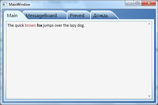
VS 2008コードエディターのタブ
Google Chrome tabs
この2つの例のタブは、長方形ではなく台形です。
この問題のコントロールテンプレートまたはソリューションをインターネット上で見つけようとしましたが、「受け入れられる」ソリューションは見つかりませんでした。だから私は自分のやり方でそれを書きました、そしてこれがそれをする最初の(そして最後の=))試みの例です:
<Window x:Class="TabControlTemplate.Window1"
    xmlns="http://schemas.Microsoft.com/winfx/2006/xaml/presentation"
    xmlns:x="http://schemas.Microsoft.com/winfx/2006/xaml"
    xmlns:src="clr-namespace:TabControlTemplate"
    Title="Window1" Width="600" Height="400">
<Window.Background>
    <LinearGradientBrush StartPoint="0,0" EndPoint="1,1">
        <GradientStop Color="#FF3164a5" Offset="1"/>
        <GradientStop Color="#FF8AAED4" Offset="0"/>
    </LinearGradientBrush>
</Window.Background>
<Window.Resources>
    <src:ContentToPathConverter x:Key="content2PathConverter"/>
    <src:ContentToMarginConverter x:Key="content2MarginConverter"/>

    <SolidColorBrush x:Key="BorderBrush" Color="#FFFFFFFF"/>
    <SolidColorBrush x:Key="HoverBrush" Color="#FFFF4500"/>
    <LinearGradientBrush x:Key="TabControlBackgroundBrush" EndPoint="0.5,0" StartPoint="0.5,1">
        <GradientStop Color="#FFa9cde7" Offset="0"/>
        <GradientStop Color="#FFe7f4fc" Offset="0.3"/>
        <GradientStop Color="#FFf2fafd" Offset="0.85"/>
        <GradientStop Color="#FFe4f6fa" Offset="1"/>
    </LinearGradientBrush>
    <LinearGradientBrush x:Key="TabItemPathBrush" StartPoint="0,0" EndPoint="0,1">
        <GradientStop Color="#FF3164a5" Offset="0"/>
        <GradientStop Color="#FFe4f6fa" Offset="1"/>
    </LinearGradientBrush>

    <!-- TabControl style -->
    <Style x:Key="TabControlStyle" TargetType="{x:Type TabControl}">
        <Setter Property="BorderThickness" Value="1"/>
        <Setter Property="Template">
            <Setter.Value>
                <ControlTemplate TargetType="TabControl">
                    <Grid>
                        <Grid.RowDefinitions>
                            <RowDefinition Height="Auto"/>
                            <RowDefinition Height="*"/>
                        </Grid.RowDefinitions>
                        <Border Grid.Row="1" BorderThickness="2,0,2,2" Panel.ZIndex="2" CornerRadius="0,0,2,2"
                                BorderBrush="{StaticResource BorderBrush}"
                                Background="{StaticResource TabControlBackgroundBrush}">
                            <ContentPresenter ContentSource="SelectedContent"/>
                        </Border>
                        <StackPanel Orientation="Horizontal" Grid.Row="0" Panel.ZIndex="1" IsItemsHost="true"/>
                        <Rectangle Grid.Row="0" Height="2" VerticalAlignment="Bottom"
                                   Fill="{StaticResource BorderBrush}"/>
                    </Grid>
                </ControlTemplate>
            </Setter.Value>
        </Setter>
    </Style>
    <!-- TabItem style -->
    <Style x:Key="{x:Type TabItem}" TargetType="{x:Type TabItem}">
        <Setter Property="SnapsToDevicePixels" Value="True"/>
        <Setter Property="Template">
            <Setter.Value>
                <ControlTemplate TargetType="TabItem">
                    <Grid x:Name="grd">
                        <Path x:Name="TabPath" StrokeThickness="2"
                              Margin="{Binding ElementName=TabItemContent, Converter={StaticResource content2MarginConverter}}"
                              Stroke="{StaticResource BorderBrush}"
                              Fill="{StaticResource TabItemPathBrush}">
                            <Path.Data>
                                <PathGeometry>
                                    <PathFigure IsClosed="False" StartPoint="1,0"
                                                Segments="{Binding ElementName=TabItemContent, Converter={StaticResource content2PathConverter}}">
                                    </PathFigure>
                                </PathGeometry>
                            </Path.Data>
                            <Path.LayoutTransform>
                                <ScaleTransform ScaleY="-1"/>
                            </Path.LayoutTransform>
                        </Path>
                        <Rectangle x:Name="TabItemTopBorder" Height="2" Visibility="Visible"
                                   VerticalAlignment="Bottom" Fill="{StaticResource BorderBrush}"
                                   Margin="{Binding ElementName=TabItemContent, Converter={StaticResource content2MarginConverter}}" />
                        <ContentPresenter x:Name="TabItemContent" ContentSource="Header"
                                          Margin="10,2,10,2" VerticalAlignment="Center"
                                          TextElement.Foreground="#FF000000"/>
                    </Grid>
                    <ControlTemplate.Triggers>
                        <Trigger Property="IsMouseOver" Value="True" SourceName="grd">
                            <Setter Property="Stroke" Value="{StaticResource HoverBrush}" TargetName="TabPath"/>
                        </Trigger>
                        <Trigger Property="Selector.IsSelected" Value="True">
                            <Setter Property="Fill" TargetName="TabPath">
                                <Setter.Value>
                                    <SolidColorBrush Color="#FFe4f6fa"/>
                                </Setter.Value>
                            </Setter>
                            <Setter Property="BitmapEffect">
                                <Setter.Value>
                                    <DropShadowBitmapEffect Direction="302" Opacity="0.4"
                                                        ShadowDepth="2" Softness="0.5"/>
                                </Setter.Value>
                            </Setter>
                            <Setter Property="Panel.ZIndex" Value="2"/>
                            <Setter Property="Visibility" Value="Hidden" TargetName="TabItemTopBorder"/>
                        </Trigger>
                    </ControlTemplate.Triggers>
                </ControlTemplate>
            </Setter.Value>
        </Setter>
    </Style>
</Window.Resources>
<Grid Margin="20">
    <TabControl Grid.Row="0" Grid.Column="1" Margin="5" TabStripPlacement="Top"
                Style="{StaticResource TabControlStyle}" FontSize="16">
        <TabItem Header="MainTab">
            <Border Margin="10">
                <TextBlock Text="The quick brown fox jumps over the lazy dog."/>
            </Border>
        </TabItem>
        <TabItem Header="VeryVeryLongTab" />
        <TabItem Header="Tab" />
    </TabControl>
</Grid>
using System;
using System.Windows;
using System.Windows.Controls;
using System.Windows.Data;
using System.Windows.Media;

namespace TabControlTemplate
{
public partial class Window1
{
    public Window1()
    {
        InitializeComponent();
    }
}

public class ContentToMarginConverter: IValueConverter
{
    #region IValueConverter Members

    public object Convert(object value, Type targetType, object parameter, System.Globalization.CultureInfo culture)
    {
        return new Thickness(0, 0, -((ContentPresenter)value).ActualHeight, 0);
    }

    public object ConvertBack(object value, Type targetType, object parameter, System.Globalization.CultureInfo culture)
    {
        throw new NotImplementedException();
    }

    #endregion
}

public class ContentToPathConverter: IValueConverter
{
    #region IValueConverter Members

    public object Convert(object value, Type targetType, object parameter, System.Globalization.CultureInfo culture)
    {
        var ps = new PathSegmentCollection(4);
        ContentPresenter cp = (ContentPresenter)value;
        double h = cp.ActualHeight > 10 ? 1.4 * cp.ActualHeight : 10;
        double w = cp.ActualWidth > 10 ? 1.25 * cp.ActualWidth : 10;
        ps.Add(new LineSegment(new Point(1, 0.7 * h), true));
        ps.Add(new BezierSegment(new Point(1, 0.9 * h), new Point(0.1 * h, h), new Point(0.3 * h, h), true));
        ps.Add(new LineSegment(new Point(w, h), true));
        ps.Add(new BezierSegment(new Point(w + 0.6 * h, h), new Point(w + h, 0), new Point(w + h * 1.3, 0), true));
        return ps;
    }

    public object ConvertBack(object value, Type targetType, object parameter, System.Globalization.CultureInfo culture)
    {
        throw new NotImplementedException();
    }

    #endregion
}
}
これらの2つのコンバーターは、コンテンツに合わせてタブサイズを調整するために作成しました。実際、コンテンツのサイズに応じてPathオブジェクトを作成しています。さまざまな幅のタブが必要ない場合は、次のように変更したコピーを使用できます。
<Style x:Key="tabPath" TargetType="{x:Type Path}">
      <Setter Property="Stroke" Value="Black"/>
      <Setter Property="Data">
          <Setter.Value>
              <PathGeometry Figures="M 0,0 L 0,14 C 0,18 2,20 6,20 L 60,20 C 70,20 80,0 84,0"/>
          </Setter.Value>
      </Setter>
  </Style>
画面:
注:これはルークの素晴らしい答えの付録にすぎません。
ルークのソリューションは実行時に完璧に機能していましたが、VS2010 WPFデザイナーサーフェイスでMainWindowを開くときに問題が発生しました。デザイナーは例外をスローし、ウィンドウを表示しませんでした。また、TabControl.xamlのTabItemのControlTemplate全体に青い波線があり、ツールチップにNullReferenceExceptionが発生したことが示されていました。関連するコードをアプリケーションに移動するときも同じ動作をしました。問題は2つの異なるマシンにあったため、インストールの問題とは関係ないと考えています。
誰かが同じ問題を経験した場合、修正が見つかったため、実行時とデザイナーでもサンプルが動作するようになりました。
最初:TabControl-XAMLコードで置換...
<Path x:Name="TabPath" StrokeThickness="2"
      Margin="{Binding ElementName=TabItemContent,
               Converter={StaticResource content2MarginConverter}}"
      Stroke="{StaticResource BorderBrush}"
      Fill="{StaticResource TabItemPathBrush}">
    <Path.Data>
        <PathGeometry>
            <PathFigure IsClosed="False" StartPoint="1,0"
                 Segments="{Binding ElementName=TabItemContent,
                            Converter={StaticResource content2PathConverter}}">
            </PathFigure>
        </PathGeometry>
    </Path.Data>
    <Path.LayoutTransform>
        <ScaleTransform ScaleY="-1"/>
    </Path.LayoutTransform>
</Path>
... by ...
<Path x:Name="TabPath" StrokeThickness="2"
      Margin="{Binding ElementName=TabItemContent,
               Converter={StaticResource content2MarginConverter}}"
      Stroke="{StaticResource BorderBrush}"
      Fill="{StaticResource TabItemPathBrush}"
      Data="{Binding ElementName=TabItemContent,
             Converter={StaticResource content2PathConverter}}">
    <Path.LayoutTransform>
        <ScaleTransform ScaleY="-1"/>
    </Path.LayoutTransform>
</Path>
Second:ContentToPathConverterクラスのConvertメソッドの最後で置換...
return ps;
... by ...
PathFigure figure = new PathFigure(new Point(1, 0), ps, false);
PathGeometry geometry = new PathGeometry();
geometry.Figures.Add(figure);

return geometry;
これがデザイナーで安定して動作する理由は説明がありませんが、ルークの元のコードでは動作しません。
Google Chromeに似たWPFのタブコントロールを完成しました。 https://github.com/realistschuckle/wpfchrometabs でプロジェクトを見つけることができます。
カスタムタブコントロールをゼロから作成する方法を理解するのに役立つことを願っています。
<Grid>
    <Grid.Resources>
        <Style TargetType="{x:Type TabControl}">
            <Setter Property="ItemContainerStyle">
                <Setter.Value>
                    <Style>
                        <Setter Property="Control.Height" Value="20"></Setter>
                        <Setter Property="Control.Template">
                            <Setter.Value>
                                <ControlTemplate TargetType="{x:Type TabItem}">
                                    <Grid Margin="0 0 -10 0">
                                        <Grid.ColumnDefinitions>
                                            <ColumnDefinition Width="10">
                                            </ColumnDefinition>
                                            <ColumnDefinition></ColumnDefinition>
                                            <ColumnDefinition Width="10"></ColumnDefinition>
                                        </Grid.ColumnDefinitions>
                                        <Path Data="M10 0 L 0 20 L 10 20 " Fill="{TemplateBinding Background}" Stroke="Black"></Path>
                                        <Rectangle Fill="{TemplateBinding Background}" Grid.Column="1"></Rectangle>
                                        <Rectangle VerticalAlignment="Top" Height="1" Fill="Black" Grid.Column="1"></Rectangle>
                                        <Rectangle VerticalAlignment="Bottom" Height="1" Fill="Black" Grid.Column="1"></Rectangle>
                                        <ContentPresenter Grid.Column="1" ContentSource="Header" />
                                       <Path Data="M0 20 L 10 20 L0 0" Fill="{TemplateBinding Background}" Grid.Column="2" Stroke="Black"></Path>
                                    </Grid>
                                    <ControlTemplate.Triggers>
                                        <Trigger Property="IsSelected" Value="True">
                                            <Trigger.Setters>
                                                <Setter Property="Background" Value="Beige"></Setter>
                                                <Setter Property="Panel.ZIndex" Value="1"></Setter>
                                            </Trigger.Setters>
                                        </Trigger>
                                        <Trigger Property="IsSelected" Value="False">
                                            <Trigger.Setters>
                                                <Setter Property="Background" Value="LightGray"></Setter>
                                            </Trigger.Setters>
                                        </Trigger>
                                    </ControlTemplate.Triggers>
                                </ControlTemplate>
                            </Setter.Value>
                        </Setter>
                    </Style>
                </Setter.Value>
            </Setter>
        </Style>
    </Grid.Resources>
    <TabControl>
        <TabItem Header="One" ></TabItem>
        <TabItem Header="Two" ></TabItem>
        <TabItem Header="Three" ></TabItem>
    </TabControl>
</Grid>
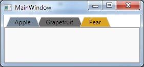
私はこれが古いことを知っていますが、私は提案したいと思います:
XAML:
    <Window.Resources>

    <ControlTemplate x:Key="trapezoidTab" TargetType="TabItem">
        <Grid>
            <Polygon Name="Polygon_Part" Points="{Binding TabPolygonPoints}" />
            <ContentPresenter Name="TabContent_Part" Margin="{TemplateBinding Margin}" Panel.ZIndex="100" ContentSource="Header" HorizontalAlignment="Center" VerticalAlignment="Center"/>
        </Grid>

        <ControlTemplate.Triggers>

            <Trigger Property="IsMouseOver" Value="False">
                <Setter TargetName="Polygon_Part" Property="Stroke" Value="LightGray"/>
                <Setter TargetName="Polygon_Part" Property="Fill" Value="DimGray" />
            </Trigger>

            <Trigger Property="IsMouseOver" Value="True">
                <Setter TargetName="Polygon_Part" Property="Fill" Value="Goldenrod" />
                <Setter TargetName="Polygon_Part" Property="Stroke" Value="LightGray"/>
            </Trigger>

            <Trigger Property="IsSelected" Value="False">
                <Setter Property="Panel.ZIndex" Value="90"/>
            </Trigger>

            <Trigger Property="IsSelected" Value="True">
                <Setter Property="Panel.ZIndex" Value="100"/>
                <Setter TargetName="Polygon_Part" Property="Stroke" Value="LightGray"/>
                <Setter TargetName="Polygon_Part" Property="Fill" Value="LightSlateGray "/>
            </Trigger>


        </ControlTemplate.Triggers>

    </ControlTemplate>

</Window.Resources>

<!-- Test the tabs-->
<TabControl Name="FruitTab">
    <TabItem Header="Apple" Template="{StaticResource trapezoidTab}" />
    <TabItem Margin="-8,0,0,0" Header="Grapefruit" Template="{StaticResource trapezoidTab}" />
    <TabItem Margin="-16,0,0,0" Header="Pear" Template="{StaticResource trapezoidTab}"/>
</TabControl>
ViewModel:
    using System;
    using System.Collections.Generic;
    using System.Linq;
    using System.Text;
    using System.Threading.Tasks;
    using System.Windows;
    using System.Windows.Shapes;
    using System.ComponentModel;
    using System.Globalization;
    using System.Windows.Media;

    namespace TrapezoidTab
    {
        public class TabHeaderViewModel : INotifyPropertyChanged
        {
            public event PropertyChangedEventHandler PropertyChanged;
            private string _tabHeaderText;
            private List<Point> _polygonPoints;
            private PointCollection _pointCollection;

            public TabHeaderViewModel(string tabHeaderText)
            {
                _tabHeaderText = tabHeaderText;
                TabPolygonPoints = GenPolygon();
            }

            public PointCollection TabPolygonPoints
            {
                get { return _pointCollection; }
                set
                {
                    _pointCollection = value;
                    if (PropertyChanged != null)
                        PropertyChanged(this, new PropertyChangedEventArgs("TabPolygonPoints"));
                }
            }

            public string TabHeaderText
            {
                get { return _tabHeaderText; }
                set
                {
                    _tabHeaderText = value;
                    TabPolygonPoints = GenPolygon();
                    if (PropertyChanged != null)
                        PropertyChanged(this, new PropertyChangedEventArgs("TabHeaderText"));
                }
            }

            private PointCollection GenPolygon()
            {
                var w = new FormattedText(_tabHeaderText, CultureInfo.GetCultureInfo("en-us"), FlowDirection.LeftToRight, new Typeface("Tahoma"), 12, Brushes.Black);
                var width = w.Width + 30;

                _polygonPoints = new List<Point>(4);
                _pointCollection = new PointCollection(4);

                _polygonPoints.Add(new Point(2, 21));
                _polygonPoints.Add(new Point(10, 2));
                _polygonPoints.Add(new Point(width, 2));
                _polygonPoints.Add(new Point(width + 8, 21));

                foreach (var point in _polygonPoints)
                    _pointCollection.Add(point);

                return _pointCollection;
            }
        }
    }
メイン:
namespace TrapezoidTab
{
    /// <summary>
    /// Interaction logic for MainWindow.xaml
    /// </summary>
    public partial class MainWindow : Window
    {
        public MainWindow()
        {
            InitializeComponent();

            foreach (var obj in FruitTab.Items)
            {
                var tab = obj as TabItem;
                if (tab == null) continue;
                tab.DataContext = new TabHeaderViewModel(tab.Header.ToString());
            }
        }
    }
}
うん、あなたはそれを行うことができます-基本的にあなたがしなければならないのは、カスタムコントロールテンプレートを作成することです。 http://www.switchonthecode.com/tutorials/the-wpf-tab-control-inside-and-out をご覧ください。 「wpf」「tabcontrol」「shape」をグーグルで検索するだけで、結果のページが表示されます。
私はこれを自分で試したことはありませんが、テンプレート内のタグをタグに置き換えて、必要な形状を取得できるはずです。
左右両方のタブエッジを傾斜させるため、タブのエッジを変更します- Slaumaの拡張 から rookの受け入れられた答え 。これは、ContentToPathConverterクラスのConvertメソッドの代替です。
    public object Convert(object value, Type targetType, object parameter, System.Globalization.CultureInfo culture)
    {
        var ps = new PathSegmentCollection(4);
        ContentPresenter cp = (ContentPresenter)value;
        double h = cp.ActualHeight > 10 ? 1.4 * cp.ActualHeight : 10;
        double w = cp.ActualWidth > 10 ? 1.25 * cp.ActualWidth : 10;
        // Smaller unit, so don't need fractional multipliers.
        double u = 0.1 * h;
        // HACK: Start before "normal" start of tab.
        double x0 = -4 * u;
        // end of transition
        double x9 = w + 8 * u;
        // transition width
        double tw = 8 * u;
        // top "radius" (actually, gradualness of curve. Larger value is more rounded.)
        double rt = 5 * u;
        // bottom "radius" (actually, gradualness of curve. Larger value is more rounded.)
        double rb = 3 * u;
        // "(x0, 0)" is start point - defined in PathFigure.
        // Cubic: From previous endpoint, 2 control points + new endpoint.
        ps.Add(new BezierSegment(new Point(x0 + rb, 0), new Point(x0 + tw - rt, h), new Point(x0 + tw, h), true));
        ps.Add(new LineSegment(new Point(x9 - tw, h), true));
        ps.Add(new BezierSegment(new Point(x9 - tw + rt, h), new Point(x9 - rb, 0), new Point(x9, 0), true));

        // "(x0, 0)" is start point.
        PathFigure figure = new PathFigure(new Point(x0, 0), ps, false);
        PathGeometry geometry = new PathGeometry();
        geometry.Figures.Add(figure);

        return geometry;
    }
また、TabControlのControlTemplateで、タブアイテムのコンテナに左(およびオプションで右)のマージンを追加します(唯一の変更はMargin="20,0,20,0"):
<Style x:Key="TabControlStyle" TargetType="{x:Type TabControl}">
    ...
    <Setter Property="Template">
        ...
        <StackPanel Grid.Row="0" Panel.ZIndex="1" Orientation="Horizontal" IsItemsHost="true" Margin="20,0,20,0"/>
問題:選択したタブではない場合、タブの左端の下部にわずかな視覚的な「グリッチ」があります。タブ領域の開始前に開始することは、「逆戻り」に関連していると思います。または、タブの下部にある線の描画に関連します(タブの左端の「通常の」長方形の前から始まることはわかりません)。