WPF ListViewは選択をオフにします
簡単なWPF ListViewと簡単な質問があります。
選択をオフにすることは可能ですか?したがって、ユーザーが行をクリックしても、行は強調表示されませんか?

クリックすると、行1が行0のように見えるようにします。
関連する可能性:ホバー/選択範囲の外観をスタイルできますか?例えば。青いグラデーションのホバールック(3行目)をカスタム単色に置き換えます。 this および this が見つかりましたが、残念ながら助けにはなりません。
(ListViewを使用せずに同じことを実現することも許容されます。ListViewのように論理スクロールとUI仮想化を使用できるようにしたいと思います)
ListViewのXAMLは次のとおりです。
<ListView Height="280" Name="listView">
    <ListView.Resources>
        <!-- attempt to override selection color -->
        <SolidColorBrush x:Key="{x:Static SystemColors.HighlightColorKey}"
                         Color="Green" />
    </ListView.Resources>
    <ListView.View>
        <GridView>
            <GridView.Columns>
                <GridViewColumn Header="Name" DisplayMemberBinding="{Binding Name}" />
                <!-- more columns -->
            </GridView.Columns>
        </GridView>
     </ListView.View>
</ListView>
Martin Konicekのコメントによると、最も簡単な方法でアイテムの選択を完全に無効にするには:
<ListView>
    <ListView.ItemContainerStyle>
        <Style TargetType="ListViewItem">
            <Setter Property="Focusable" Value="false"/>
        </Style>
    </ListView.ItemContainerStyle>
    ...
</ListView>
ただし、アイテムを選択できるなど、ListViewの機能が引き続き必要な場合は、次のように選択したアイテムのスタイルを視覚的に無効にすることができます。
これは、ListViewItemの ControlTemplate を変更するだけでなく、スタイルを設定する(はるかに簡単な)方法から、さまざまな方法で行うことができます。 ItemContainerStyle を使用してListViewItemsのスタイルを作成し、選択時に背景ブラシと境界線ブラシを「オフ」にすることができます。
<ListView>
    <ListView.ItemContainerStyle>
        <Style TargetType="{x:Type ListViewItem}">
            <Style.Triggers>
                <Trigger Property="IsSelected"
                         Value="True">
                    <Setter Property="Background"
                            Value="{x:Null}" />
                    <Setter Property="BorderBrush"
                            Value="{x:Null}" />
                </Trigger>
            </Style.Triggers>
        </Style>
    </ListView.ItemContainerStyle>
    ...
</ListView>
また、アイテムが選択されたときに(または単にテストのために)ユーザーに通知する他の方法がない限り、値を表す列を追加できます。
<GridViewColumn Header="IsSelected"
                DisplayMemberBinding="{Binding RelativeSource={RelativeSource Mode=FindAncestor, AncestorType={x:Type ListViewItem}}, Path=IsSelected}" />
ムーアの答えは機能せず、ここのページ:
リストボックス内のアイテムの選択色、コンテンツの配置、および背景色の指定
なぜ機能しないのかを説明します。
リストビューに基本テキストのみが含まれる場合、問題を解決する最も簡単な方法は、透明なブラシを使用することです。
<Window.Resources>
  <Style TargetType="{x:Type ListViewItem}">
    <Style.Resources>
      <SolidColorBrush x:Key="{x:Static SystemColors.HighlightBrushKey}" Color="#00000000"/>
      <SolidColorBrush x:Key="{x:Static SystemColors.ControlBrushKey}" Color="#00000000"/>
    </Style.Resources>
  </Style>
</Window.Resources>
リストビューのセルがコンボボックスなどのコントロールを保持している場合、色も変更されるため、これは望ましくない結果をもたらします。この問題を解決するには、コントロールのテンプレートを再定義する必要があります。
  <Window.Resources>
    <Style TargetType="{x:Type ListViewItem}">
      <Setter Property="Template">
        <Setter.Value>
          <ControlTemplate TargetType="{x:Type ListViewItem}">
            <Border SnapsToDevicePixels="True"
                    x:Name="Bd"
                    Background="{TemplateBinding Background}"
                    BorderBrush="{TemplateBinding BorderBrush}"
                    BorderThickness="{TemplateBinding BorderThickness}"
                    Padding="{TemplateBinding Padding}">
              <GridViewRowPresenter SnapsToDevicePixels="{TemplateBinding SnapsToDevicePixels}"
                                    VerticalAlignment="{TemplateBinding VerticalContentAlignment}"
                                    Columns="{TemplateBinding GridView.ColumnCollection}"
                                    Content="{TemplateBinding Content}"/>
            </Border>
            <ControlTemplate.Triggers>
              <Trigger Property="IsEnabled"
                       Value="False">
                <Setter Property="Foreground"
                        Value="{DynamicResource {x:Static SystemColors.GrayTextBrushKey}}"/>
              </Trigger>
            </ControlTemplate.Triggers>
          </ControlTemplate>
        </Setter.Value>
      </Setter>
    </Style>
  </Window.Resources>
Focusableがfalseに設定されるように、各ListViewItemのスタイルを設定します。
<ListView ItemsSource="{Binding Test}" >
    <ListView.ItemContainerStyle>
        <Style TargetType="{x:Type ListViewItem}">
            <Setter Property="Focusable" Value="False"/>
        </Style>
    </ListView.ItemContainerStyle>
</ListView>
私が見つけた最も簡単な方法:
<Setter Property="Focusable" Value="false"/>
BlendのListViewItemのデフォルトテンプレートは次のとおりです。
デフォルトのListViewItemテンプレート:
        <Setter Property="Template">
            <Setter.Value>
                <ControlTemplate TargetType="{x:Type ListViewItem}">
                    <Border x:Name="Bd" BorderBrush="{TemplateBinding BorderBrush}" BorderThickness="{TemplateBinding BorderThickness}" Background="{TemplateBinding Background}" Padding="{TemplateBinding Padding}" SnapsToDevicePixels="true">
                        <ContentPresenter HorizontalAlignment="{TemplateBinding HorizontalContentAlignment}" SnapsToDevicePixels="{TemplateBinding SnapsToDevicePixels}" VerticalAlignment="{TemplateBinding VerticalContentAlignment}"/>
                    </Border>
                    <ControlTemplate.Triggers>
                        <Trigger Property="IsSelected" Value="true">
                            <Setter Property="Background" TargetName="Bd" Value="{DynamicResource {x:Static SystemColors.HighlightBrushKey}}"/>
                            <Setter Property="Foreground" Value="{DynamicResource {x:Static SystemColors.HighlightTextBrushKey}}"/>
                        </Trigger>
                        <MultiTrigger>
                            <MultiTrigger.Conditions>
                                <Condition Property="IsSelected" Value="true"/>
                                <Condition Property="Selector.IsSelectionActive" Value="false"/>
                            </MultiTrigger.Conditions>
                            <Setter Property="Background" TargetName="Bd" Value="{DynamicResource {x:Static SystemColors.InactiveSelectionHighlightBrushKey}}"/>
                            <Setter Property="Foreground" Value="{DynamicResource {x:Static SystemColors.InactiveSelectionHighlightTextBrushKey}}"/>
                        </MultiTrigger>
                        <Trigger Property="IsEnabled" Value="false">
                            <Setter Property="Foreground" Value="{DynamicResource {x:Static SystemColors.GrayTextBrushKey}}"/>
                        </Trigger>
                    </ControlTemplate.Triggers>
                </ControlTemplate>
            </Setter.Value>
        </Setter>
IsSelected TriggerとIsSelected/IsSelectionActive MultiTriggerを削除するだけで、以下のコードをスタイルに追加してデフォルトのテンプレートを置き換えます。選択すると視覚的な変更はありません。
IsSelectedプロパティの視覚的な変更をオフにするソリューション:
    <Setter Property="Template">
        <Setter.Value>
            <ControlTemplate TargetType="{x:Type ListViewItem}">
                <Border x:Name="Bd" BorderBrush="{TemplateBinding BorderBrush}" BorderThickness="{TemplateBinding BorderThickness}" Background="{TemplateBinding Background}" Padding="{TemplateBinding Padding}" SnapsToDevicePixels="true">
                    <ContentPresenter HorizontalAlignment="{TemplateBinding HorizontalContentAlignment}" SnapsToDevicePixels="{TemplateBinding SnapsToDevicePixels}" VerticalAlignment="{TemplateBinding VerticalContentAlignment}"/>
                </Border>
                <ControlTemplate.Triggers>
                    <Trigger Property="IsEnabled" Value="false">
                        <Setter Property="Foreground" Value="{DynamicResource {x:Static SystemColors.GrayTextBrushKey}}"/>
                    </Trigger>
                </ControlTemplate.Triggers>
            </ControlTemplate>
        </Setter.Value>
    </Setter>
上記のソリューションに加えて... MultiTriggerを使用して、選択後にMouseOverハイライトが機能し続けるようにし、ListViewItemのスタイルを次のようにします。
        <ListView.ItemContainerStyle>
            <Style TargetType="ListViewItem">
                <Style.Triggers>
                    <MultiTrigger>
                        <MultiTrigger.Conditions>
                            <Condition Property="IsSelected" Value="True" />
                            <Condition Property="IsMouseOver" Value="False" />
                        </MultiTrigger.Conditions>
                        <MultiTrigger.Setters>
                            <Setter Property="Background" Value="{x:Null}" />
                            <Setter Property="BorderBrush" Value="{x:Null}" />
                        </MultiTrigger.Setters>
                    </MultiTrigger>
                </Style.Triggers>
            </Style>
        </ListView.ItemContainerStyle>
さて、ゲームに少し遅れましたが、これらの解決策のどれも、私がやろうとしていたことをまったく行いませんでした。これらのソリューションにはいくつかの問題があります
- ListViewItemを無効にします。これはスタイルを台無しにし、すべての子コントロールを無効にします
- ヒットテストスタックから削除します。つまり、子コントロールはマウスオーバーまたはクリックされません。
- 焦点を合わせられないようにします、これは私にとってはうまくいきませんでしたか?
グループ化ヘッダー付きのListViewが必要でした。各ListViewItemは選択またはホバーオーバーなしの「情報」である必要がありますが、ListViewItemにはボタンがあり、クリックしてホバーオーバーできます。
本当に欲しいのは、ListViewItemをListViewItemにしないことです。ですから、ListViewItemのControlTemplateを乗り越えて、単純なContentControlにしました。
<ListView.ItemContainerStyle>
    <Style TargetType="ListViewItem">
        <Setter Property="Template">
            <Setter.Value>
                <ControlTemplate>
                    <ContentControl Content="{Binding Content, RelativeSource={RelativeSource TemplatedParent}}"/>
                </ControlTemplate>
            </Setter.Value>
         </Setter>
     </Style>
</ListView.ItemContainerStyle>
リストビューのプロパティの1つはIsHitTestVisibleです。チェックを外します。
以下のコードを使用します。
   <ListView.ItemContainerStyle>
          <Style TargetType="{x:Type ListViewItem}">
           <Setter Property="Background" Value="Transparent`enter code here`" />
             <Setter Property="Template">
               <Setter.Value>
                 <ControlTemplate TargetType="{x:Type ListViewItem}">
                   <ContentPresenter />
                 </ControlTemplate>
               </Setter.Value>
             </Setter>
          </Style>
   </ListView.ItemContainerStyle>
これは、次の要件が発生する可能性のある他のユーザー向けです。
- 標準的なハイライトの色を変更するだけでなく、「選択された」という視覚的な表示を完全に置き換えます(たとえば、ある種の形状を使用します)。
- この選択した指標をモデルの他の視覚的表現とともにDataTemplateに含めますが、
- モデルクラスに「IsSelectedItem」プロパティを追加する必要がなく、すべてのモデルオブジェクトでそのプロパティを手動で操作する必要がありません。
- ListViewでアイテムを選択可能にする必要があります
- IsMouseOverの視覚的表現も置き換えたい
あなたが私と似ていて(.NET 4.5でWPFを使用)、スタイルトリガーを含むソリューションが単に機能しないことがわかった場合、ここに私のソリューションがあります。
スタイルのListViewItemのControlTemplateを置き換えます。
<ListView ItemsSource="{Binding MyStrings}" ItemTemplate="{StaticResource dtStrings}">
        <ListView.ItemContainerStyle>
            <Style TargetType="ListViewItem">
                <Setter Property="Template">
                    <Setter.Value>
                        <ControlTemplate TargetType="ListViewItem">
                            <ContentPresenter/>
                        </ControlTemplate>
                    </Setter.Value>
                </Setter>
            </Style>
        </ListView.ItemContainerStyle>
    </ListView>
..DataTemplate:
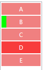
<DataTemplate x:Key="dtStrings">
        <Border Background="LightCoral" Width="80" Height="24" Margin="1">
            <Grid >
                <Border Grid.ColumnSpan="2" Background="#88FF0000" Visibility="{Binding RelativeSource={RelativeSource AncestorType=ListViewItem}, Path=IsMouseOver, Converter={StaticResource conBoolToVisibilityTrueIsVisibleFalseIsCollapsed}}"/>
                <Rectangle Grid.Column="0" Fill="Lime" Width="10" HorizontalAlignment="Left" Visibility="{Binding RelativeSource={RelativeSource AncestorType=ListViewItem}, Path=IsSelected, Converter={StaticResource conBoolToVisibilityTrueIsVisibleFalseIsCollapsed}}" />
                <TextBlock Grid.Column="1" Text="{Binding}" HorizontalAlignment="Center" VerticalAlignment="Center" Foreground="White" />
            </Grid>
        </Border>
    </DataTemplate>
実行時にこれが発生します(アイテム「B」が選択され、アイテム「D」がマウスオーバーします):
以下のコードは、ListViewItem行選択を無効にし、パディング、マージンなどを追加することもできます。
<ListView.ItemContainerStyle>
   <Style TargetType="ListViewItem">
       <Setter Property="Template">
         <Setter.Value>
           <ControlTemplate TargetType="{x:Type ListViewItem}">
              <ListViewItem Padding="0" Margin="0">
                  <ContentPresenter />
              </ListViewItem>
           </ControlTemplate>
         </Setter.Value>
         </Setter>
      </Style>
  </ListView.ItemContainerStyle>