CSSまたはSVGで半円を描く
CSSまたはSVGを使用してこの円の下部を描画する方法を探しています。私は この答え を見てきましたが、それは完全な半円を扱いますが、半分より少し少なくするために余分なセグメントを切り取る必要があります。純粋なCSSではおそらく不可能ですが、SVGの答えは私が変更するのが複雑になります。
<svg class="pie">
  <circle cx="115" cy="115" r="110"></circle>
  <path d="M115,115 L115,5 A110,110 1 0,1 225,115 z"></path>
</svg>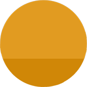
あなたはCSSでそれを行うことができます:
.partial-circle {
  position: relative;
  height: 20px;
  width: 100px;
  overflow: hidden;
}
.partial-circle:before {
  content: '';
  position: absolute;
  height: 100px;
  width: 100px;
  border-radius: 50%;
  bottom: 0;
  background: #D08707;
}
<div class="partial-circle"></div>また、次の2つの部分を持つことができます。
.partial-circle {
  position: relative;
  width: 100px;
  overflow: hidden;
}
.partial-circle:before {
  content: '';
  position: absolute;
  height: 100px;
  width: 100px;
  border-radius: 50%;
}
.partial-circle.top {
  height: 80px;
}
.partial-circle.bottom {
  height: 20px;
}
.partial-circle.top:before {
  top: 0;
  background: #E19B21;
}
.partial-circle.bottom:before {
  bottom: 0;
  background: #D08707;
}
<div class="partial-circle top"></div>
<div class="partial-circle bottom"></div>Arcコマンドで2つのpath要素を使用してみませんか?
<svg width="135" height="135">
  <path d="M125,85 a60,60 0 1,0 -115,0" fill="#E79A16" /><!--Top Half-->
  <path d="M10,85 a60,60 0 0,0 115,0" fill="#D78500" /><!--Bottom Half-->
</svg>
それらは簡単に分離できます。
<svg width="135" height="135">
  <path d="M125,80 a60,60 0 1,0 -115,0" fill="#E79A16" /><!--Top Half-->
</svg>
<svg width="135" height="135">
  <path d="M10,80 a60,60 0 0,0 115,0" fill="#D78500" /><!--Bottom Half-->
</svg>
<svg width="135" height="135">
  <path d="M10,0 a60,60 0 0,0 115,0" fill="#D78500" /><!--Bottom Half-->
</svg>