css:テキストを真ん中にして円を描くにはどうすればいいですか?
私はstackoverflowでこの例を見つけました:
これは素晴らしいです。しかし、円の中央にテキストを含めることができるように、この例を変更する方法を知りたいですか?
私はまたこれを見つけた: (iphoneの通知バッジのように)CSSの円の縦そして横のセンタリングのテキスト
しかし、何らかの理由で、それは私のために働いていません。次のようなテストコードを作成したとします。
<div class="badge">1</div>
円の代わりに、私は楕円形になります。私はそれがうまくいくようにすることができる方法を見るためにコードで遊ぼうとしています。
.circle {
  width: 500px;
  height: 500px;
  border-radius: 50%;
  font-size: 50px;
  color: #fff;
  line-height: 500px;
  text-align: center;
  background: #000
}
<div class="circle">Hello I am A Circle</div>あなたのコンテンツが折り返されて未知の身長になることになるなら、これはあなたの最善の策です:
http://cssdeck.com/labs/aplvrmue
.badge {
  height: 100px;
  width: 100px;
  display: table-cell;
  text-align: center;
  vertical-align: middle;
  border-radius: 50%; /* may require vendor prefixes */
  background: yellow;
}
.badge {
  height: 100px;
  width: 100px;
  display: table-cell;
  text-align: center;
  vertical-align: middle;
  border-radius: 50%;
  background: yellow;
}
<div class="badge">1</div>Css3 flexbox を使用できます。
HTML:
<div class="circle-with-text">
    Here is some text in circle
</div>
CSS:
.circle-with-text {
  justify-content: center;
  align-items: center;
  border-radius: 100%;
  text-align: center;
  display: flex;
}
これにより、縦と横の中央揃えの単一行と複数行のテキストを持つことができます。
body {
  margin: 0;
}
.circles {
  display: flex;
}
.circle-with-text {
  background: linear-gradient(orange, red);
  justify-content: center;
  align-items: center;
  border-radius: 100%;
  text-align: center;
  margin: 5px 20px;
  font-size: 15px;
  padding: 15px;
  display: flex;
  height: 180px;
  width: 180px;
  color: #fff;
}
.multi-line-text {
  font-size: 20px;
}
<div class="circles">
<div class="circle-with-text">
Here is some text in circle
</div>
<div class="circle-with-text multi-line-text">
Here is some multi-line text in circle
</div>
</div>楕円形や円でテキストを書きたいと思いますか?なんでこれじゃないの?
<span style="border-radius:50%; border:solid black 1px;padding:5px">Hello</span>私は最近、ウェブデザインのために、固定された円の問題で中心にある未知の量のテキストを解決しなければならないと考えていました。
私が持っていた主な問題は、テキストが円の境界をしばしば破るということでした。これを解決するために、私は4 divを使用しました。円の最大(固定)境界を指定する長方形のコンテナ。その内側には、幅と高さを100%に設定して円を描くdivがあるため、親のサイズを変更すると実際の円のサイズも変わります。その中には別の長方形のdivがあります。これは、%を使用して、テキストが円を離れるのを防ぐテキスト境界領域を作成します(大部分)。最後に、テキストと垂直方向の中央揃えの実際のdiv。
それはコードとしてもっと理にかなっています:
/* Main Container -  this controls the size of the circle */
.circle_container
{
        width : 128px;
        height : 128px;
        margin : 0;
        padding : 0;
/*      border : 1px solid red; */
}

/* Circle Main draws the actual circle */
.circle_main
{
        width : 100%;
        height : 100%;
        border-radius : 50%;
        border : 2px solid black;       /* can alter thickness and colour of circle on this line */
        margin : 0;
        padding : 0;
}

/* Circle Text Container - constrains text area to within the circle */
.circle_text_container
{
        /* area constraints */
        width : 70%;
        height : 70%;
        max-width : 70%;
        max-height : 70%;
        margin : 0;
        padding : 0;

        /* some position nudging to center the text area */
        position : relative;
        left : 15%;
        top : 15%;

        /* preserve 3d prevents blurring sometimes caused by the text centering in the next class */
        transform-style : preserve-3d;

        /*border : 1px solid green;*/
}

/* Circle Text - the appearance of the text within the circle plus vertical centering */
.circle_text
{
        /* change font/size/etc here */
        font: 11px "Tahoma", Arial, Serif;
        text-align : center;

        /* vertical centering technique */
        position : relative;
        top : 50%;
        transform : translateY(-50%);
}
<div class="circle_container">
<div class="circle_main">
<div class="circle_text_container">
<div class = "circle_text">
Here is an example of some text in my circle.
</div>
</div>
</div>
</div> コンテナーdivの境界線の色をコメント解除して、それがどのように制約されるかを確認できます。
気をつけるべきこと:あなたがあまりにも多くのテキストを入れたり、長すぎる単語/途切れのないテキストを使った場合でも、円の境界を破ることができます。まだ完全に未知のテキスト(ユーザー入力など)にはまだ適していませんが、保存する必要があるテキストの最大量が漠然とわかっていて、それに応じてサークルサイズとフォントサイズを設定すると最も効果的です。もちろんオーバーフローを隠すためにテキストコンテナdivを設定することができますが、それは単に "壊れた"ように見えるかもしれません、そして実際にあなたのデザインで最大サイズを正しく説明するための代替ではありません。
これが誰かに役立つことを願っています! HTML/CSSは私の主な分野ではないので、もっと上達できると確信しています!
もちろん、それにはタグを使用する必要があります。 1つは円を作成し、もう1つはテキストを作成します。
ここでいくつかのコードはあなたを助けるかもしれません
#circle {
    background: #f00;
    width: 200px;
    height: 200px;
    border-radius: 50%;
    color:black;

}
.innerTEXT{
    position:absolute;
    top:80px;
    left:60px;
}

<div id="circle">
    <span class="innerTEXT"> Here a text</span>
</div>
ライブサンプルはこちら http://jsbin.com/apumik/1/edit
更新
いくつかの変更を加えれば、これより小さくなります。
テキストが1行しかない場合は、line-heightプロパティを要素の高さと同じ値で使用できます。
height:100px;
line-height:100px;
テキストに複数の行がある場合、またはコンテンツが可変の場合は、padding-topを使用できます。
padding-top:30px;
height:70px;
Foundation 5とCompassフレームワークを使用している場合は、これを試すことができます。
.sass入力
$circle-width: rem-calc(25) !default;
$circle-height: $circle-width !default;
$circle-bg: #fff !default;
$circle-radius: 50% !default;
$circle-line-height: $circle-width !default;
$circle-text-align: center !default;

@mixin circle($cw:$circle-width, $ch:$circle-height, $cb:$circle-bg, $clh:$circle-line-height, $cta:$circle-text-align, $cr:$circle-radius) {
    width: $cw;
    height: $ch;
    background: $cb;
    line-height: $clh;
    text-align: $cta;
    @include inline-block;
    @include border-radius($cr);
}

.circle-default {
    @include circle;
}
.css出力
.circle-default {
  width: 1.78571rem;
  height: 1.78571rem;
  background: white;
  line-height: 1.78571rem;
  text-align: center;
  display: -moz-inline-stack;
  display: inline-block;
  vertical-align: middle;
  *vertical-align: auto;
  zoom: 1;
  *display: inline;
  -webkit-border-radius: 50%;
  -moz-border-radius: 50%;
  -ms-border-radius: 50%;
  -o-border-radius: 50%;
  border-radius: 50%;
}
私にとっては、 この解決方法 のみが複数行のテキストに対して有効でした。
.circle-multiline {
    display: table-cell;
    height: 200px;
    width: 200px;
    text-align: center;
    vertical-align: middle;
    border-radius: 50%;
    background: yellow;
}
ここでの解決策のいくつかは私にとって小さなサークルではうまくいきませんでした。だから私は古い絶対位置を使ってこの解決策を作った。
SASSを使うとこのようになります。
.circle-text {
    position: relative;
    display: block;
    text-align: center;
    border-radius: 50%;
    > .inner-text {
        display: block;
        @extend .center-align;
    }
}

.center-align {
    position: absolute;
    top: 50%;
    left: 50%;
    margin: auto;
    -webkit-transform: translateX(-50%) translateY(-50%);
    -ms-transform: translateX(-50%) translateY(-50%);
    transform: translateX(-50%) translateY(-50%);
}

@mixin circle-text($size) {
    width: $size;
    height: $size;
    @extend .circle-text;
}
そしてのように使用することができます
#red-circle {
    background-color: red;
    border: 1px solid black;
    @include circle-text(50px);
}

#green-circle {
    background-color: green;
    border: 1px solid black;
    @include circle-text(150px);
}
https://codepen.io/matheusrufca/project/editor/DnYPMK のデモを参照してください。
出力CSSを見るためのスニペットを見る
.circle-text {
  position: relative;
  display: block;
  border-radius: 50%;
  text-align: center;
  min-width: 50px;
  min-height: 50px;
}

.center-align {
  position: absolute;
  top: 50%;
  left: 50%;
  margin: auto;
  -webkit-transform: translateX(-50%) translateY(-50%);
  -ms-transform: translateX(-50%) translateY(-50%);
  transform: translateX(-50%) translateY(-50%);
}
<div id="red-circle" class="circle-text">
<span class="inner-text center-align">Hey</span>
</div>
<div id="green-circle" class="circle-text">
<span class="inner-text center-align">Big size circle</span>
<div>
<style>
#red-circle {
background-color: red;
border: 1px solid black;
width: 60px;
height: 60px;
}
#green-circle {
background-color: green;
border: 1px solid black;
width: 150px;
height: 150px;
}
</style>これは、とても簡単な設定のYouTubeページから取得しました。絶対に保守可能で再利用可能です。
.circle {
    position: absolute;
    top: 4px;
    color: white;
    background-color: red;
    width: 18px;
    height: 18px;
    border-radius: 50%;
    line-height: 18px;
    font-size: 10px;
    text-align: center;
    cursor: pointer;
    z-index: 999;
}
<div class="circle">2</div>.circle {
width: 500px;
height: 500px;
border-radius: 50%;
font-size: 50px;
color: #fff;
line-height: 500px;
text-align: center;
background: #000
}<div class="circle">Hello I am A CircleHello I am A CircleHello I am A CircleHello I am A CircleHello I am A CircleHello I am A CircleHello I am A CircleHello I am A CircleHello I am A Circle</div>HTMLタグ付きでCSSなしのテキストを中央に配置して円を描く
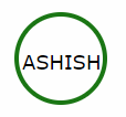
このためのSVGタグを持つHTML。 CSSを使いたくない場合は、この標準的な方法に従うことができます。
 <svg width="100" height="100">
   <circle cx="50" cy="50" r="40" stroke="green" stroke-width="4" fill="white" />
     Sorry, your browser does not support inline SVG.
   <text fill="#000000" font-size="18" font-family="Verdana"
     x="15" y="60">ASHISH</text>
 </svg>
このコードを使うとそれもまた反応するでしょう。
<div class="circle">ICON</div>

.circle {
  position: relative;
  display: inline-block;
  width: 100%;
  height: 0;
  padding: 50% 0;
  border-radius: 50%;
  /* Just making it pretty */
  -webkit-box-shadow: 0 4px 0 0 rgba(0, 0, 0, 0.1);
  box-shadow: 0 4px 0 0 rgba(0, 0, 0, 0.1);
  text-shadow: 0 4px 0 rgba(0, 0, 0, 0.1);
  background: #38a9e4;
  color: white;
  font-family: Helvetica, Arial Black, sans;
  font-size: 48px;
  text-align: center;
}
私は他の人々からのいくつかの答えを結合していました、そしてfloatとrelativeでそれは私が必要とした結果を私に与えました。
HTMLでは私はdivを使います。ナビゲーションバーのためにliの中で使います。
.large-list-style {
    float: left;
    position: relative;
    top: -8px;

    border-radius: 50%;

    margin-right: 8px;

    background-color: rgb(34, 198, 200);

    font-size: 18px;
    color: white;
}
    .large-list-style:before,
    .large-list-style:after {
        content: '\200B';
        display:inline-block;
        line-height:0;

        padding-top: 50%;
        padding-bottom: 50%;
    }
    .large-list-style:before {
        padding-left: 16px;
    }
    .large-list-style:after {
        padding-right: 16px;
    }
その1つの方法は、テキストを中央に揃えるためにflexboxを使用することです。私が見つけた方法は次のとおりです。
HTML:
<div class="circle-without-text">
  <div class="text-inside-circle">
    The text
  </div>
</div>
CSS:
.circle-without-text {
    border-radius: 50%;
    width: 70vh;
    height: 70vh;
    background-color: red;
    position: relative;
 }

.text-inside-circle {
    position: absolute;
    top: 0;
    bottom: 0;
    width: 100%;
    display: flex;
    align-items: center;
    justify-content: center;
 }
ここでplnkr: https://plnkr.co/edit/EvWYLNfTb1B7igoc3TZx?p=preview