WPF ListViewの非アクティブな選択色
複数のListViewの選択が連続して行われるWPFアプリケーションを作成しています(iTunesブラウザーに似ています)。問題は、デフォルトの非アクティブな選択色が明るすぎることです。 (下記参照) 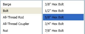
非アクティブなリストビューがこのようになるようにこの色を変更するにはどうすればよいですか? (下記参照) 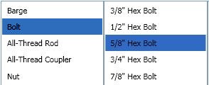
解決
デフォルトのSystemColorを次のようにStyleでオーバーライドします。
<Style TargetType="ListViewItem">
    <Style.Resources>
        <SolidColorBrush x:Key="{x:Static SystemColors.ControlBrushKey}" Color="{x:Static SystemColors.HighlightColor}"/>
    </Style.Resources>
</Style>
ListBoxテンプレートは、ControlBrushと呼ばれるシステムカラーを使用して、非アクティブなハイライトカラーを設定します。したがって、その色をオーバーライドできます。
<ListBox>
    <ListBox.Resources>
        <SolidColorBrush x:Key="{x:Static SystemColors.ControlBrushKey}">Red</SolidColorBrush>
    </ListBox.Resources>
</ListBox>
SystemColors.ControlBrushKeyを変更しても機能しなかったため、SystemColors.InactiveSelectionHighlightBrushKeyを変更する必要がありました
代わりに:
<SolidColorBrush x:Key="{x:Static SystemColors.ControlBrushKey}" Color="Red" />
私は使用しなければなりませんでした:
<SolidColorBrush x:Key="{x:Static SystemColors.InactiveSelectionHighlightBrushKey}" Color="Red"/>
答えは場合によっては問題を解決しますが、コントロールが無効/読み取り専用になると破損し、カラースキームを利用するのではなくオーバーライドするため、理想的ではありません。代わりに、ListBoxタグに次を追加することをお勧めします。
<ListBox....>
    <ListBox.Resources>
            <Style TargetType="ListBoxItem">
                <Setter Property="Template">
                    <Setter.Value>
                        <ControlTemplate TargetType="ListBoxItem">
                            <Border Name="Border" Padding="2" SnapsToDevicePixels="true">
                                <ContentPresenter />
                            </Border>
                            <ControlTemplate.Triggers>
                                <Trigger Property="IsSelected" Value="true">
                                    <Setter TargetName="Border" Property="Background"
                                            Value="{DynamicResource {x:Static SystemColors.HighlightBrushKey}}"/>
                                </Trigger>
                            </ControlTemplate.Triggers>
                        </ControlTemplate>
                    </Setter.Value>
                </Setter>
        </Style>
    </ListBox.Resources>
</ListBox>
これにより、リストボックス項目が選択されるたびに(コントロールの状態に関係なく)ハイライト背景色が設定されます。
私の答えは、次のブログと共に、すでに与えられた答えからの助けに基づいています。 http://blogs.vbcity.com/xtab/archive/2009/06/29/9344.aspx
SystemColorsのいくつかのプロパティをオーバーライドする必要があります。 SystemColors Class(MSDN) をご覧ください。 InactiveSelectionHighlightBrushKeyよりも多くのプロパティがあります。テキストの色に影響するInactiveSelectionHighlightTextBrushKey。
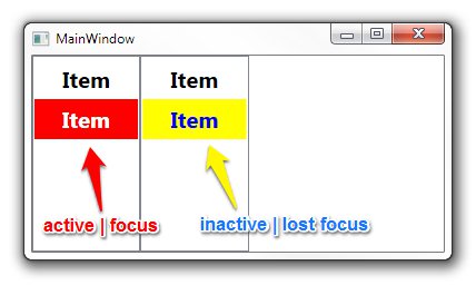
<Window x:Class="WpfApplication1.MainWindow"
        xmlns="http://schemas.Microsoft.com/winfx/2006/xaml/presentation"
        xmlns:x="http://schemas.Microsoft.com/winfx/2006/xaml"
        Title="MainWindow" Height="350" Width="525">
    <Window.Resources>
        <SolidColorBrush x:Key="{x:Static SystemColors.HighlightBrushKey}" Color="Red"/>
        <SolidColorBrush x:Key="{x:Static SystemColors.HighlightTextBrushKey}" Color="White"/>
        <SolidColorBrush x:Key="{x:Static SystemColors.InactiveSelectionHighlightBrushKey}" Color="Yellow"/>
        <SolidColorBrush x:Key="{x:Static SystemColors.InactiveSelectionHighlightTextBrushKey}" Color="Blue"/>
        <Style TargetType="ListViewItem">
            <Setter Property="FontSize" Value="20" />
            <Setter Property="FontWeight" Value="Bold" />
            <Setter Property="Padding" Value="25,5" />
        </Style>
    </Window.Resources>
    <StackPanel Orientation="Horizontal">
        <ListView>
            <ListViewItem Content="Item" />
            <ListViewItem Content="Item" />
        </ListView>
        <ListView>
            <ListViewItem Content="Item" />
            <ListViewItem Content="Item" />
        </ListView>
    </StackPanel>
</Window>
古い.NET Frameworkでは、システムカラーのオーバーライドは機能しません。 .NET Framework 4.0で動作するソリューションは here です。
<ListView>
<ListView.Resources>
<Style TargetType="{x:Type ListViewItem}">
    <Setter Property="Template">
        <Setter.Value>
            <ControlTemplate TargetType="{x:Type ListViewItem}">
                <Border x:Name="Bd"
                        BorderBrush="{TemplateBinding BorderBrush}"
                        BorderThickness="{TemplateBinding BorderThickness}"
                        Background="{TemplateBinding Background}"
                        Padding="{TemplateBinding Padding}"
                        SnapsToDevicePixels="true">
                    <ContentPresenter HorizontalAlignment="{TemplateBinding HorizontalContentAlignment}"
                                        SnapsToDevicePixels="{TemplateBinding SnapsToDevicePixels}"
                                        VerticalAlignment="{TemplateBinding VerticalContentAlignment}" />
                </Border>
                <ControlTemplate.Triggers>
                    <MultiTrigger>
                        <MultiTrigger.Conditions>
                            <Condition Property="Selector.IsSelectionActive"
                                        Value="False" />
                            <Condition Property="IsSelected"
                                        Value="True" />
                        </MultiTrigger.Conditions>
                        <Setter Property="Background"
                                TargetName="Bd"
                                Value="DarkOrange" />
                    </MultiTrigger>
                    <MultiTrigger>
                        <MultiTrigger.Conditions>
                            <Condition Property="Selector.IsSelectionActive"
                                        Value="True" />
                            <Condition Property="IsSelected"
                                        Value="True" />
                        </MultiTrigger.Conditions>
                        <Setter Property="Background"
                                TargetName="Bd"
                                Value="OrangeRed" />
                    </MultiTrigger>
                </ControlTemplate.Triggers>
            </ControlTemplate>
        </Setter.Value>
    </Setter>
</Style>
ListBoxとListViewの両方で機能します。
この他の答え に基づいて、実際の値をハードコーディングせずにアクティブと非アクティブの色を同じにするために次を使用しました:
<ListBox.Resources>
    <SolidColorBrush x:Key="{x:Static SystemColors.InactiveSelectionHighlightBrushKey}"
                     Color="{x:Static SystemColors.HighlightColor}"/>
    <SolidColorBrush x:Key="{x:Static SystemColors.InactiveSelectionHighlightTextBrushKey}"
                     Color="{x:Static SystemColors.HighlightTextColor}"/>
</ListBox.Resources>
アクティブと非アクティブの両方で同じ色を使用することはidealではないかもしれませんが、デフォルトの色は非常にかすかで、どの項目が選択されたかを判別するのが困難でした非アクティブでした。これは明確な改善です。
私にとって、これはトリックでした:
 <ListBox HorizontalContentAlignment="Stretch">
                <ListBox.ItemTemplate>
                    <DataTemplate>
                        <Label  Margin="-5, -2,-5,-2" Content="{Binding Item}">
                            <Label.Style>
                                <Style TargetType="Label">
                                    <Style.Triggers>
                                        <MultiDataTrigger>
                                            <MultiDataTrigger.Conditions>
                                                <Condition Binding="{Binding RelativeSource={RelativeSource Mode=FindAncestor,AncestorType={x:Type ListBox}},Path=IsFocused}" Value="False"/>
                                                <Condition Binding="{Binding RelativeSource={RelativeSource Mode=FindAncestor,AncestorType={x:Type ListBoxItem}},Path=IsSelected}" Value="True"/>
                                            </MultiDataTrigger.Conditions>
                                            <Setter Property="Background" Value="CornflowerBlue"/>
                                        </MultiDataTrigger>
                                        <DataTrigger Binding="{Binding RelativeSource={RelativeSource Mode=FindAncestor,AncestorType={x:Type ListBoxItem}},Path=IsSelected}" Value="True">
                                            <Setter Property="Foreground" Value="White"/>
                                        </DataTrigger>
                                        <DataTrigger Binding="{Binding RelativeSource={RelativeSource Mode=FindAncestor,AncestorType={x:Type ListBoxItem}},Path=IsSelected}" Value="False">
                                            <Setter Property="Foreground" Value="Black"/>
                                        </DataTrigger>
                                    </Style.Triggers>
                                </Style>
                            </Label.Style>
                        </Label>
                    </DataTemplate>
                </ListBox.ItemTemplate>
            </ListBox>