divの楕円形を与えるには?
両面が切れた楕円形をたくさん試しましたが出来ませんでした 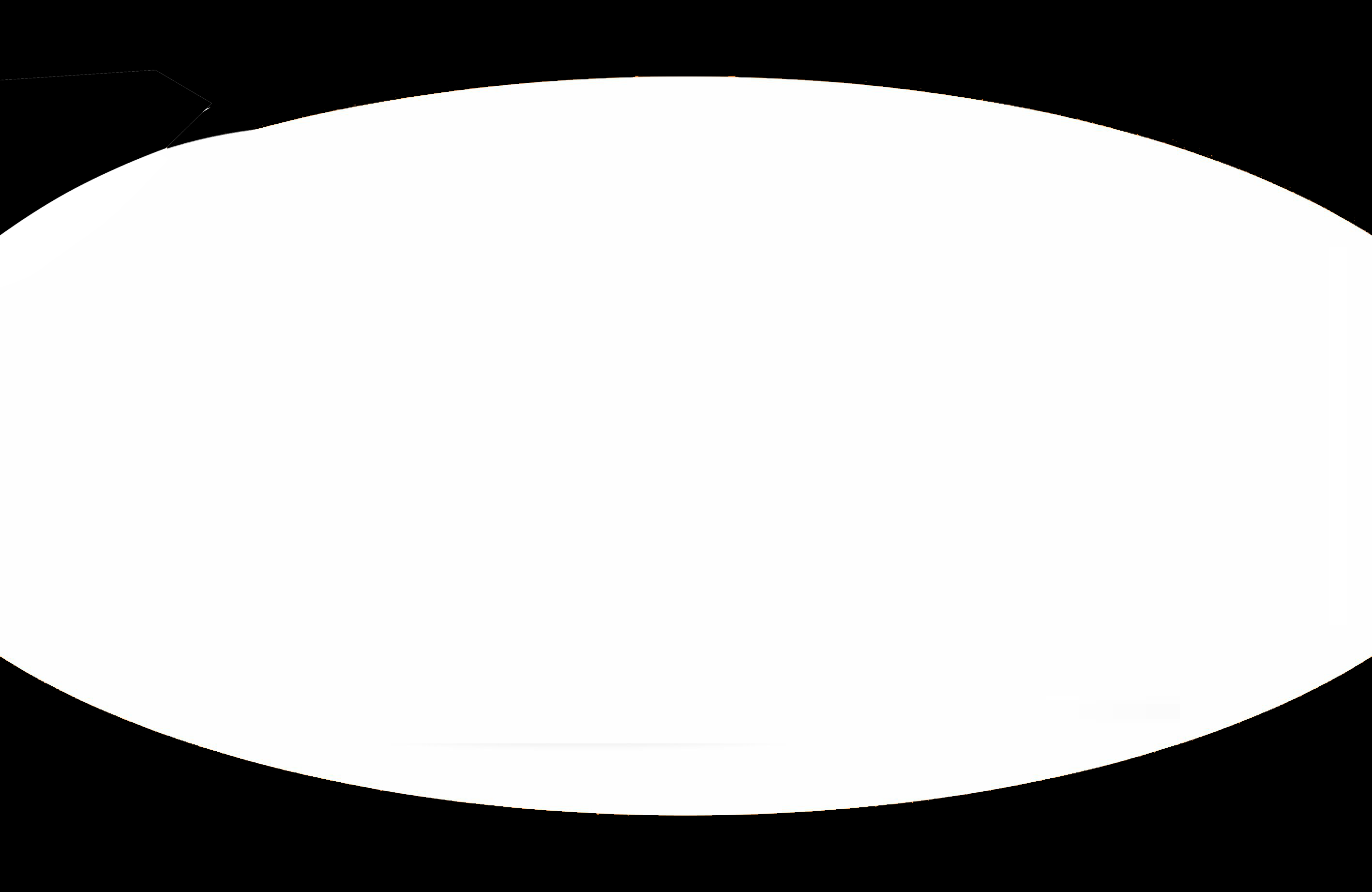
両側がカットされた楕円形のコードが必要です。
以下が私のコードです:-
.demo{
    width: 100%;
    height: 600px;
    background: white;
    -moz-border-radius: 100px / 50px;
    -webkit-border-radius: 100px / 178px;
    border-radius: 694px / 208px;

    z-index: 100;
    position: relative;
    }
これでよろしいですか ?
[〜#〜] html [〜#〜]
<div id="oval_parent">
    <div id="oval"></div>
</div>
[〜#〜] css [〜#〜]
#oval_parent{
    background:black;
    width:200px;
    height:120px;
    overflow:hidden;
}

#oval{
    width: 220px;
    height: 100px;
    margin:10px 0 0 -10px;
    background: white;
    -moz-border-radius: 100px / 50px;
    -webkit-border-radius: 100px / 50px;
    border-radius: 100px / 50px;
}
これを試して:
#oval-shape {
    width: 200px;
    height: 100px;
    background: blue;
    -moz-border-radius: 100px / 50px;
    -webkit-border-radius: 100px / 50px;
    border-radius: 100px / 50px;
}
高さに対するコーナー値の比率に注意してください。
Cssの値を変更します。
#demo {
    width: 100%;
    height: 600px;
    background: white;
    -moz-border-radius: 50% / 250px;
    -webkit-border-radius: 40% / 250px;
    border-radius: 50% / 250px;

    z-index: 100;
    position: relative;
}
考えられる2つのバリエーションを次に示します。
メソッド#01:
radial-gradient() を使用:
background: radial-gradient(ellipse 65% 40%, transparent 0, transparent 90%, black 90%);
body {
  background: linear-gradient(orange, red);
  padding: 0 20px;
  margin: 0;
}
.oval {
  background: radial-gradient(ellipse 65% 40%, transparent 0, transparent 90%, black 90%);
  height: 100vh;
}
<div class="oval">
</div>メソッド#02:
:beforeまたは:after疑似要素を使用してオーバーレイを作成します。border-radiusを追加します。- 大きな
box-shadowをoverflow: hiddenとともに親に適用して、不要な領域を非表示にします。
body {
  background: linear-gradient(orange, red);
  padding: 0 20px;
  margin: 0;
}
.oval {
  position: relative;
  overflow: hidden;
  height: 100vh;
}

.oval:before {
  box-shadow: 0 0 0 500px #000;
  border-radius: 100%;
  position: absolute;
  content: '';
  right: -10%;
  left: -10%;
  top: 10%;
  bottom: 10%;
}
<div class="oval">
</div>すべての楕円形を表示するのに十分な高さで、幅が十分でない別のdiv内に配置し、overflow:hiddenを設定します。中央に配置されている場合、端は切り取られますが、横スクロールすることはできません。